Rebrand and positioning for Scotland’s first wellness and music festival.
Paisley Alive aims to bring people together through, movement, wellness and music to channel energy, joy and the profit right back into the community. The festival isn’t just about celebrating art and music or inspiring healthier lifestyles; it’s part of a bigger plan for the local community. Paisley Alive is for the people. By the people.
The Challenge
We worked closely with local entrepreneur Scott McFarlane and his team to bring their vision for the festival to life through a new identity system, positioning and website.
Paisley Alive is no ordinary music festival. Our challenge was to develop an inclusive brand that embodies not just live music but wellness and fitness for a wide demographic. Giving the festival a confident new energy while leaving room to evolve as the festival grows.
The project’s impact reaches beyond branding. Proceeds from the festival will be reinvested into the local area, with plans to restore the Barshaw Park bandstand and transform it into a year round venue for live performances, weddings and community events This ensures the brand creates lasting cultural and economic value beyond the event itself.
Our Approach
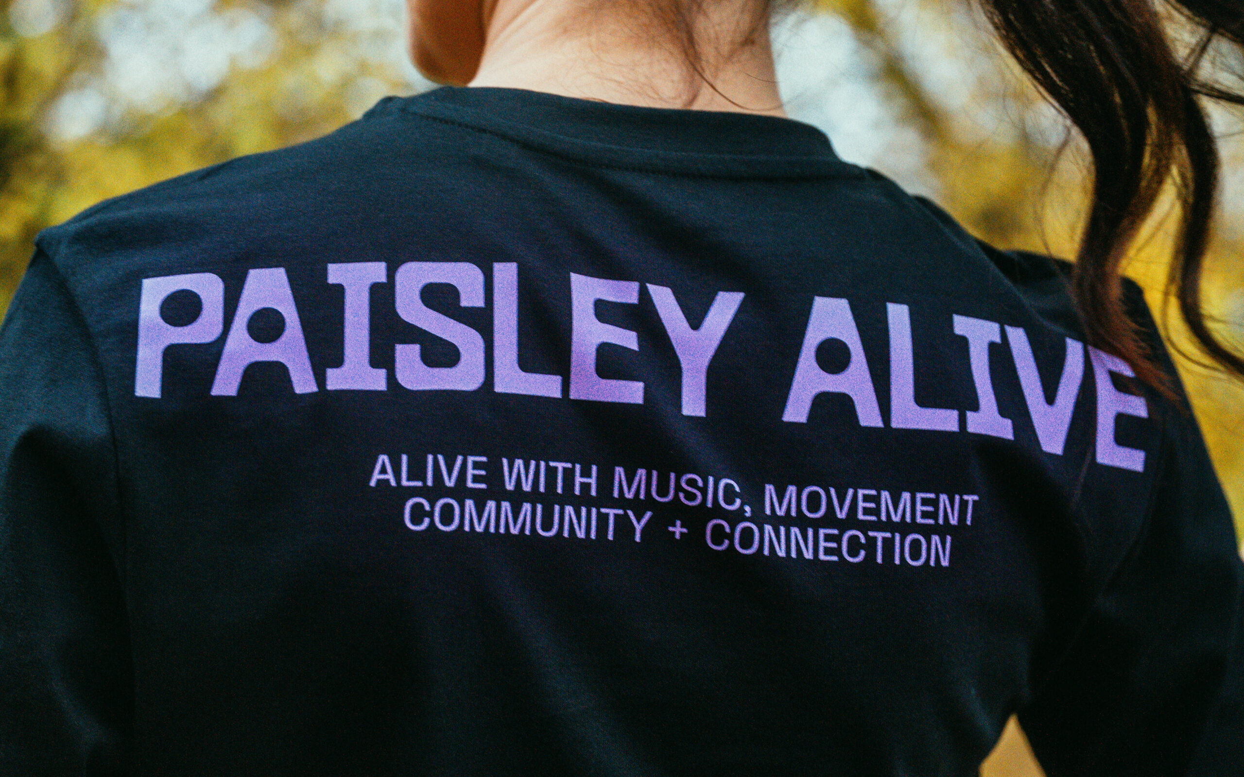
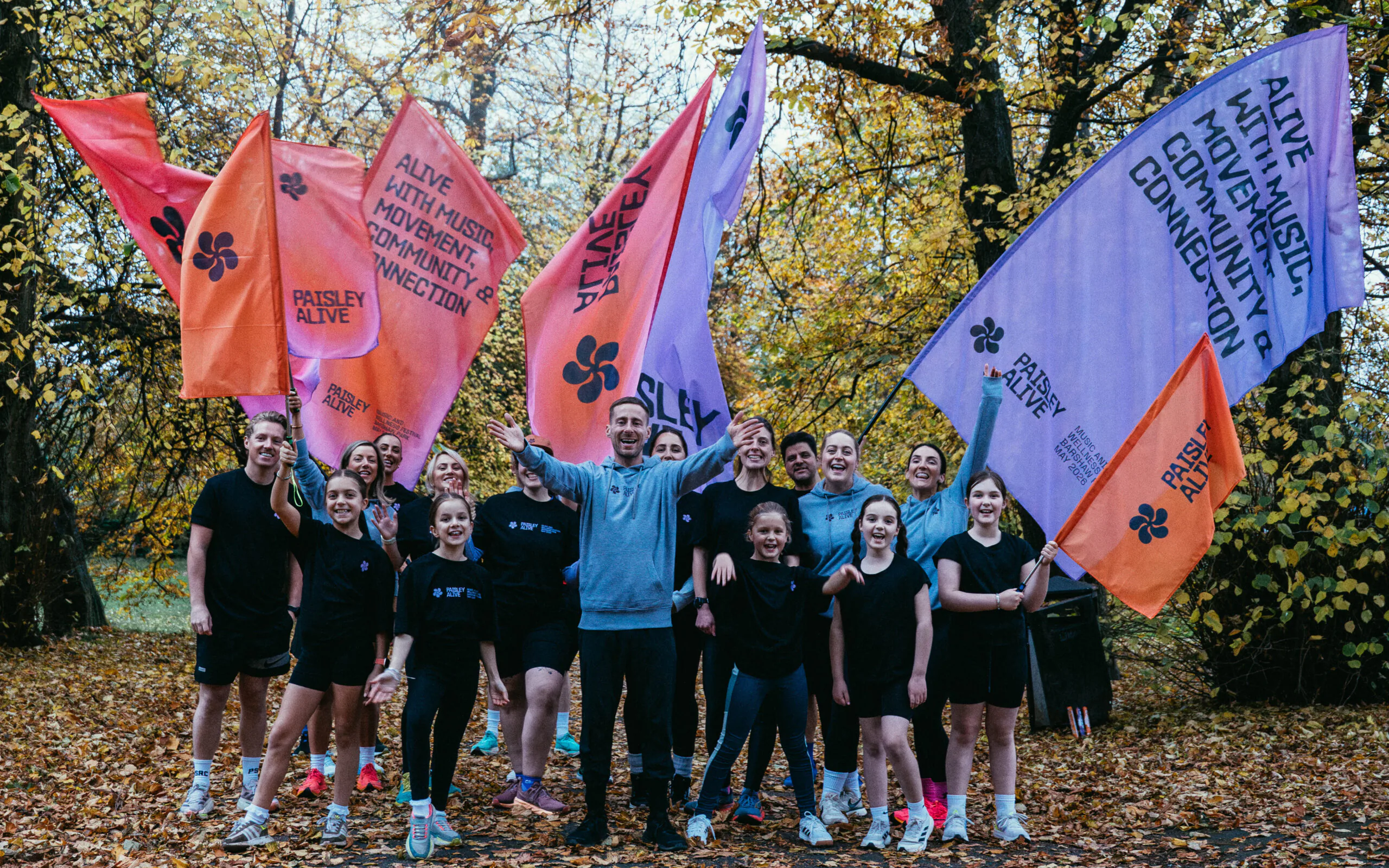
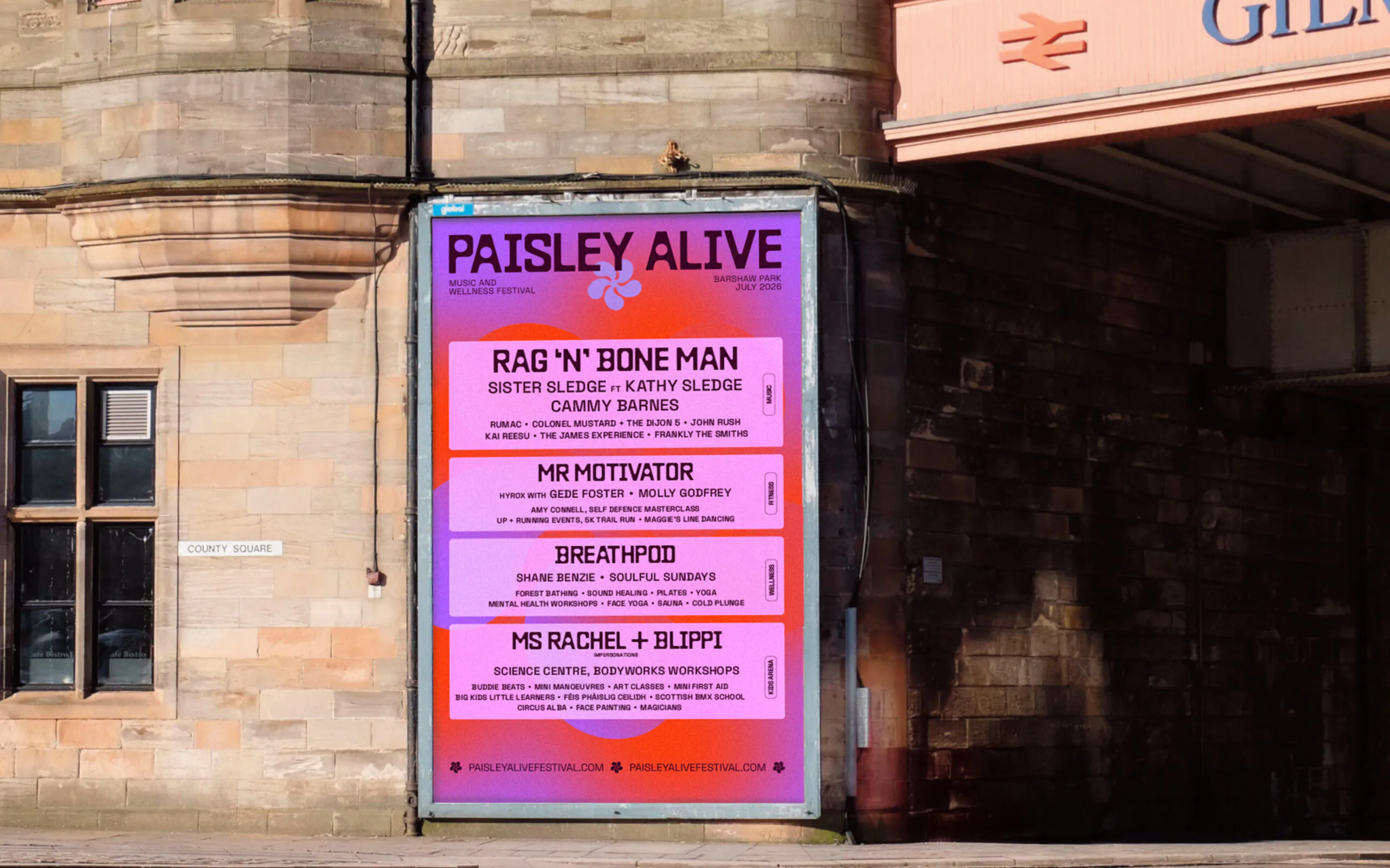
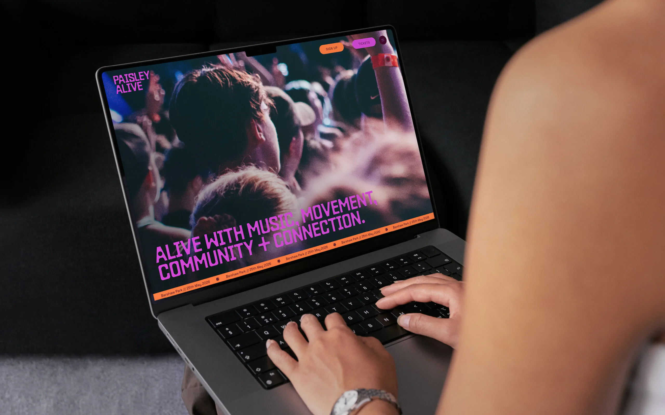
Through initial workshops and team discussions, we uncovered a clear purpose: ‘Alive with music, movement, community and connection’. This idea became the foundation of the brand, shaping an energetic identity designed to capture the emotion of moving your body.
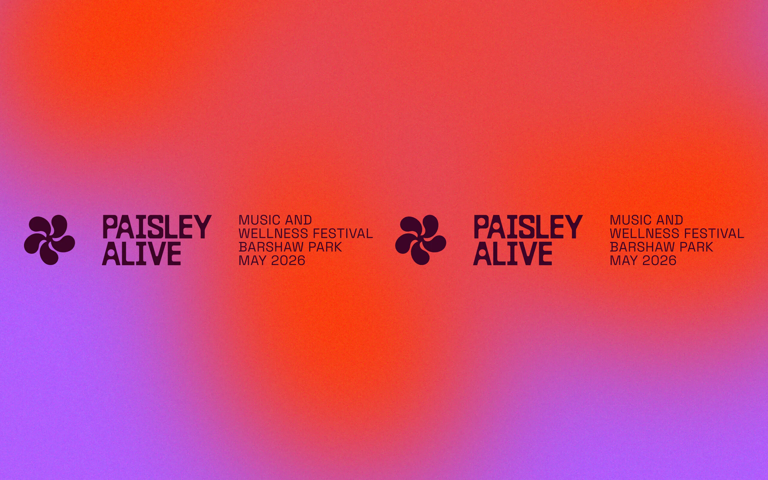
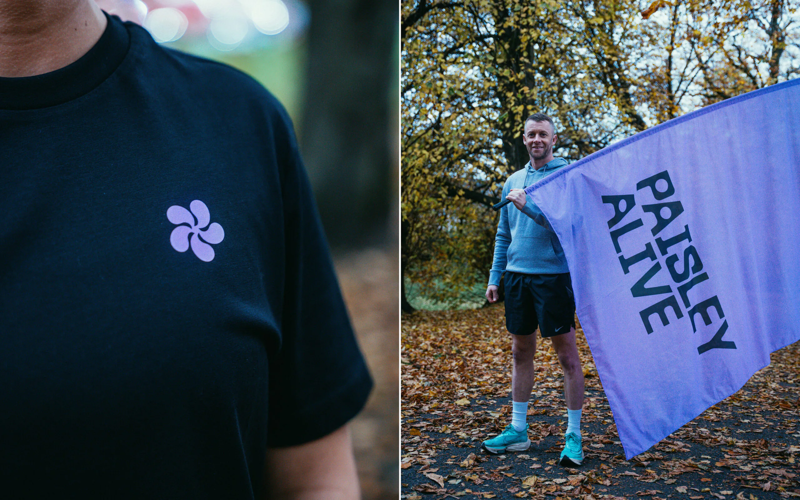
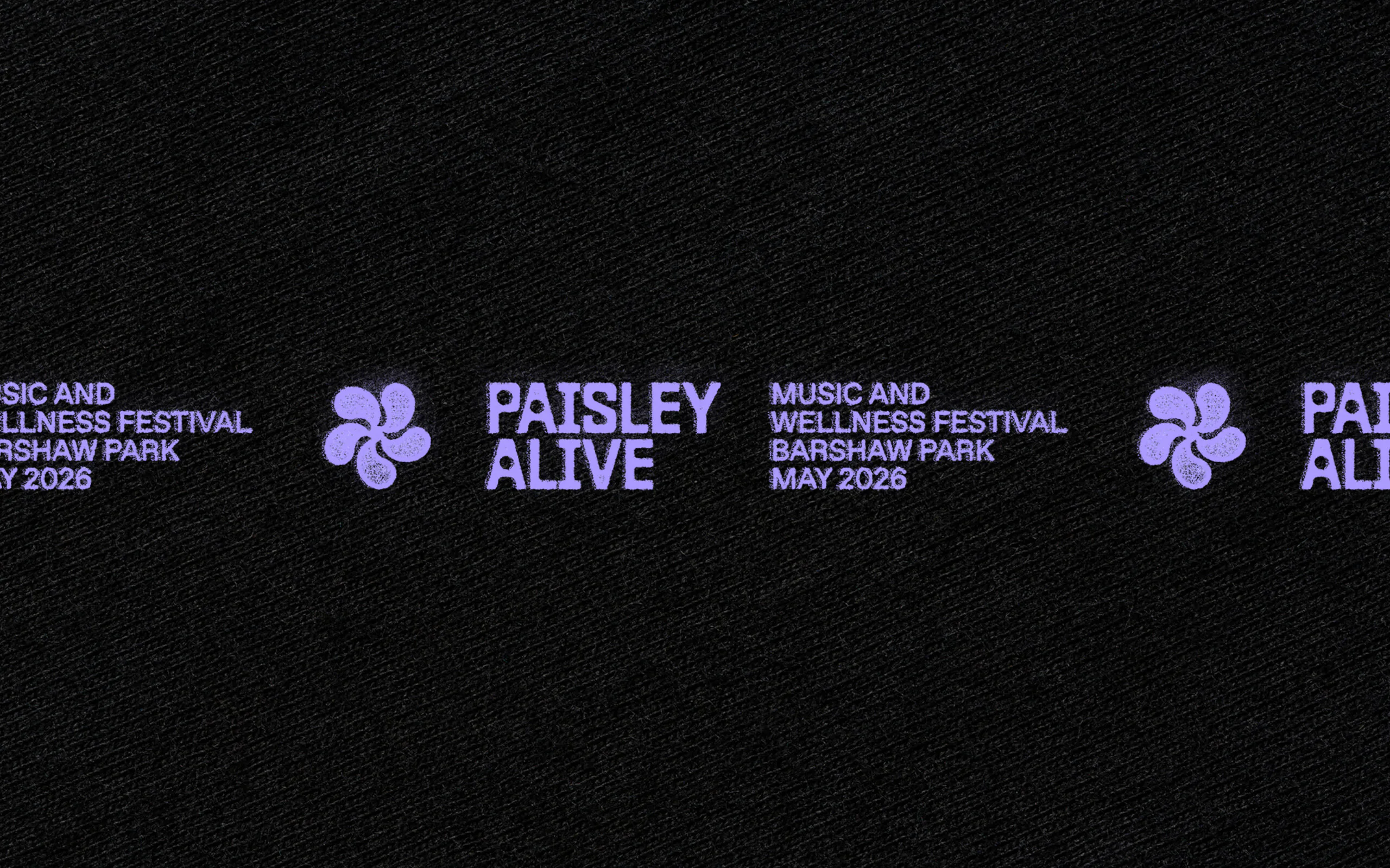
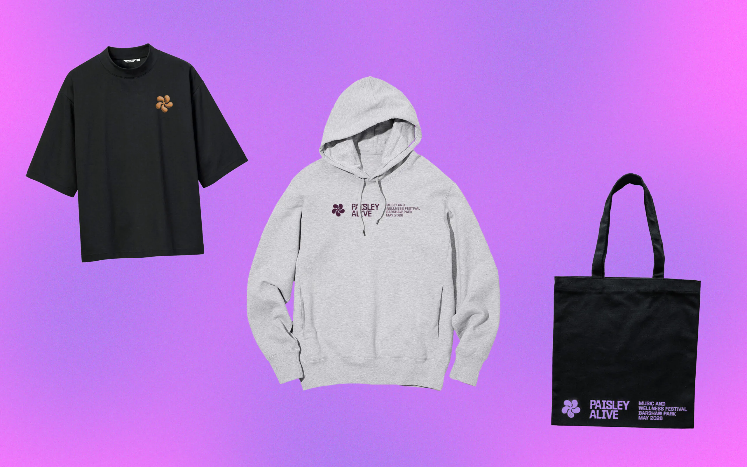
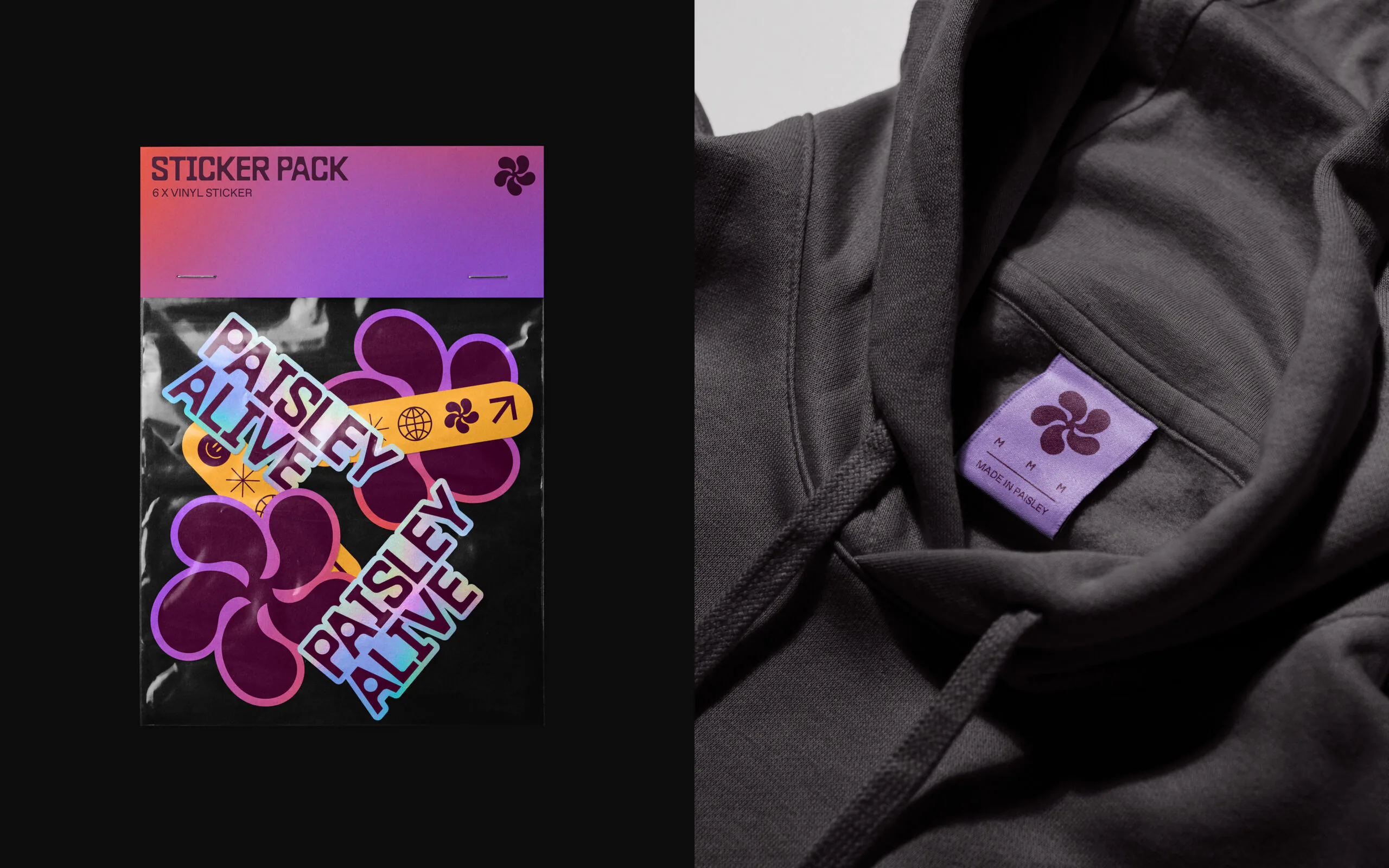
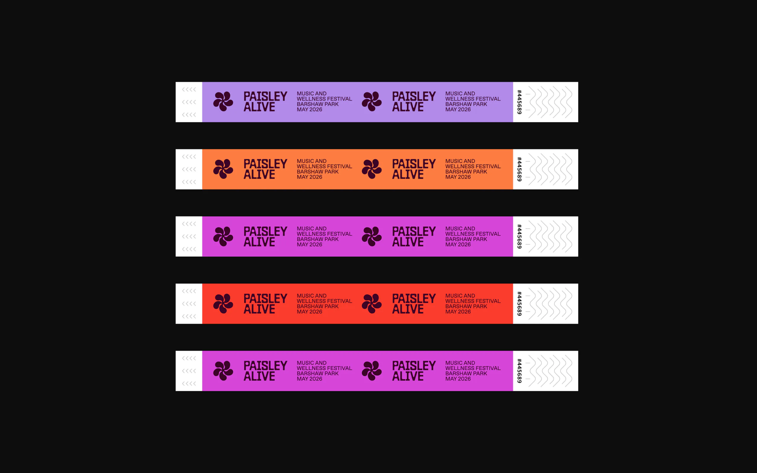
The brand marque is a minimal nod to the famous Paisley pattern, directly linking the identity to the heritage of the town in a contemporary way. Inspired by the energy of sound, the marque pulses with movement, creating an eye catching element that embodies the spirit of the festival.
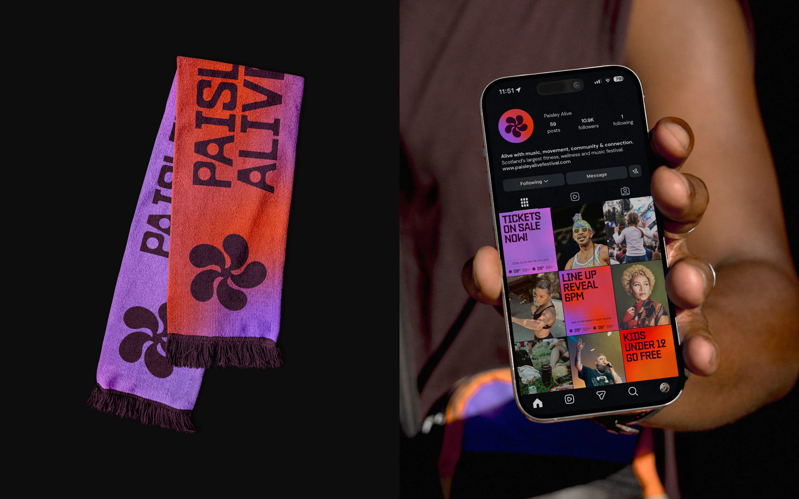
The colour palette mirrors the festival’s natural transition from day to night, from wellness and fitness to music. Drawing inspiration from the sky at dawn and dusk, we developed a living gradient that evokes energy, giving the team the freedom to adapt and evolve the look across an extensive range of assets.
The Outcome
The new identity has helped maximise the impact of the launch of the festival across various media channels with positive engagement and ticket sales. Now with the new website in place, a streamlined process has been created for people to buy tickets, book sessions and learn more about the festival’s cultural goals.
“We knew we had one chance to make a big statement with the launch of the new brand and the festival. We worked with Shine to nail our core values and festival’s inclusive look and feel. It’s been a great project to see come to life through their expertise and the feedback since the launch has been excellent. We wanted people to be inspired by the event and the new brand has given us the confidence and credibility to put on the best possible event for the people of Paisley.”
Scott McFarlane, Founder of Paisley Alive Festival
Rebrand and repositioning for Charity Leadership Scotland. Formerly ACOSVO, Charity Leadership Scotland is the home of Scotland’s voluntary sector leaders.

The Challenge
After 25 years of supporting, connecting and championing Scotland’s voluntary sector leaders, ACOSVO embarked on a new era with a new name: Charity Leadership Scotland. We worked closely with the senior team to reposition the organisation to better reflect the resilience, influence and ambition of its 700 members. Building on ACOSVO’s legacy, we created a new identity that captures what the charity stands for today.


Together Towards Change.
Connection emerged as a central theme throughout the initial workshops and conversations. At its core, the organisation brings leaders together to offer support and drive meaningful change across the sector. This sense of community and a collective voice that challenges the norm, became the cornerstone of the brand’s new positioning.


The Brand
With a new name that reflects their mission with more clarity, a modernised brand was created to help strengthen recognition, influence and reach across the sector and beyond. The brand marque draws inspiration from ripples of change, circles of community and crossing paths of connection, each closely tied to the organisation’s vision and values.


A new look
Moving away from the corporate purple tones of the ACOSVO brand, a new and accessible palette was introduced to help differentiate from others in the sector. We also introduced new typography to bring a warmth to communications. A brand toolkit was created for the internal team to allow staff to roll out the brand across various print and digital media.


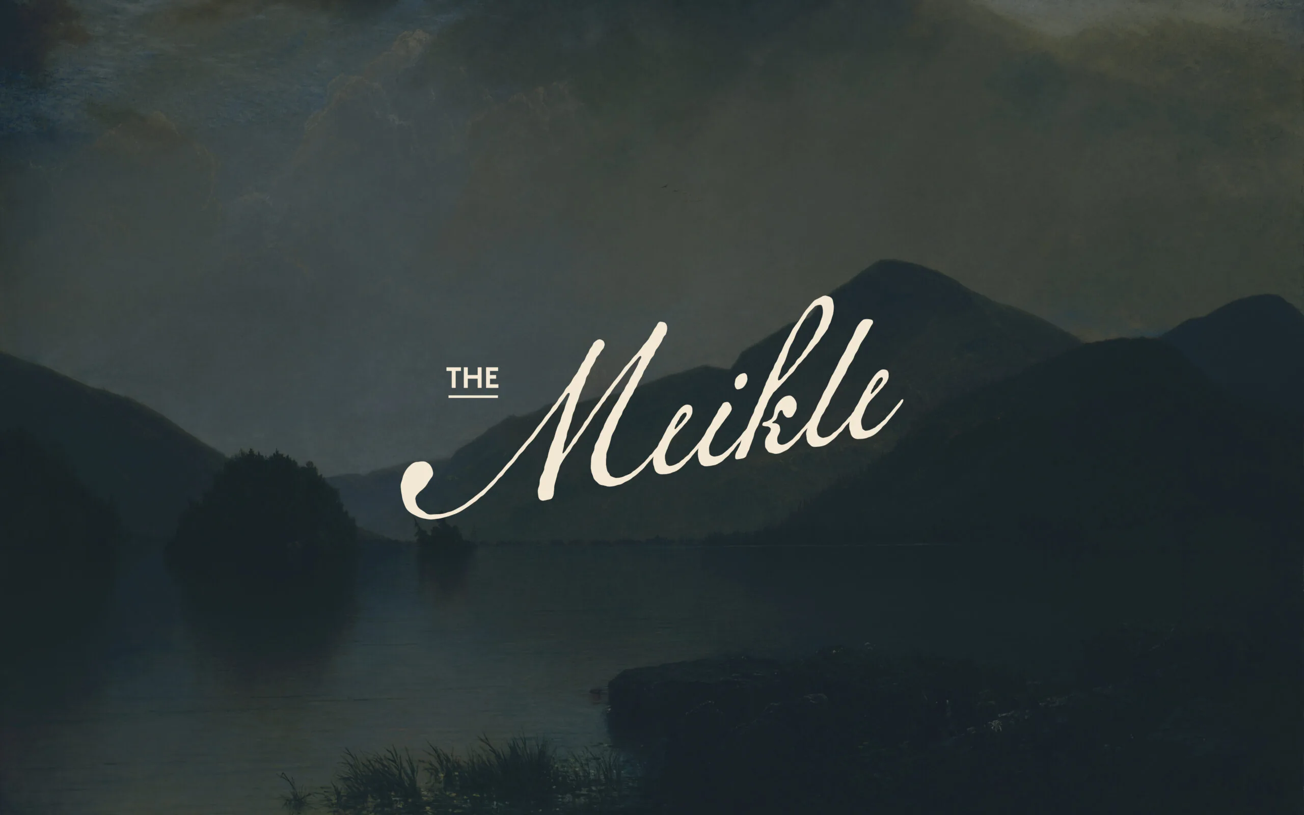
Rebranding a new breakfast restaurant space at Crieff Hydro.
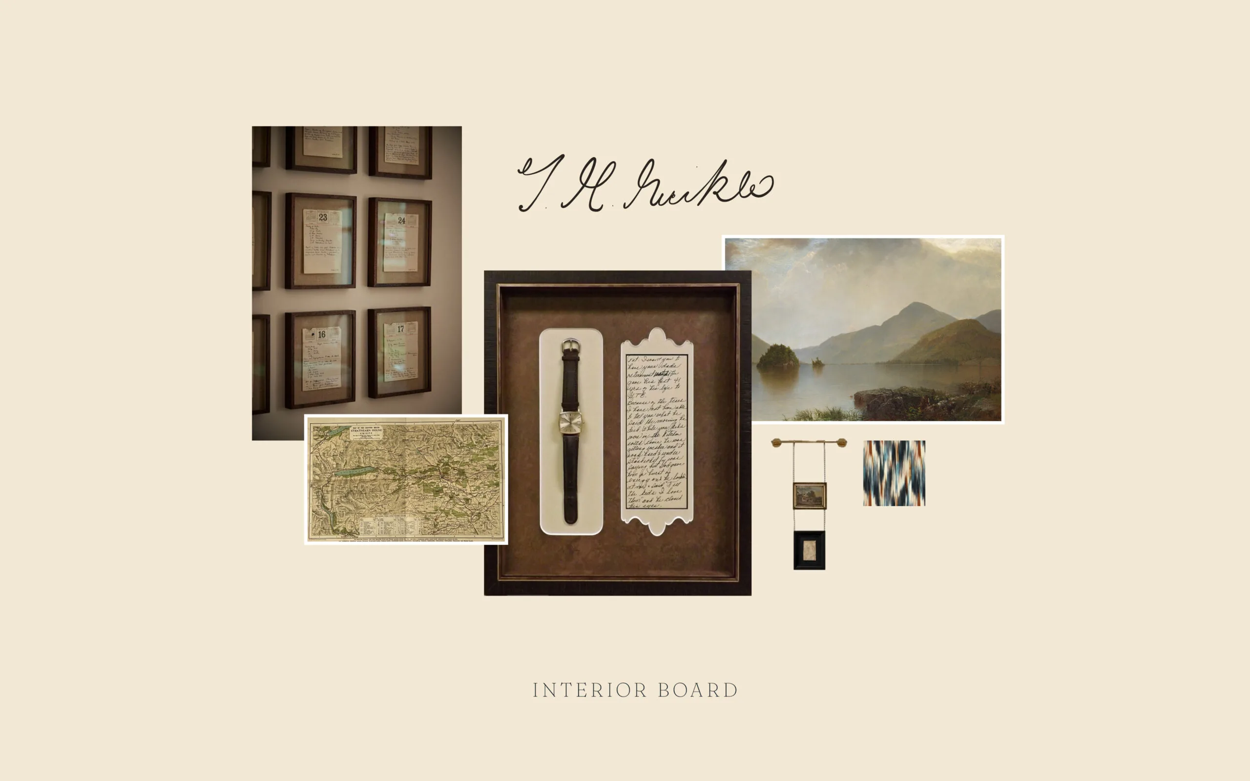
The Challenge
Early in 2025 we partnered with Crieff Hydro on their £5M dining refurbishment project which sees the creation of six new bar and restaurant venues and refreshed menus for its existing dining spots.
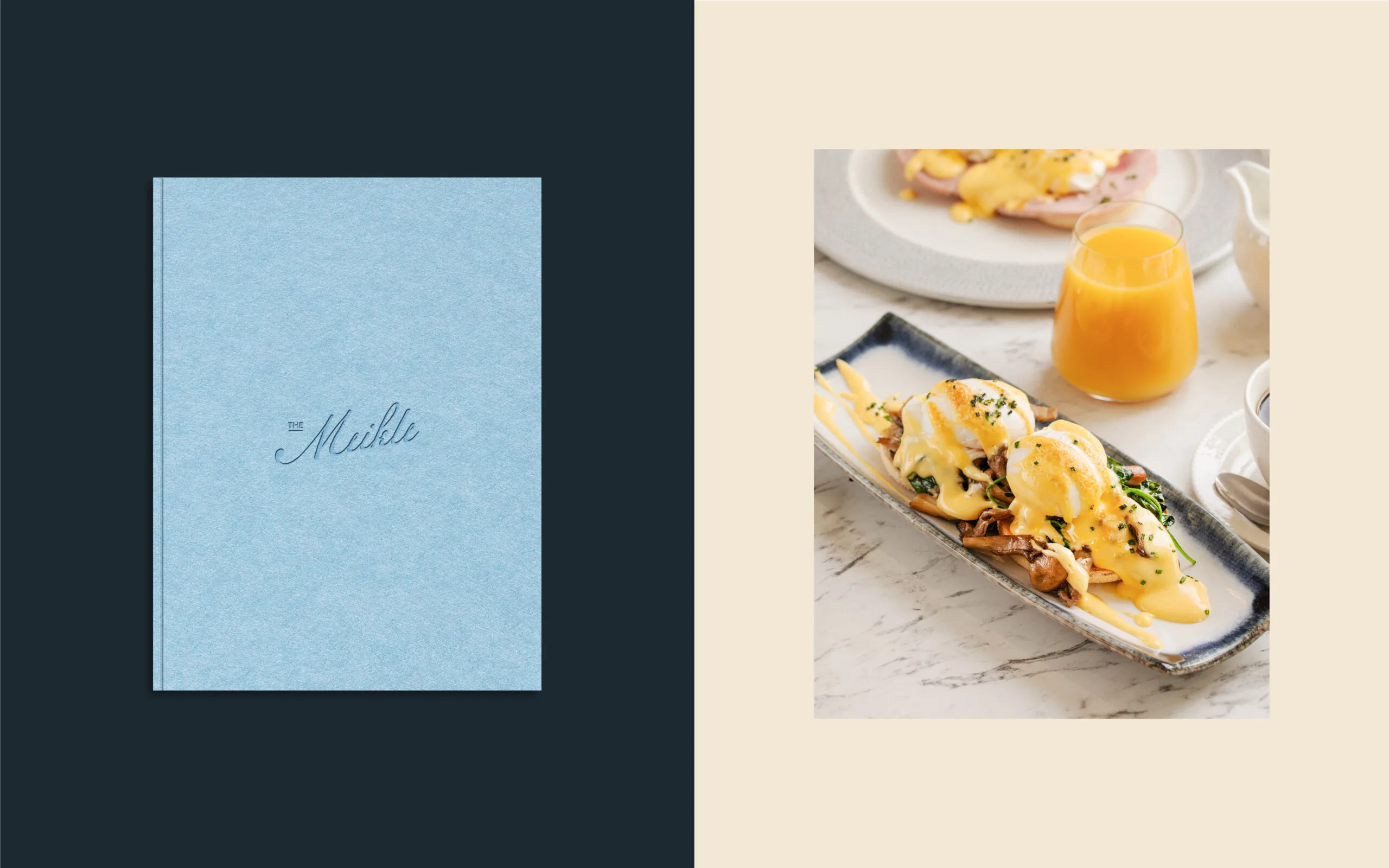
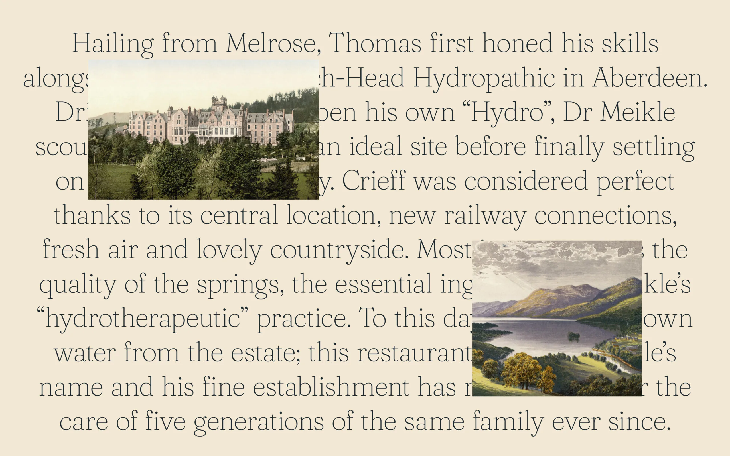
The Brand
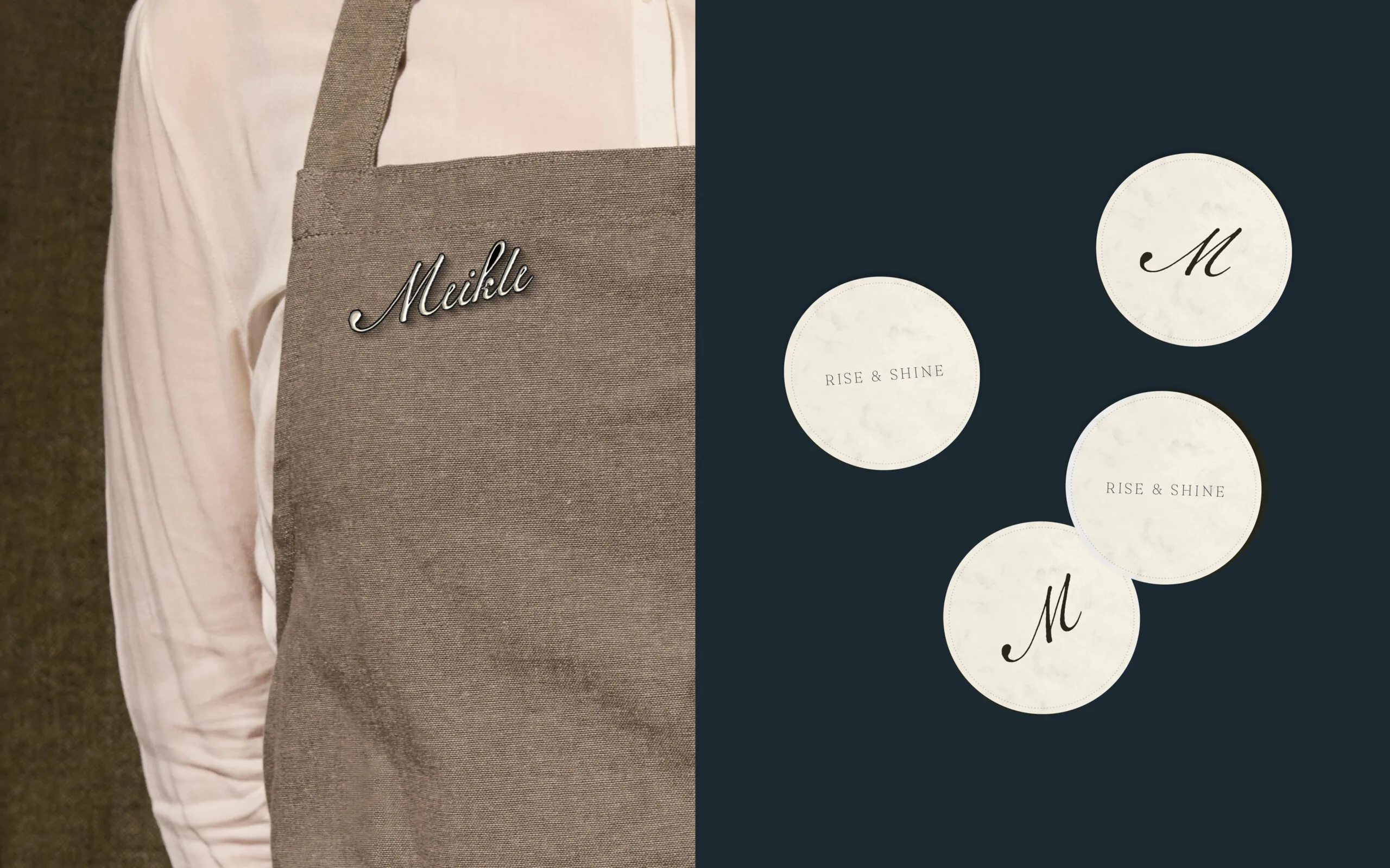
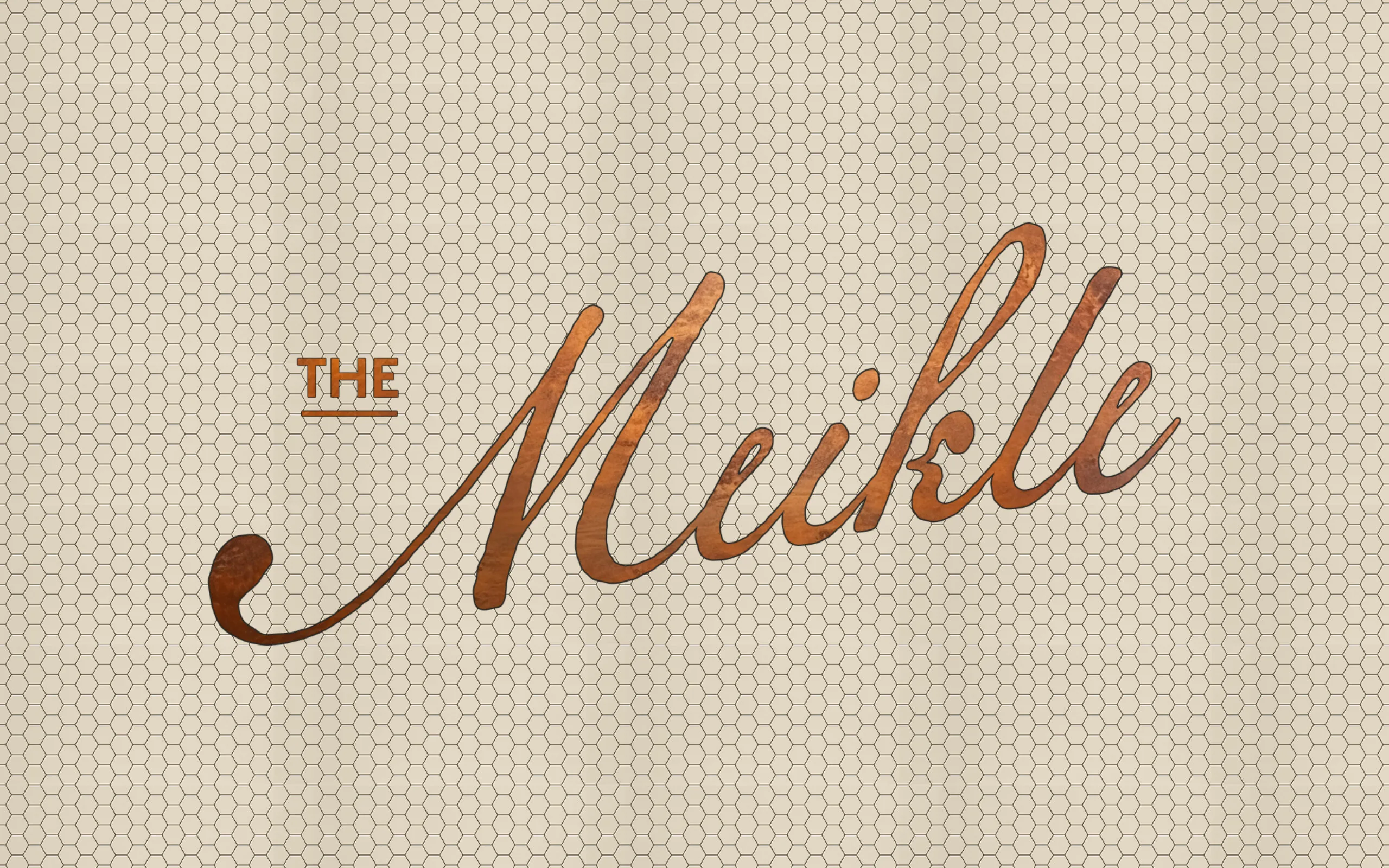
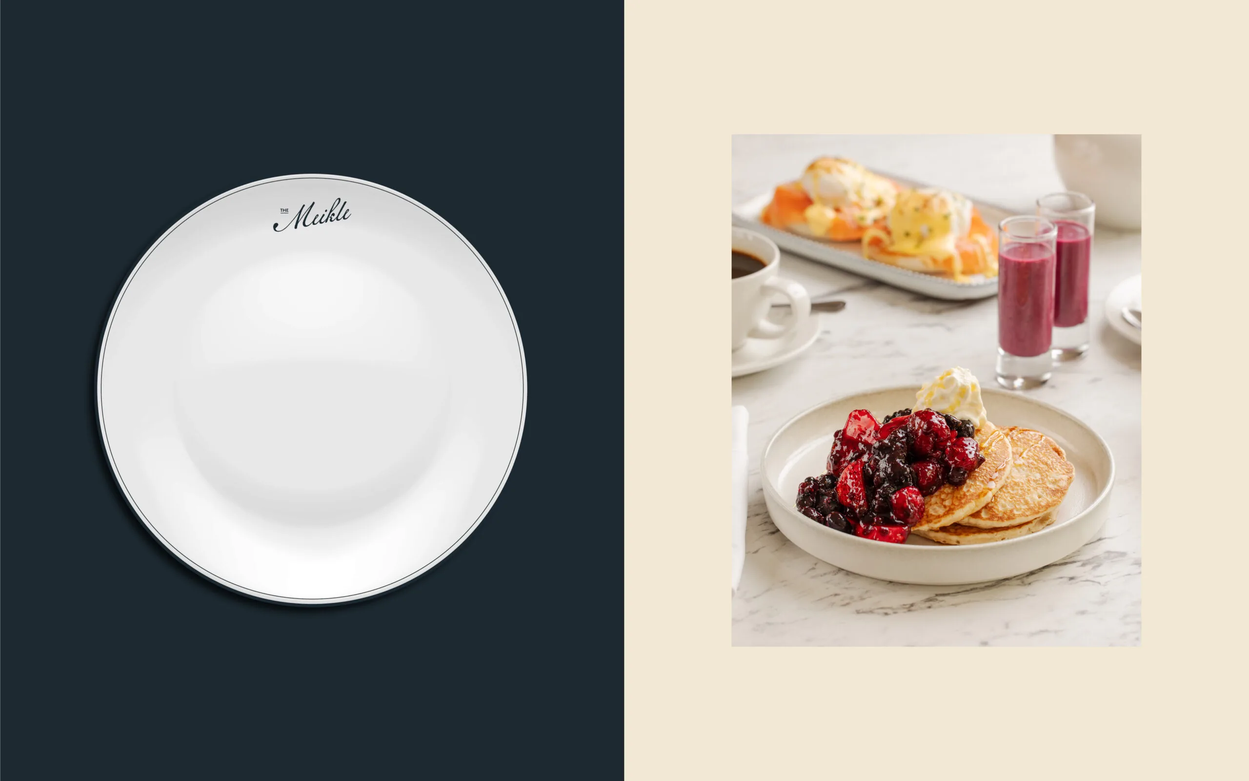
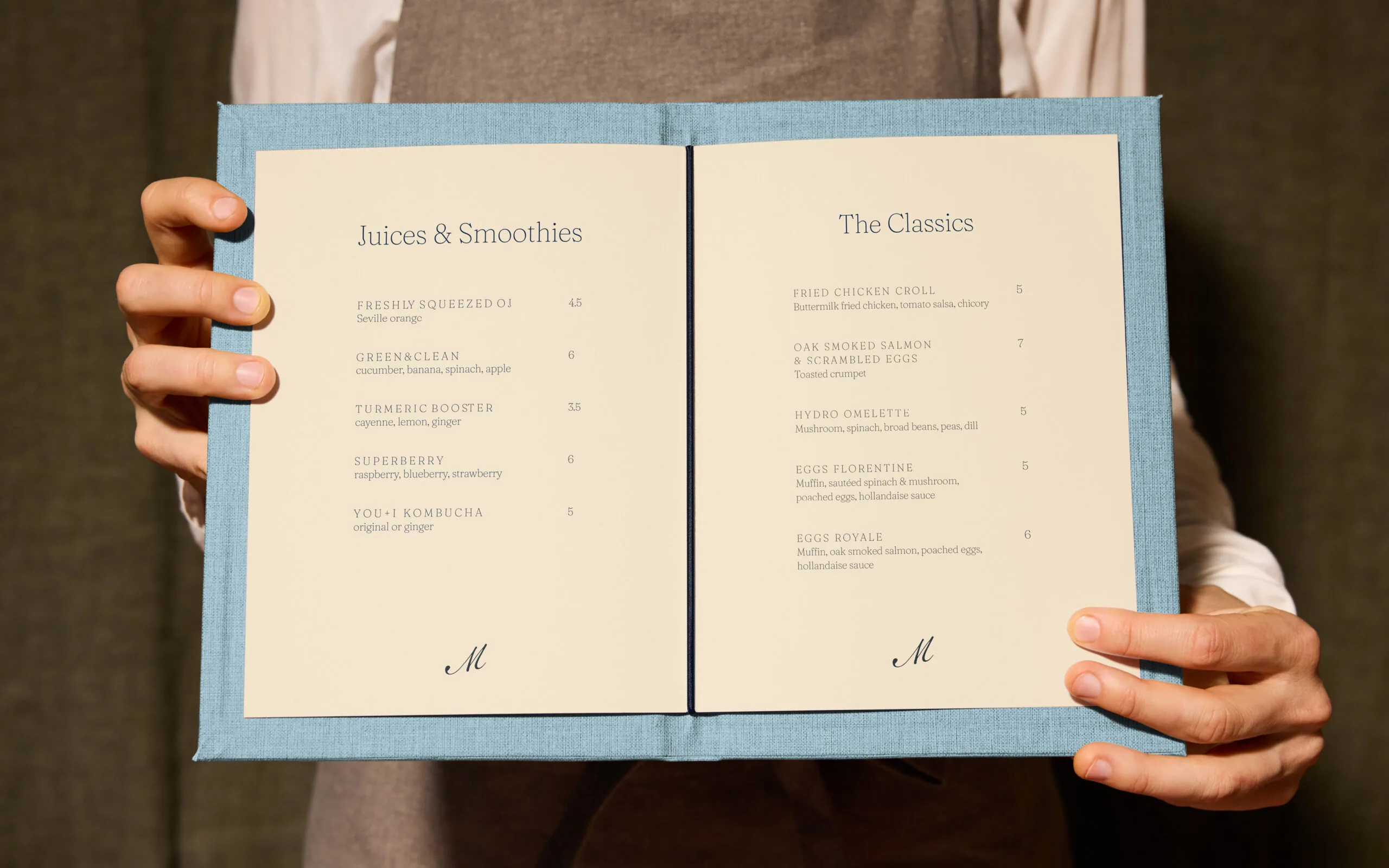
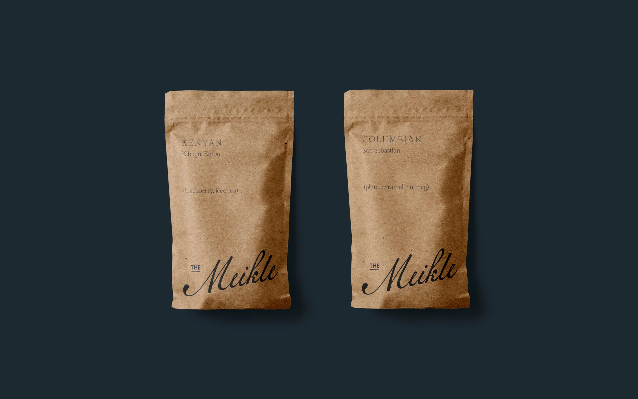
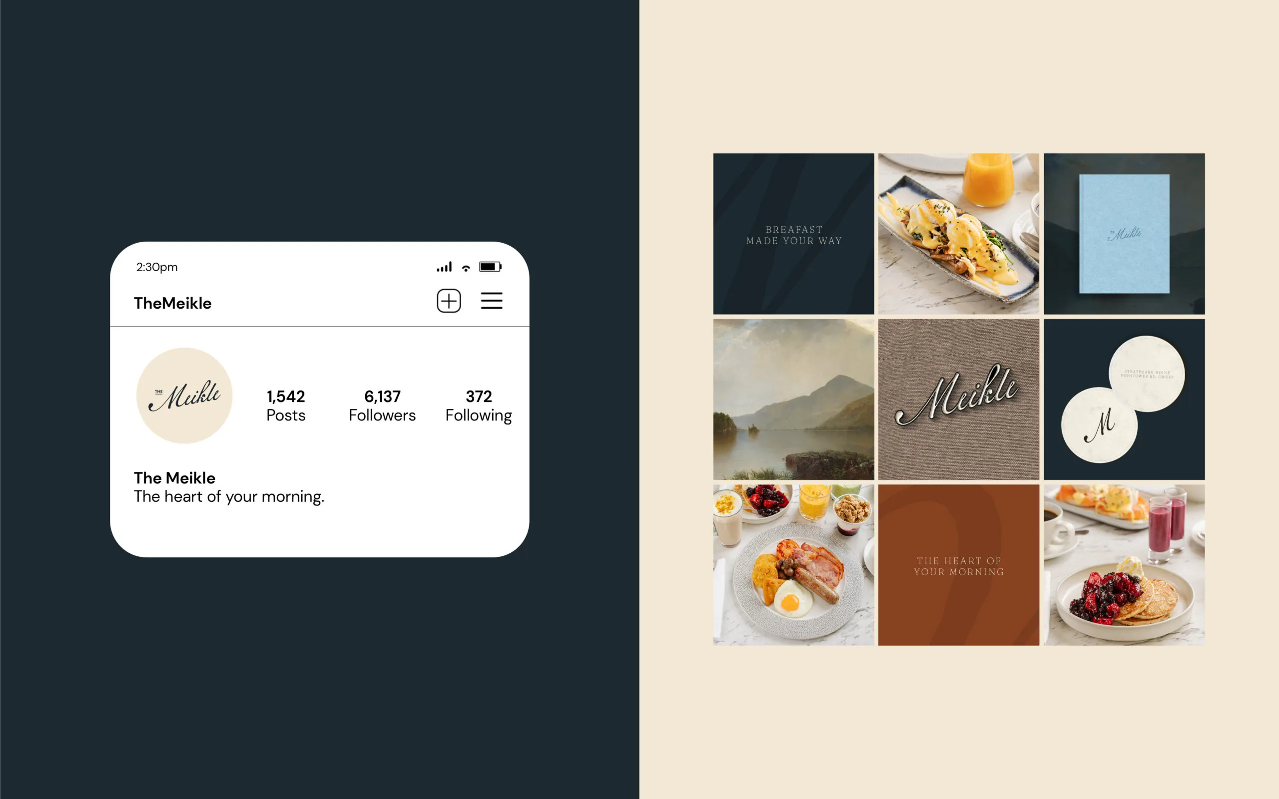
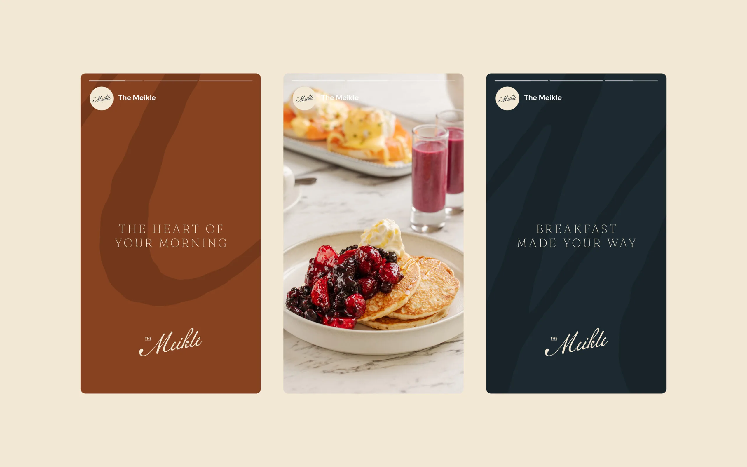
Working closely with the Crieff Hydro project team and their interior partners, we helped bring the vision for the new breakfast space, The Meikle, to life. The concept draws inspiration from a curated collection of historical materials, including Dr. Meikle’s original notes and a range of books and images from the hotel’s archive. The logotype echoes the character of Dr. Meikle’s signature, complemented by typefaces informed by his handwritten and typewritten documents. Our aim was to create a brand that captures a moment in time while presenting it through a contemporary lens, much like the hotel itself so effortlessly achieves.
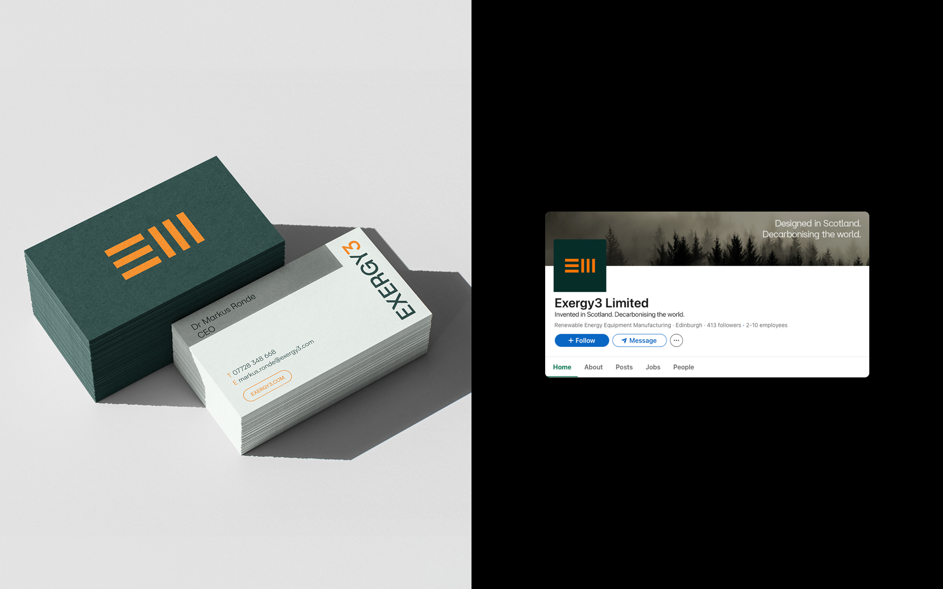
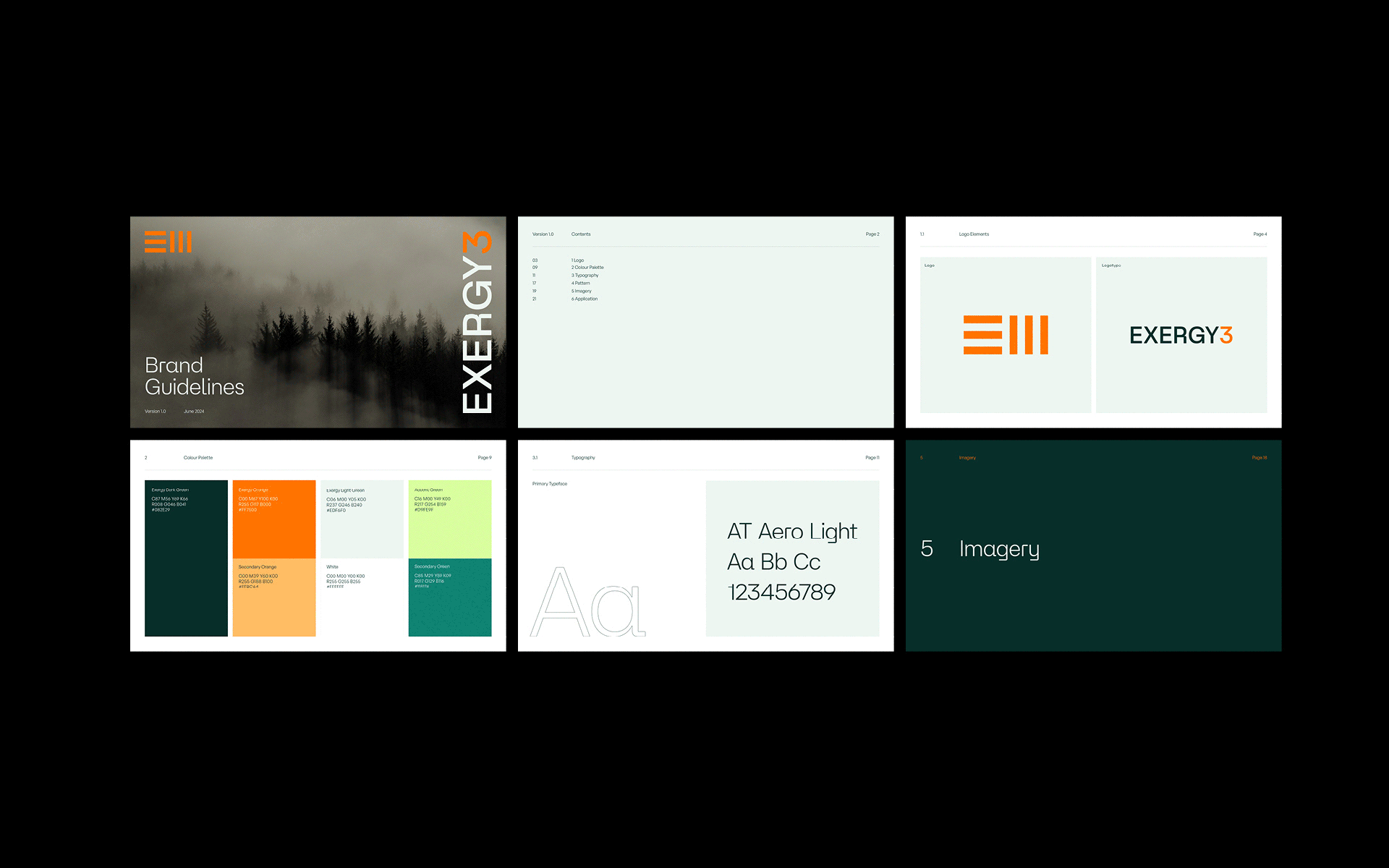
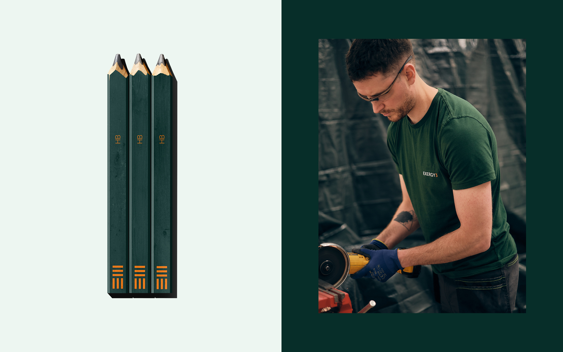
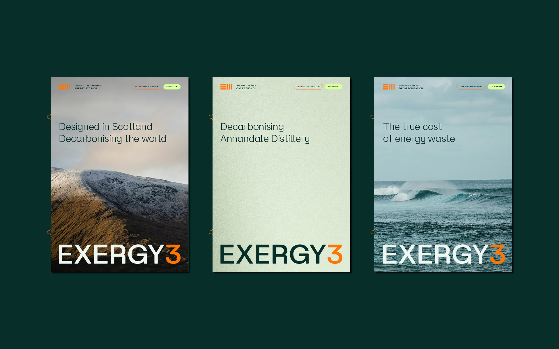
Brand positioning, development and new digital platform for thermal energy spin out Exergy3.


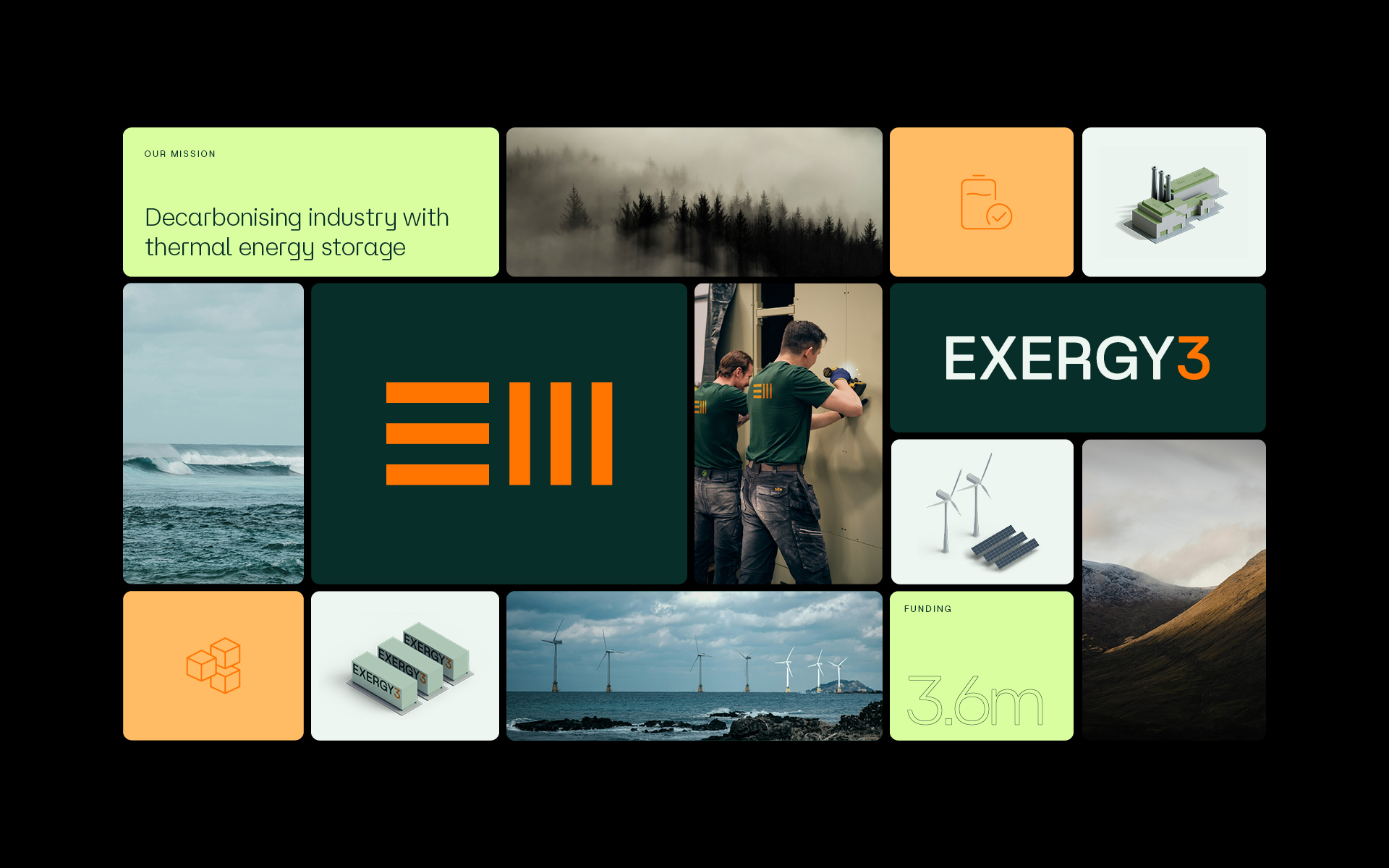
The Challenge
Exergy3 are a team of expert engineers, scientists and professionals committed to building a greener world. The Scottish spin out team from Edinburgh University have developed an industry changing thermal energy storage device which stores heat at temperatures up to 1200ºC with less than a 1% thermal loss per day. With their first major installation on the horizon, Exergy3 approached us to redevelop their existing brand and website as they prepare to take the sector by storm.
A new position
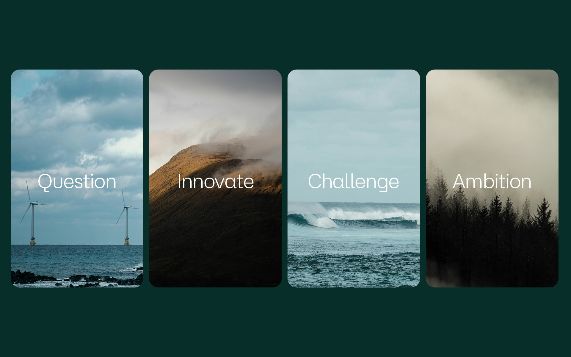
Through a series of collaborative workshops and discussions a new positioning for Exergy3 was developed. Inspired by industrial revolutionaries such as James Watt we focused our messaging on the impact of technology conceived in Scotland. To compliment the new language, a suite of scenic Scottish imagery was curated, along side workshop and on site photography and video.
We took the existing brand and brought it to life with a new logotype, supporting typography and an expanded colour palette more fitting of the business and sector. With their first major installation on the horizon, Exergy3 approached us to redevelop their existing brand and website as they prepare to take the sector by storm. Their new site is designed with the functionality to grow with the business as they complete future projects.


Rebrand and repositioning for Scotland’s largest independent laundry operator.


The Challenge
In a highly competitive industry, The Green Group aim to stand out from the crowd with their environmental credentials, innovative systems and strong business relationships. Through organic growth, the company’s workforce has expanded to over 100 employees, prompting a need to better reflect its established position and growing client base.


A Fresh Approach
Through a series of collaborative workshops and discussions, a new brand strategy was developed. The refined tone of voice and key messaging were crafted to highlight what truly sets The Green Group apart from its competitors. To support this, a comprehensive set of guidelines was created, helping staff apply the new tone of voice consistently across digital touch points and client interactions.


The Brand
A new brand was created to support the repositioning. Inspired by folded, stacked linen, the monogram aims to be a symbol of reliability and trust and reflect the long standing relationships built within the industry. In a sea of blues and whites, a contemporary green colour palette was chosen to help stand out from the crowd. Supporting photography and video was created to highlight the scale and innovation of the business.


We worked closely with the in-house team to deliver a new digital platform that truly reflects this historic Glasgow landmark. Not only is the house a cultural attraction and home to the popular Art Lover’s Café, but it also hosts regular art, design, and architecture-related events in its purpose-built studios and seminar rooms. It is also one of Glasgow’s finest wedding venues and event spaces.


The Solution
The new site brings the complete offering together into one streamlined experience for the first time. An optimised mobile journey now makes browsing what’s on, booking a table, or enquiring about hosting an event easier than ever across any device.
Archival drawings and writings by Mackintosh were thoughtfully curated throughout the site design, reinforcing the brand’s positioning as an ever-evolving space where history and imagination converge.
A new suite of photography and video assets were developed to bring the refreshed brand tone and positioning to life. Designed with longevity in mind, this content can be managed internally, equipping the team to create rich, ever-evolving digital experiences.


Outcome
Since the launch in February the new site has achieved: User Engagement: Up 143% Pages Views – Up 104% Conversions – Up 80% Sales – Up 25%.
“Working with Shine on our new website has been a fantastic experience from start to finish. They took the time to really understand what makes House for an Art Lover special and brought it to life online with a modern, engaging design that still feels true to our roots. They struck the perfect balance between celebrating Charles Rennie Mackintosh and our artistic heritage and delivering something with real commercial impact. The team were fantastic to work with – creative, collaborative and incredibly organised.”
“They listened carefully, offered great ideas and kept the project moving forward at every stage. We’re absolutely delighted with the finished product and have had brilliant feedback from our visitors and clients already. It was a real pleasure partnering with Shine and we wouldn’t hesitate to recommend them.”
Kate Kaczor – Sales & Events Manager


Photography by Otago Street
Brand refresh, positioning and new website for established family run funeral service.

The Challenge
Since 1985, Little’s has provided a personal and caring family funeral service in Glasgow and the surrounding areas.
Over the years, the brand had become inconsistent and challenging to apply, with multiple logo variations and issues with legibility and tone of voice that required alignment.
With the new digital presence in mind, it was time to re-evaluate how Little’s presented itself and communicated with clients.


Approach
A new logotype was created, inspired by the heritage typography of the brands first logo. This update addressed legibility issues and introduced a modern aesthetic, while retaining a sense of familiarity with the original brand. A supporting monogram was created based on hand writing from the original founders. This personal touch reflects the highly personal and compassionate service provided by their funeral directors.
‘Trust us to take care of your family’ became the foundation of the new brand positioning. This language was developed around the core values of family and trust, with particular care taken to highlight that family members are taken ‘into care’ and will reassuringly be looked after.
Soft, hand-drawn illustrations and a new photography suite were introduced to complement the messaging, helping to communicate in a compassionate and respectful way.


New Digital Presence
Little’s new website focuses on simple messaging and ease of navigation for visitors. With subtle yet clear calls-to-action, it was important to inform users that Little’s is available to discuss requirements 24 hours a day, 7 days a week.
The website also serves as a platform to convey that Little’s is a family business with years of experience, introducing the team in a warm and approachable way.
Illustrations by Mireille St-Pierre
Photography by Otago.


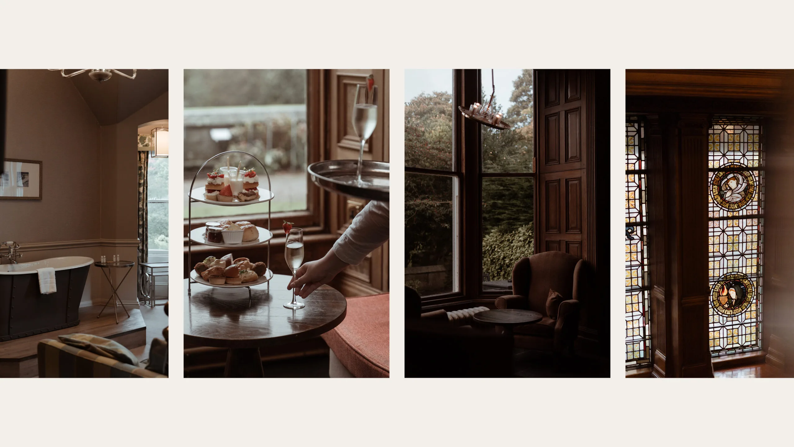
Brand identity, content creation, and website for historic luxury castle on the outskirts of Edinburgh. As Scotland’s oldest inhabited castle, Dalhousie has been hosting royalty, celebrated poets, and distinguished guests since the 13th century.


The Challenge
The goal of the project was to differentiate Dalhousie Castle from its local competitors, while also increasing awareness among a new international market of high-end clientele. A key part of this involved building a stronger social presence to drive engagement and improving the online journey to enhance bookings.


Repositioning & Identity
Capturing a sense of place and history was essential in crafting the new identity for Dalhousie Castle. The brand emphasises the castle’s timeless tradition of warm hospitality, aiming to provide customers with an authentic castle experience.
Inspiration for the logotype and supporting monogram was drawn from architectural details within the castle, along with nods to the original Ramsay family crest. These elements were crafted to reflect the castles history, while still appealing to a modern audience.


Content Creation & Website
A new suite of photography was commissioned to highlight the castle’s unique atmosphere and support the relaunch of its website, social channels, and digital marketing.
The website aimed to create an intuitive and immersive experience, balancing modern aesthetics with a practical user journey.


Brand identity and repositioning of a 19th-century baronial mansion turned hotel & spa based in Aberdeen.


The Challenge
After recently deflagging the property from a large hotel chain and tackling various post COVID issues, Ardoe needed a fresh start. The new owner’s wanted to relaunch the hotel to the local market in Aberdeen and attract a more diverse mix of domestic and international visitors.


Repositioning
With the aim to restore the hotel’s historic reputation we focused on Ardoe’s unique selling points and confirming their target audience. The hotel has a history deep rooted in creating lasting memories. From royal visits to local weddings, over time these moments become part of the clients and the hotels story and this sentiment is at the core of the new brand positioning.


A new identity
We drew inspiration from the property’s many unique features, from the colour palette to typography the brand reflects Ardoe’s historic past now presented in a modern way. The new brand reclaims the hotel’s identity and sets the foundation for its future. A set of comprehensive guidelines were created for the hotel’s internal team to assist with the role out of the brand touchpoints.
A new suite of photography was commissioned to capture the estate and support the relaunch of the new website, social channels and digital marketing goals.
Photography by Otago.


Brand refresh and digital platform for well-respected property surveyors. DM Hall has over 120 qualified surveyors, specialising in the full spectrum of residential and commercial services, including property for sale and lease.
While beginning our web process, it was clear from early meetings with the team that this was also the perfect opportunity to refresh the visual identity and brand positioning of the business to better align with DM Hall’s nationwide reputation.
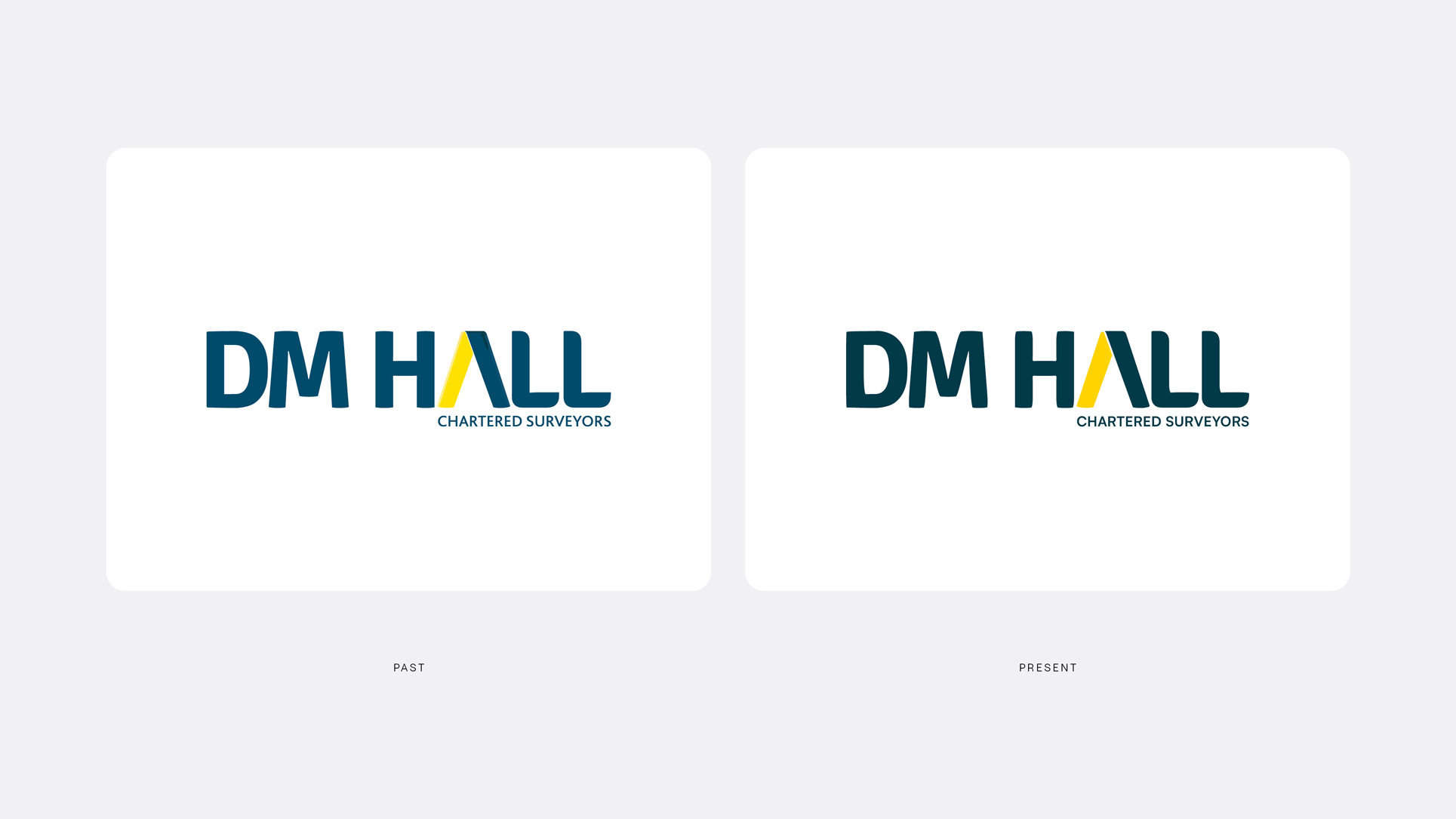
Brand Refresh
Over the course of the last 6 months, we have worked closely with the team at DM Hall to refine the brand and introduce a contemporary visual style with the new website in mind.
An easy-to-use brand guidelines document was produced to bring consistency to marketing touch points across the business, something that had been an issue for several years.
As part of the process, we commissioned a new direction for corporate photography and video that aimed to bring a human element to the brand and showcase their expertise and key business services.


New Digital Platform
The current DM Hall site had become dated and difficult to update for users. We began by looking at the content level required on the site, using this to guide our decisions on the user journey. One of the key aspects of the project was redefining this user experience with clear navigation through the site for both customers and professionals working in the property industry.
With a high level of mobile users, this journey had to be smooth across multiple devices. Clear calls to action, stronger copy and better visibility of key services play a major role in the success of the new site.
However, it is the enhanced back-end user experience, custom built for the DM Hall team that sets the site apart. Users are now able to easily update content and create dynamic property pages that are automatically pushed to external partner websites.


“From the start, the team at Shine impressed us with their understanding of the brief. They didn’t just create a stunning website and brand refresh; they crafted a much-improved customer journey, based on their broad range of experience, mostly out-with our sector. By replacing unnecessary details with a crisp look, and clear calls to action, Shine have transformed our online presence and we’re already seeing an early uplift in enquiries and significant instructions. Their expertise, combined with a friendly approach, has made the entire process a very rewarding collaboration.”
Caroline Wayte
Marketing Manager, DM Hall