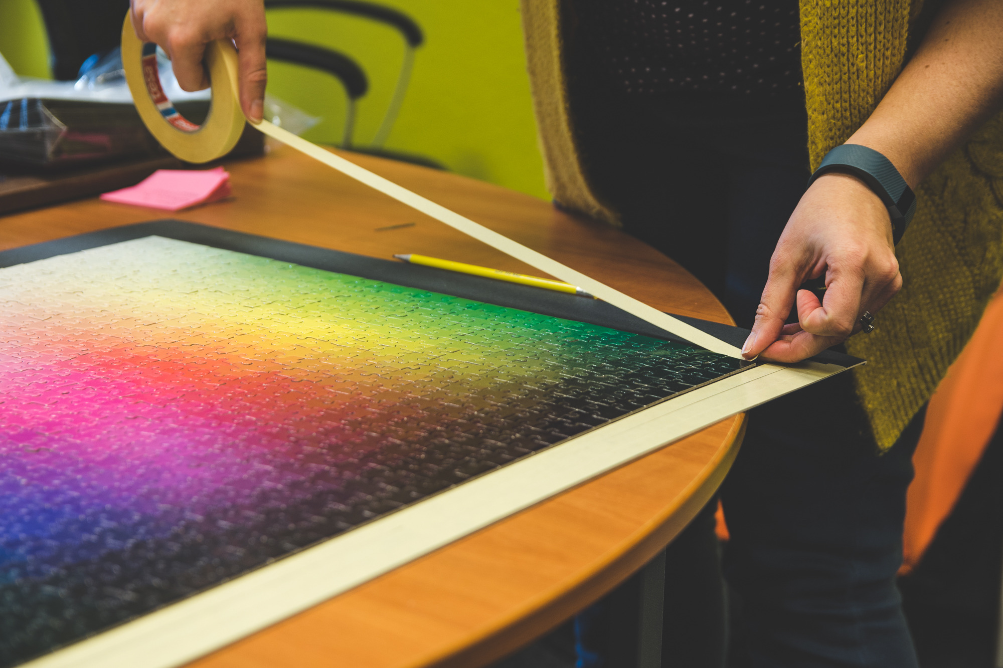
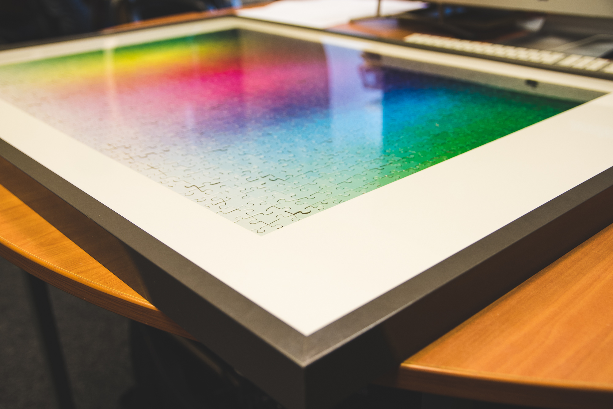
Remember the “1000-piece impossible colour jigsaw“? Well, we wanted to put it to good use and decided to frame it above the TV in the studio. We couldn’t break it up after all that hard work!
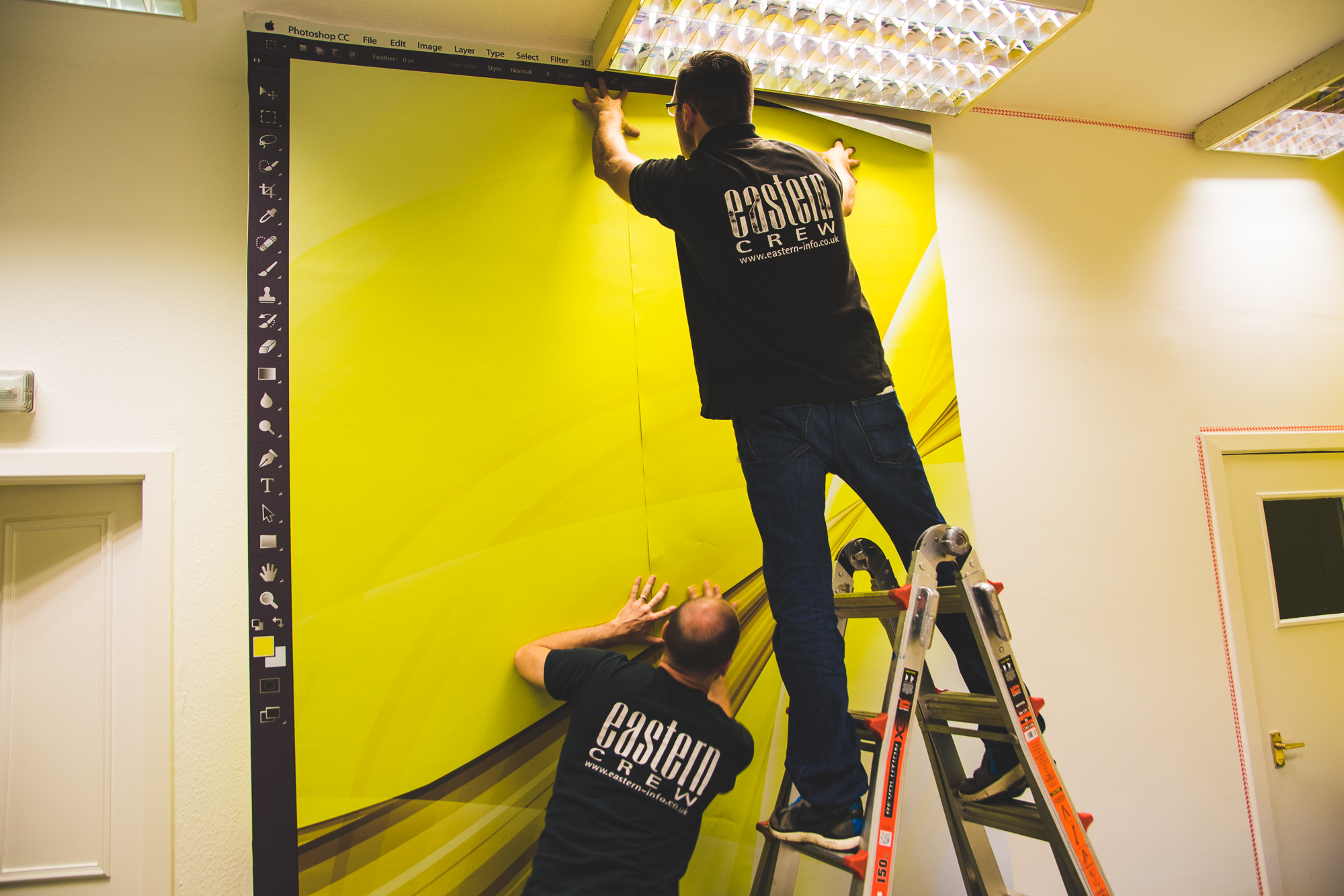
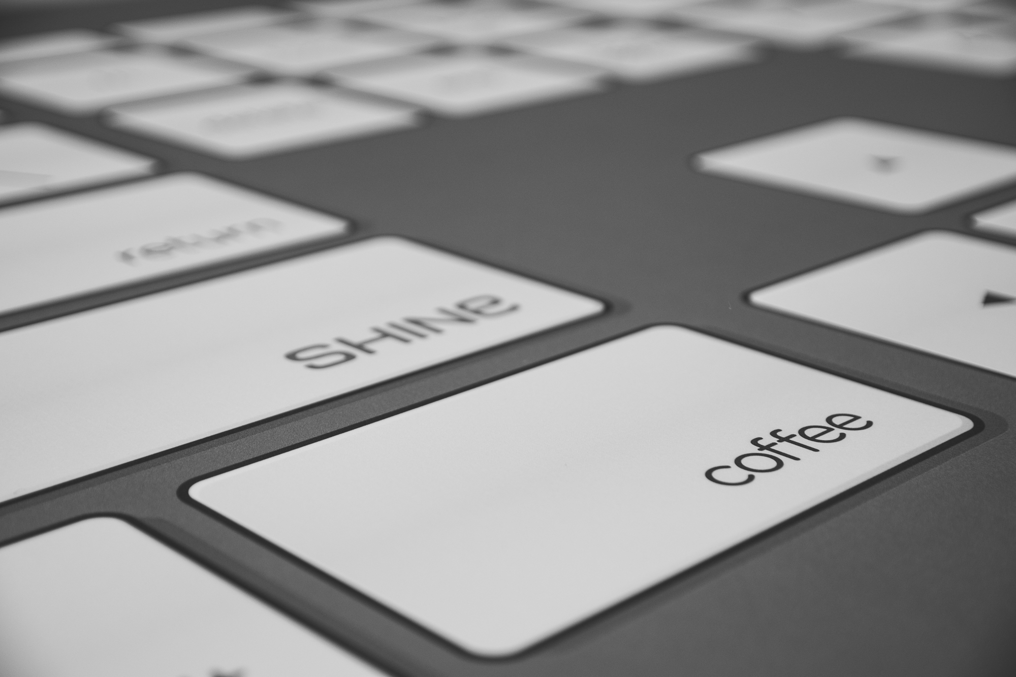
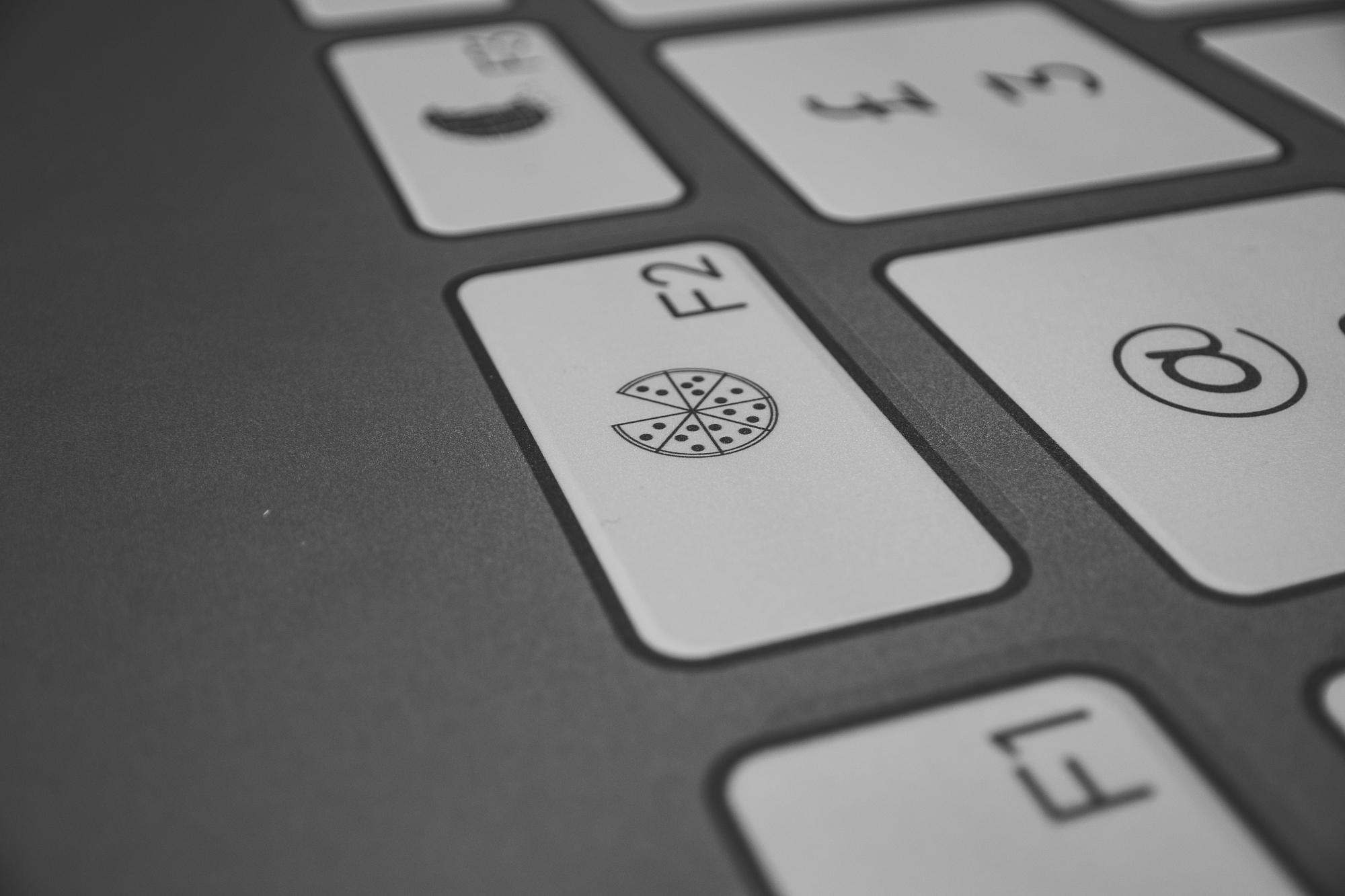
In Craig’s office, where we have all the “big people” meetings, Martyn came up with this rather clever idea to turn the room into a giant computer. We now have digital wallpaper in the form of a Photoshop desktop, and a keyboard themed table. All we need now is an oversized yellow mouse!
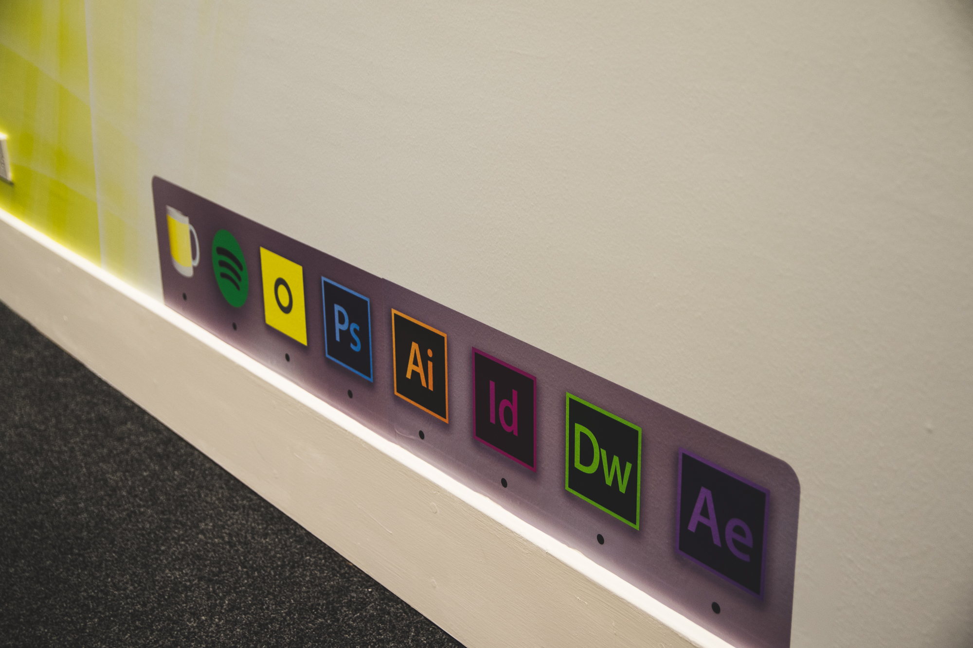

So far, the table has gone down really well with clients. There have been tweets, there have been comments and there has been a mutual understanding by all, for how wonderful this table is. There are a few jokes hidden in the keyboard, so you will need to pop in to see it face-to-face and spot them all.
(Added incentive: we always have biscuits and good coffee!! … We also design stuff…)
Finally, we also gave the entrance to the SHINE plaza a bit of a spruce up. There has never been enough yellow before, but now you can be in no doubt that you are in the right place.

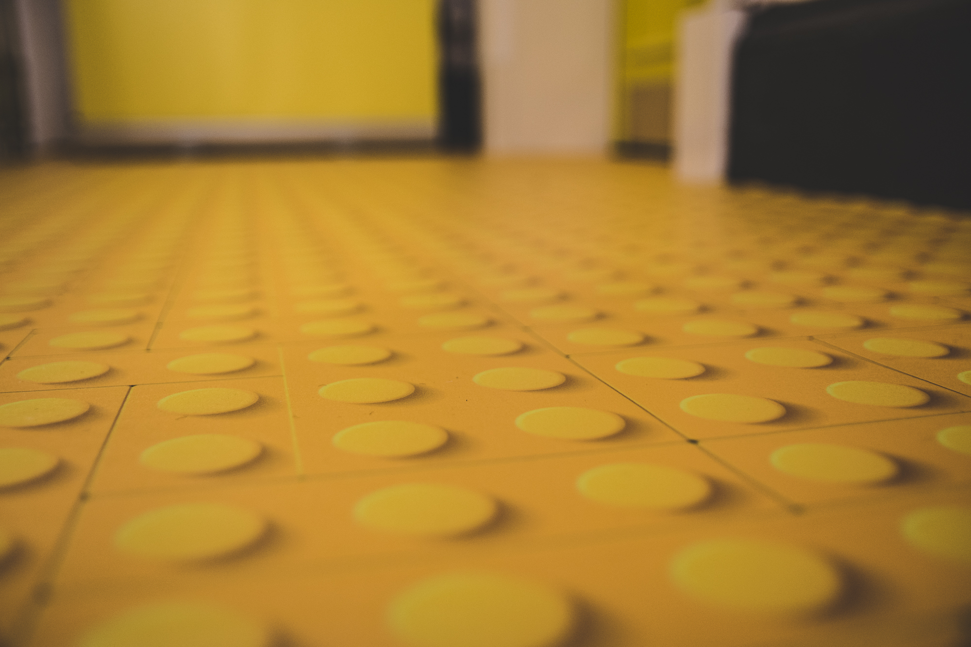
Our yellow lego road is going to come in very handy when we have visitors. Before, we would just say “we’re on the top floor”, but now we will just say, “Follow the yellow brick road…”
Thanks to the guys at Eastern for doing such a great job! ]]>
The Torridon are one of our major clients and we have been working together for some years now. We have worked on their branding, website, marketing materials and other design-related activities.
So when they decided they wanted a branded whisky bottle, we were keen to get involved and start designing.
The design brief was two-fold; we wanted to incorporate the branding of The Torridon as well as making it look like a whisky brand. To do this, we had to bring in two different styles that worked together and carry out research into what is expected from a whisky brand.
We came up with three quite different concepts ranging from the more traditional designs to slightly more contemporary.
It was also important to keep the end user in mind and create a design that would appeal to The Torridon’s customers. So once we had decided on the final three ideas, we put it to them to see which they liked best. We ran a competition on social media and asked the audience to vote on their favourite design.

This is quite a simple design. No frills. A slightly more traditional idea, this label showcases the ingredients of the product and looks very clean and simple.
Here’s what people had to say…
“This is the ‘softest’ looking label and the one I like the most”
“Sleek, in a simple clean way.”
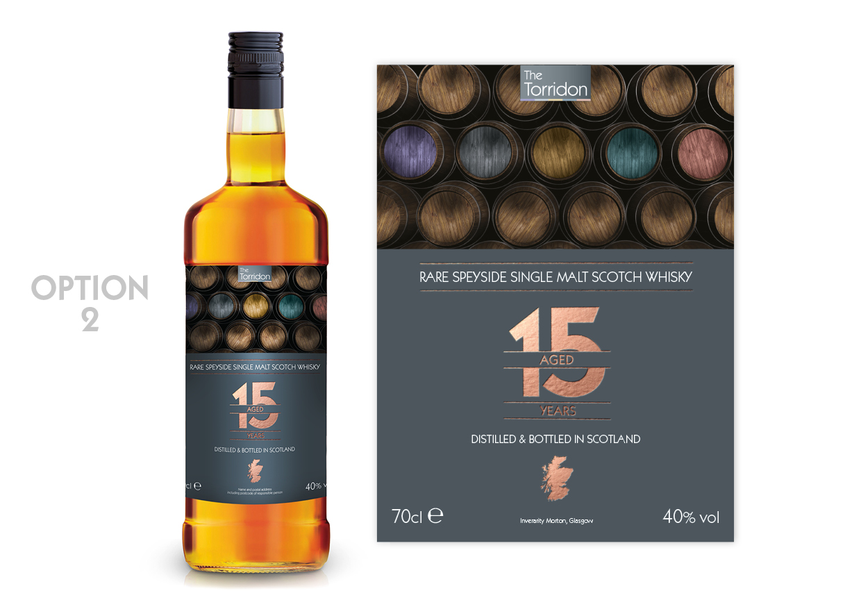
This design has more of a modern twist to a traditional whisky bottle. Using a copper foil, we wanted to ‘class it up’. We added subtle colour and grey tones, to create that contemporary look and fell.
Here’s what people had to say…
“It’s different!”
“Clear and modern!”
“It’s unique!”
“I like Option 2…. Colourful barrels!
“Nice, rustic yet modern…”
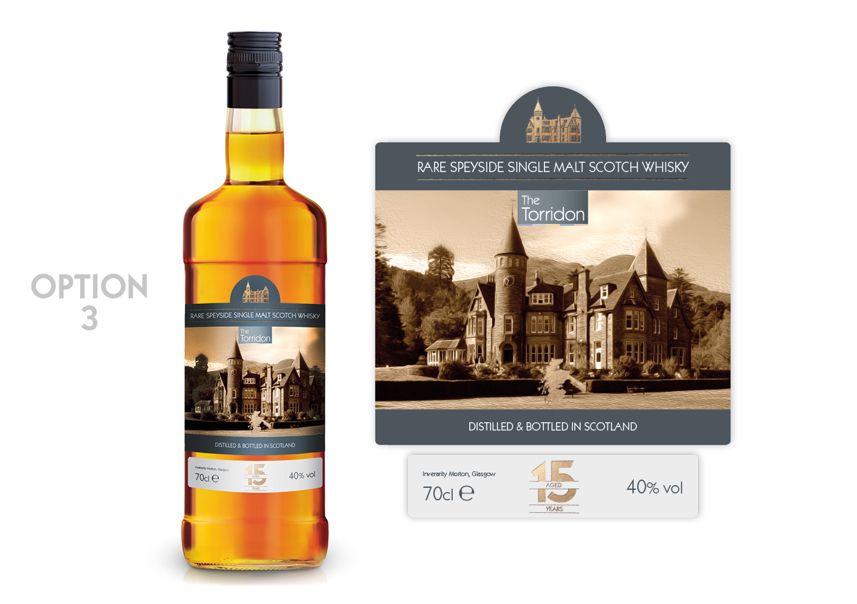
As this is an own-brand whisky, it made sense to do a design with the hotel in the forefront of the design. It doesn’t get much more ‘Torridon-y’ than this. This particular concept was inspired from other whisky brands, using sectioned labels in the packaging.
Here’s what people had to say…
“This one captures your venue in a classy way”
“I love Option 3! The hotel is majestic and truly one of a kind!”
“Love Option 3 because I love castles”
“Classy and timeless and ageless”
And just to throw another one into the mix, one voter said, “Is there one with Rohaise on it?? That would surely get everyone’s vote.” (Rohaise is one of the owners of The Torridon)
However, despite that excellent suggestion, we had to pick a winner from these three options.
And the winner was ……… Option 2!
Taking into account the contemporary look, this design incorporates the sophisticated branding of The Torridon and is a clear winner.
So, we put it to The Torridon customers to find out which design they preferred, now it’s your turn. Which is your favourite design?
Colours are a very visual way of getting people’s attention. Whether it’s bright yellow or dark red, different colours create different reactions from people. The concept of colour psychology spans from this idea; that people feel certain emotions when viewing a particular colour. Colour psychology can be used in all sorts of ways, including personal use such as interior design, but it can also be used in branding (for a really great example of this, just look at SHINE!!)
Red can represent danger or excitement and is often used to get your attention with it’s bold personality. In contrast, green has a calming and peaceful effect, perhaps because it is associated with nature and the environment.
So, what about yellow? If we were to ask you to think of things that are yellow, what would you say?
The sun? Daffodils? Springtime, bananas, lemons, post-it notes? Something a bit more fun like minions or even SHINE? (obviously because of our See Yellow, Think SHINE campaign) When you see these things, how do you feel and what do you associate it with?
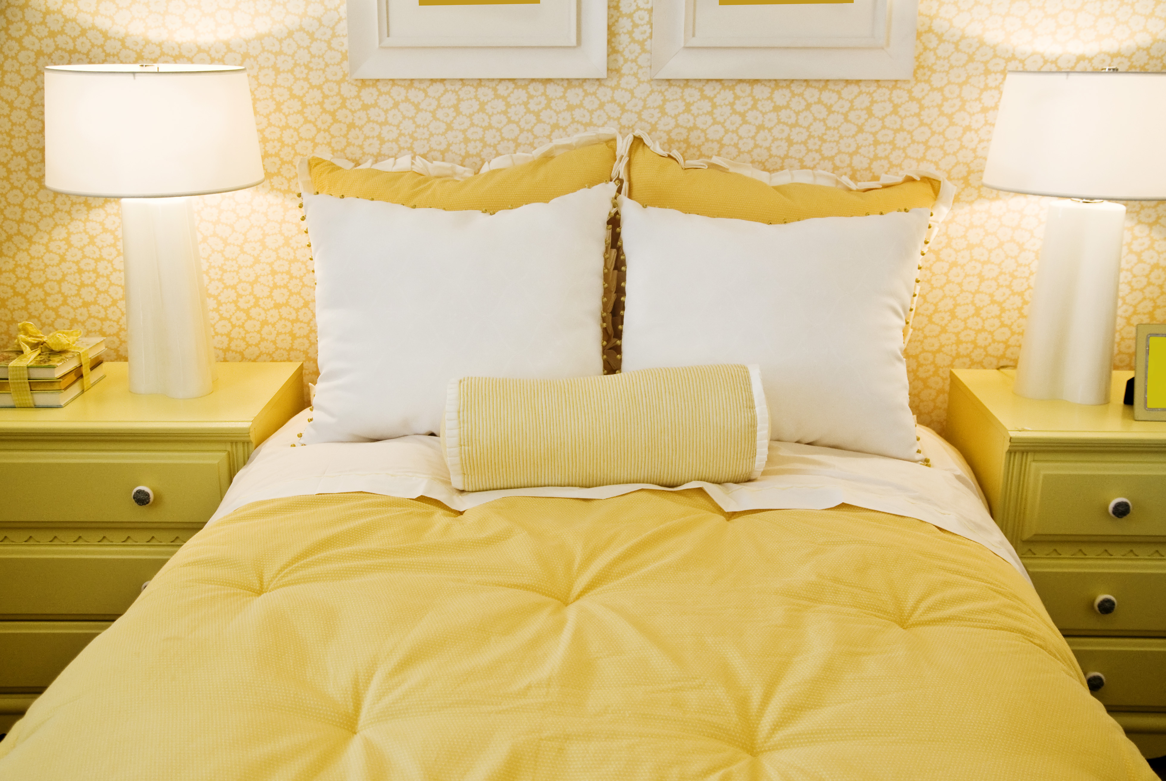
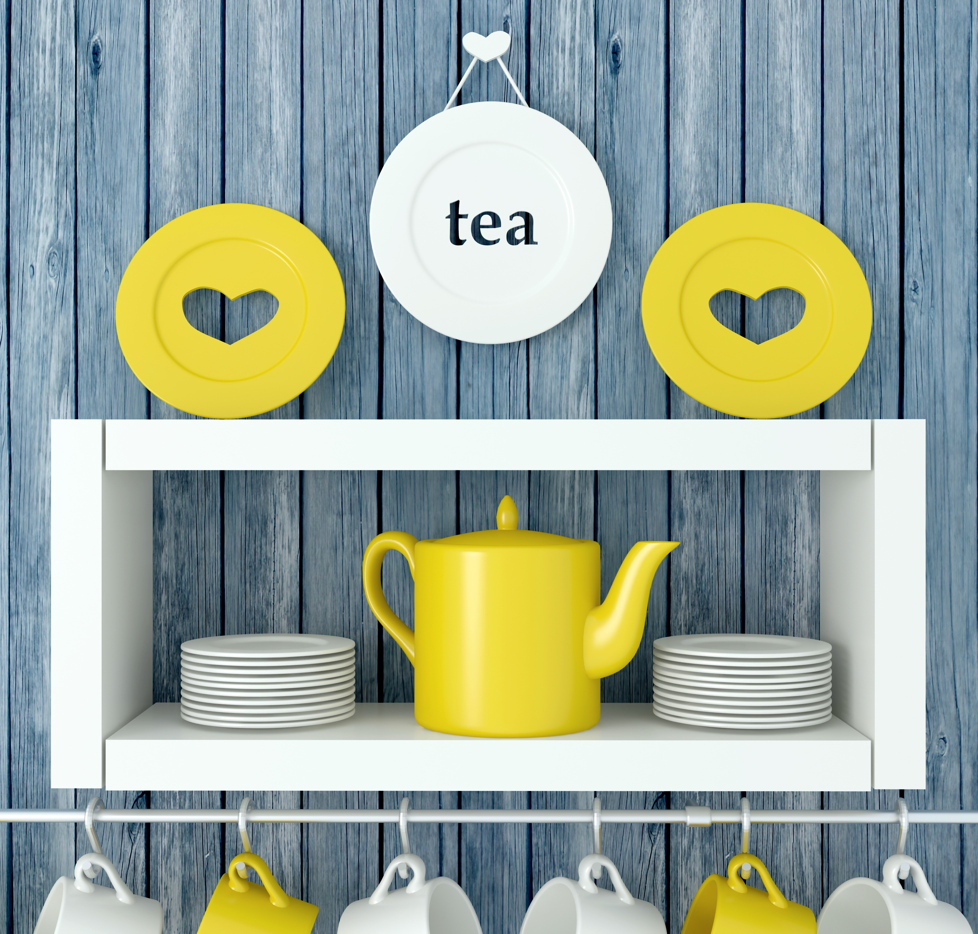
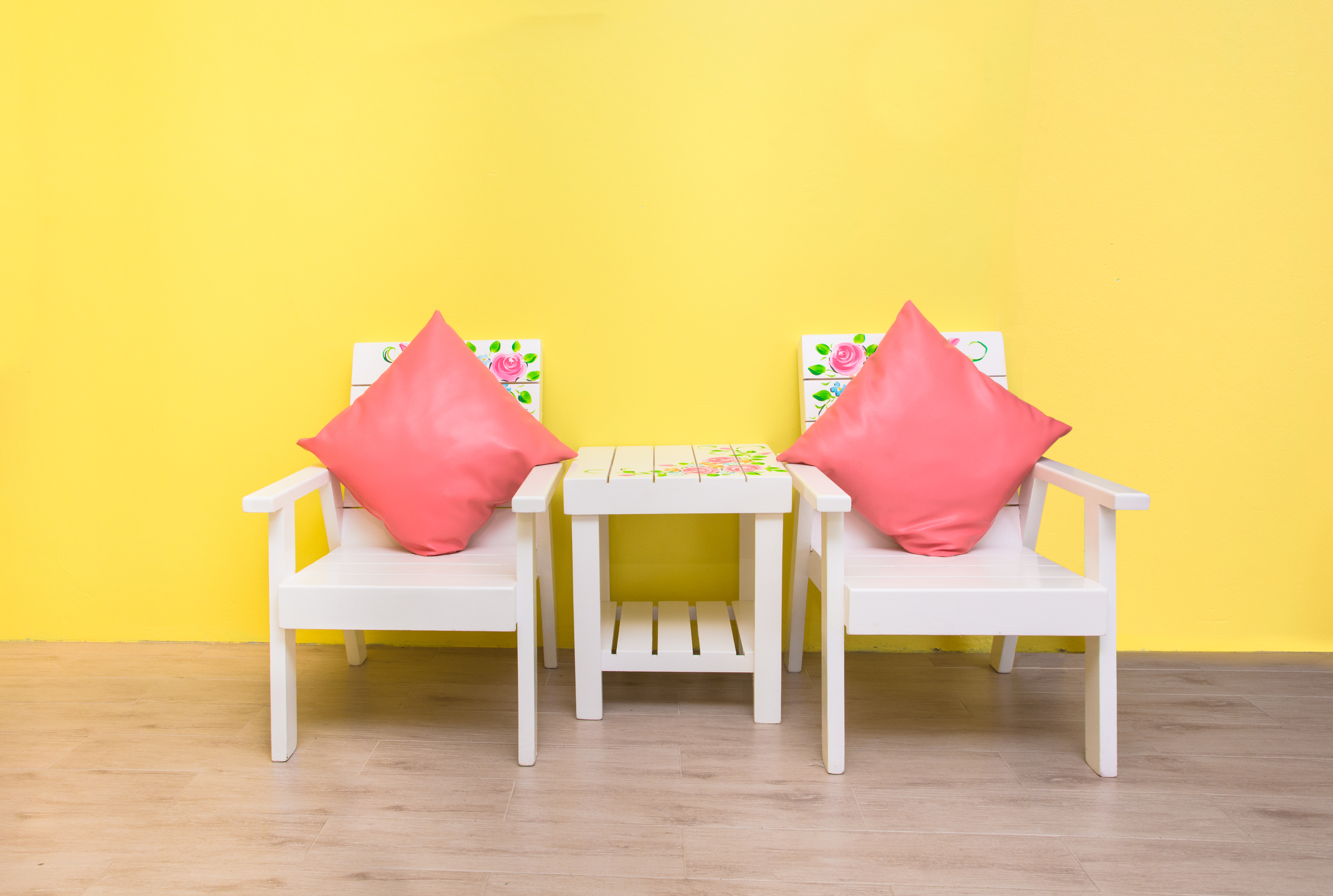
Lots of people think of spring or summer. Yellow is considered to be one of the happiest colours. It’s warm. It’s cheery. It gives people confidence in you. It represents wisdom, knowledge, energy, creativity and optimism. Of course, these are all reasons why SHINE is all about yellow – we are a happy, cheery design agency!
One of the wonderful things about yellow is that it stands out and attracts the most attention out of any other colours. This is why it is used for signage, as it can be spotted and interpreted from a distance (read more about the design strategy of signage here).
Of course there are many many positive things about yellow. But maybe we should provide a balanced view and present some of the negatives too… (not that there are many)
Some research has shown a yellow room can have a stimulating effect on the brain and therefore is good for studying… while other research suggests people in a yellow room are more likely to lose their tempers (maybe people are losing their tempers because they are studying…)
Have you heard of the phrase a ‘yellow house’? It used to be said when referring to a mad place (apparently, mental asylums used to be painted yellow and so the phrase stuck). So, some say yellow is the colour of madness. Of course we completely disagree with that; we’re all perfectly normal…
]]>