The Gannochy trust is a Scottish charity with a preference for projects in Perth and Kinross. The trust was founded in 1937 by influential Perth business man Arthur Kinmond Bell, known as A. K. Bell
The Trust funds many activities in Scotland, with a preference for Perth and Kinross, through awarding grants to what it feels are worthwhile causes. It has four over-arching themes with grant applications expected to meet at least one of the following aims, although the third and fourth will only be accepted for projects within Perth and Kinross:
- Inspiring young people
- Improving the quality of life for disadvantaged and vulnerable people
- Supporting and developing amenities for communities
- Caring for the natural and man made environments
The Gannochy trust particularly provides many grants for the improvement of sports provision and participation.
“After a lengthy evaluation process, we are delighted to appoint Shine to redevelop our website. Craig and his team took the time to understand us an organisation and have clearly set out their approach for modernising the site and improving the user experience. We very much look forward to working with Shine over the coming months.”
– Carol Downie, Chief Executive, The Gannochy Trust
We are really looking forward to what this year brings with Gannochy Trust .
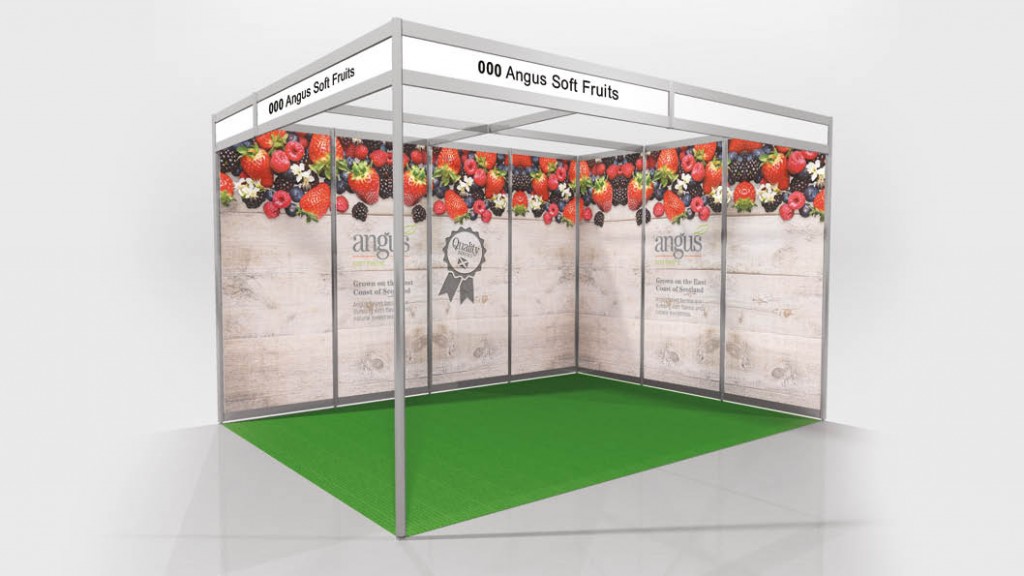
]]>One of our clients, Angus Soft Fruits, attend every year and asked us to design their exhibition stand for them.
The brief was to ensure it looked fresh and eye-catching, with a really natural and almost ‘farmy’ look to it. One of our key inspirations came from a wooden crate of strawberries, which definetly ticked all of these boxes.
We got to work with some creative ideas and came back to them with 4 different concepts for them to choose from. The decided favourite was the ‘wooden crate’ concept, inspired from the image above. It met with the brief of being, fresh and eye-catching – really helping to showcase the products.
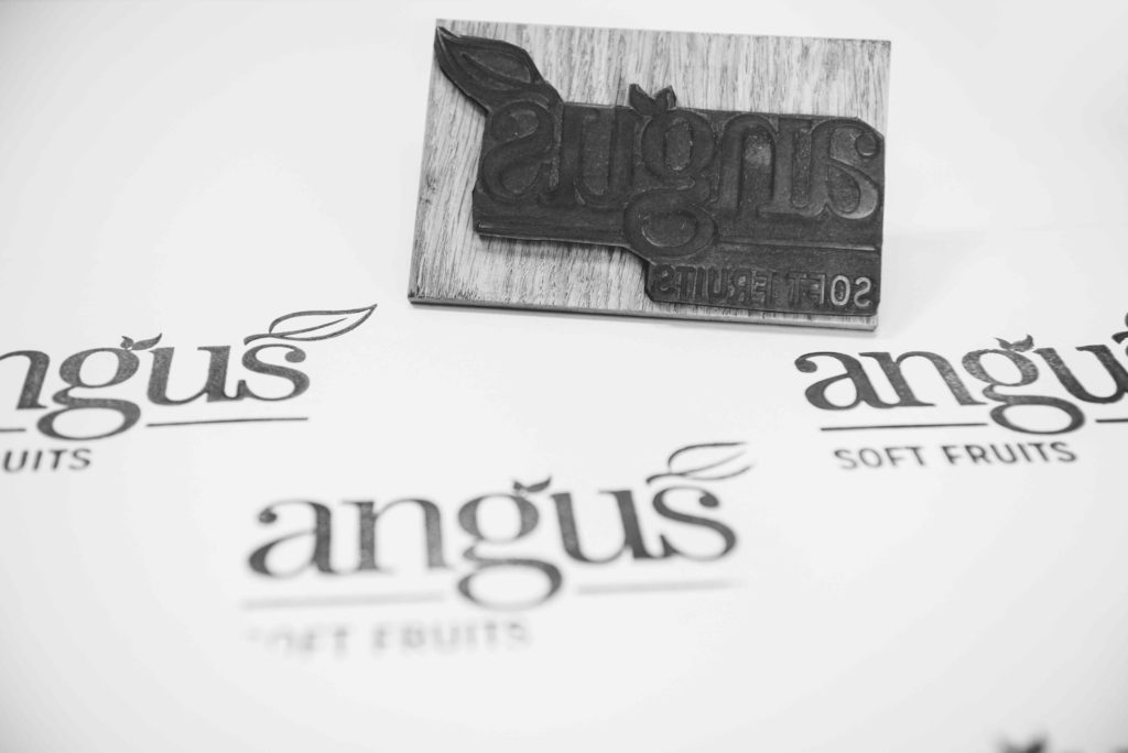
We also organised a bespoke branded stamp, allowing Angus Soft Fruits to mark their logo on paper bags.
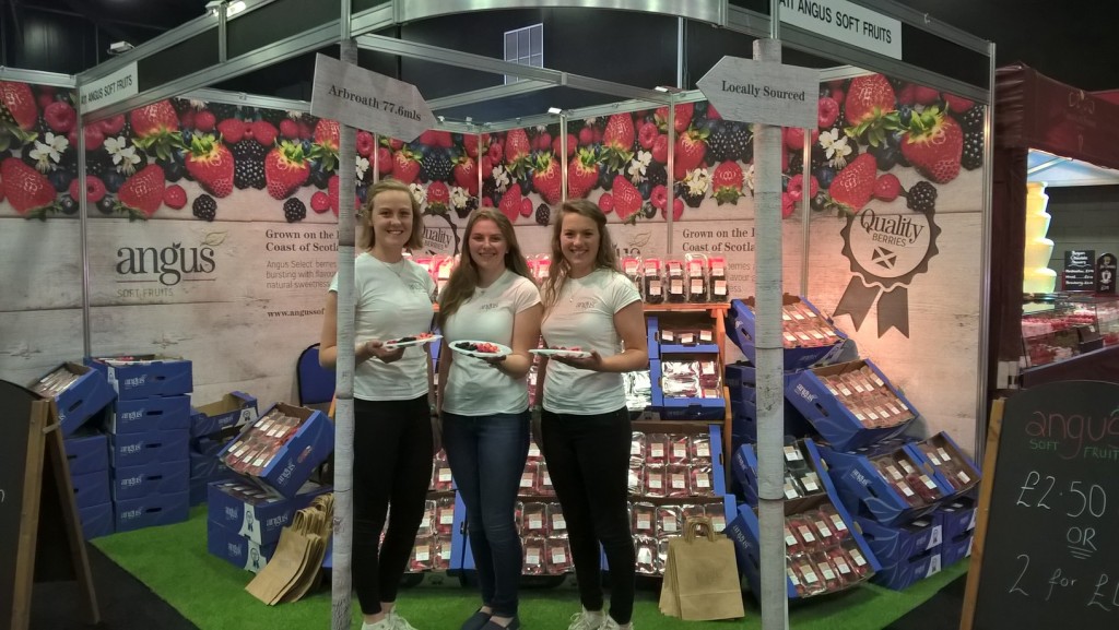
It was a very successful weekend and Angus Soft Fruits sold out! Congratulations everyone!
“Just wanted to drop you all a quick note to THANK YOU so much for your skill, speed, delivery and service for the RHS. It was amazing what you pulled out of the bag for us (especially at the last minute!)
So all in all THANKS – you really are all awesome!”
– Jill Witheyman, Marketing Manager at Angus Soft Fruits
The Torridon are one of our major clients and we have been working together for some years now. We have worked on their branding, website, marketing materials and other design-related activities.
So when they decided they wanted a branded whisky bottle, we were keen to get involved and start designing.
The design brief was two-fold; we wanted to incorporate the branding of The Torridon as well as making it look like a whisky brand. To do this, we had to bring in two different styles that worked together and carry out research into what is expected from a whisky brand.
We came up with three quite different concepts ranging from the more traditional designs to slightly more contemporary.
It was also important to keep the end user in mind and create a design that would appeal to The Torridon’s customers. So once we had decided on the final three ideas, we put it to them to see which they liked best. We ran a competition on social media and asked the audience to vote on their favourite design.

This is quite a simple design. No frills. A slightly more traditional idea, this label showcases the ingredients of the product and looks very clean and simple.
Here’s what people had to say…
“This is the ‘softest’ looking label and the one I like the most”
“Sleek, in a simple clean way.”
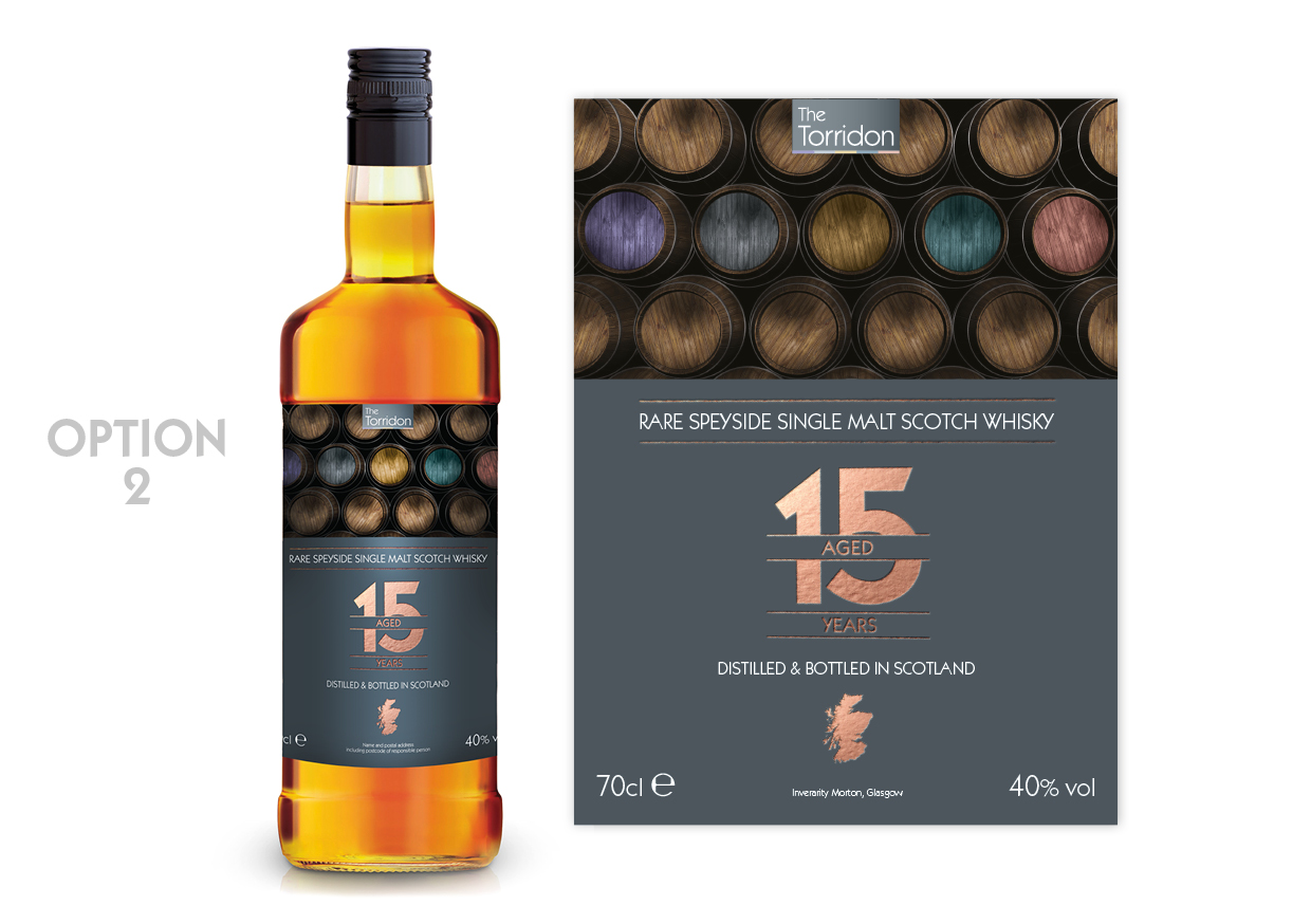
This design has more of a modern twist to a traditional whisky bottle. Using a copper foil, we wanted to ‘class it up’. We added subtle colour and grey tones, to create that contemporary look and fell.
Here’s what people had to say…
“It’s different!”
“Clear and modern!”
“It’s unique!”
“I like Option 2…. Colourful barrels!
“Nice, rustic yet modern…”
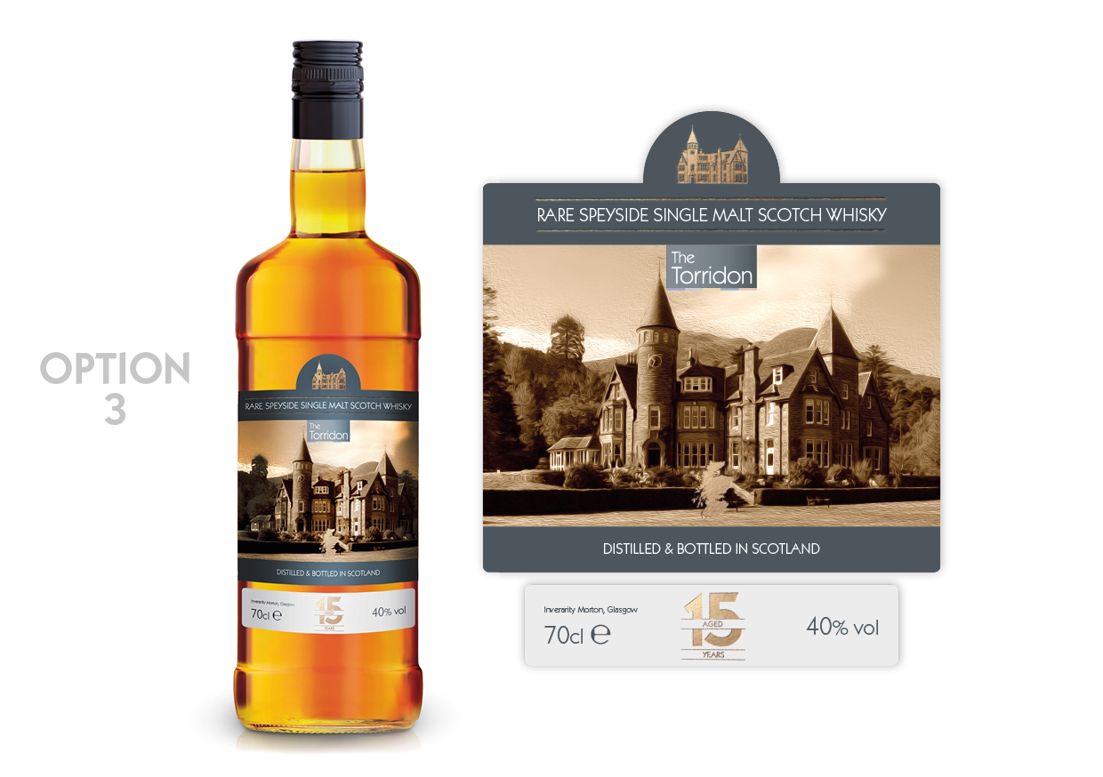
As this is an own-brand whisky, it made sense to do a design with the hotel in the forefront of the design. It doesn’t get much more ‘Torridon-y’ than this. This particular concept was inspired from other whisky brands, using sectioned labels in the packaging.
Here’s what people had to say…
“This one captures your venue in a classy way”
“I love Option 3! The hotel is majestic and truly one of a kind!”
“Love Option 3 because I love castles”
“Classy and timeless and ageless”
And just to throw another one into the mix, one voter said, “Is there one with Rohaise on it?? That would surely get everyone’s vote.” (Rohaise is one of the owners of The Torridon)
However, despite that excellent suggestion, we had to pick a winner from these three options.
And the winner was ……… Option 2!
Taking into account the contemporary look, this design incorporates the sophisticated branding of The Torridon and is a clear winner.
So, we put it to The Torridon customers to find out which design they preferred, now it’s your turn. Which is your favourite design?
We have always worked closely with Cancer Support Scotland, not just from a charitable point of view, but also because they are one of our long-standing clients. So when they asked us to design this year’s Annual Review, we were more than happy to get stuck in.
We have actually been designing their Annual Review for a number of years now (they must trust us to do a good job!!) and we love the challenge of trying to make the design unique for each year. Of course, it has to be in keeping with the brand image and style, but it is great fun trying to be creative and figure out how to make it look different and interesting.

So for 2015, we decided to up our game and create a well thought-out report. In fact, here is something rather snazzy you might not have noticed. The ‘2015’ header is styled on the branding and incorporates the actual logo in the design. Isn’t it beautiful?!
We actually had very little time to do this. In fact, the whole design was basically completed in one day in order to meet the tight deadlines. Not bad!

This project was actually rather well timed with the appointing of Craig as the Chairman for the charity. He first became involved as a Trustee and then became the Vice Chairman, before making the leap to Chairman. Congratulations Craig!
As we have strong ties with Cancer Support Scotland, we have also been taking on graphic design interns. We like to help up-and-coming graphic designers get their foot in the door in the creative industry. This 3-month internship is based part-time at SHINE and part-time at Cancer Support Scotland. Our last intern Michael, ended up working with us for a further 6 months. So if you are interested in this fantastic opportunity, you can click here to apply.
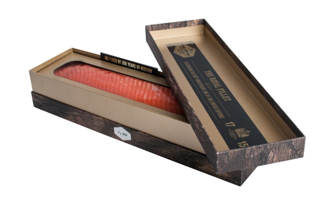
Over the last couple of months we have been working hard for our client RR. Spink to prepare for the launch of the ‘RR. Spink 300 Anniversary Limited Edition Royal Fillet’. Inspired by the long standing history and expertise in fish mongering, RR. Spink were ready to mark their 300 year anniversary with something a bit special.
The idea came to celebrate with a limited edition fillet of trout. As it is all about the 300 year anniversary, it was decided that only 300 trout fillets were to be produced and they would sell for £300. So the concept had been decided. The taste had been perfected. Now over to SHINE for the design.
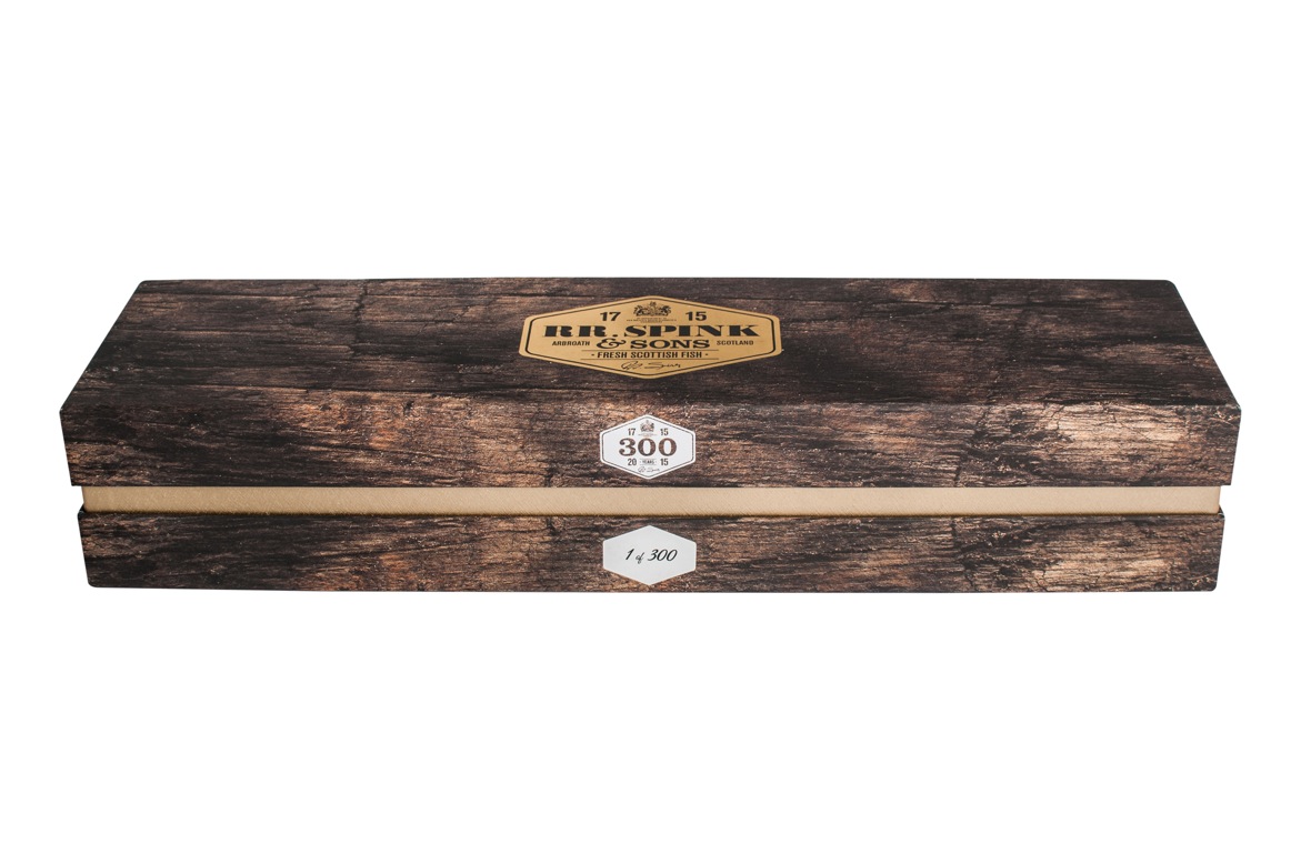
The inspiration for the packaging came from whisky. When you think of whisky, you think of a luxury product, steeped in Scottish history and a real depth to the flavour. This was the idea we wanted to get across. As the trout has a smoky yet woody taste, it made sense to base the packaging design on this.
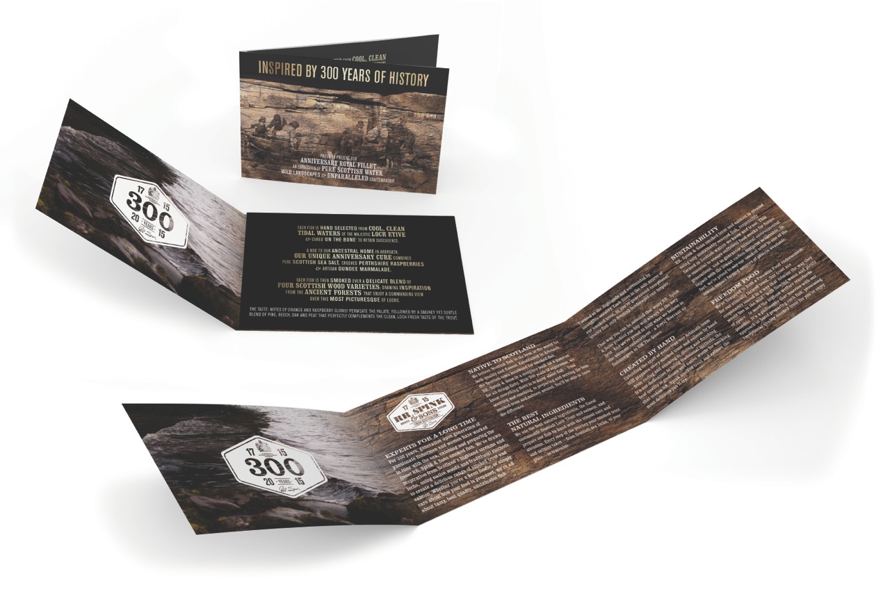
To really showcase and introduce the product, we created a beautiful information leaflet. In here, it explains all about the history of RR. Spink, the reasons behind for the limited edition fish and what you can expect to experience when purchasing this product. This was to be included in every package that was sold.
Normally when you buy fish from the supermarket you don’t expect it to be beautifully packaged in a wooden-inpsired box. Of course, this product is in a league of its own. Our bespoke box design is reminiscent of whisky, promoting the exclusivity of the product.
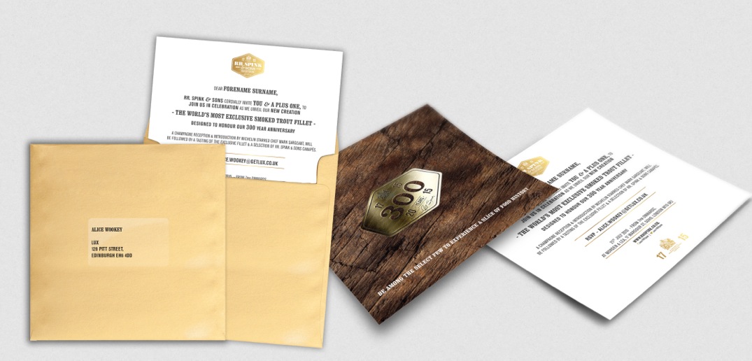
So the product and packaging design were now perfected. The next stage was to hold the launch event. Invitations were designed and sent to London’s finest foodie fanatics (is that too much alliteration?) to attend the unveiling of the world’s most exclusive smoked trout fillet. At £300 per fillet, this promised to be one of the most exciting prestigious events for fish-lovers.
The brand ambassador, Michelin star chef Mark Sargeant, hosted and introduced the event at his Soho restaurant, Morden & Lea. He was telling us all about —
Wait! Is that a yellow chopping board?!! We love it!
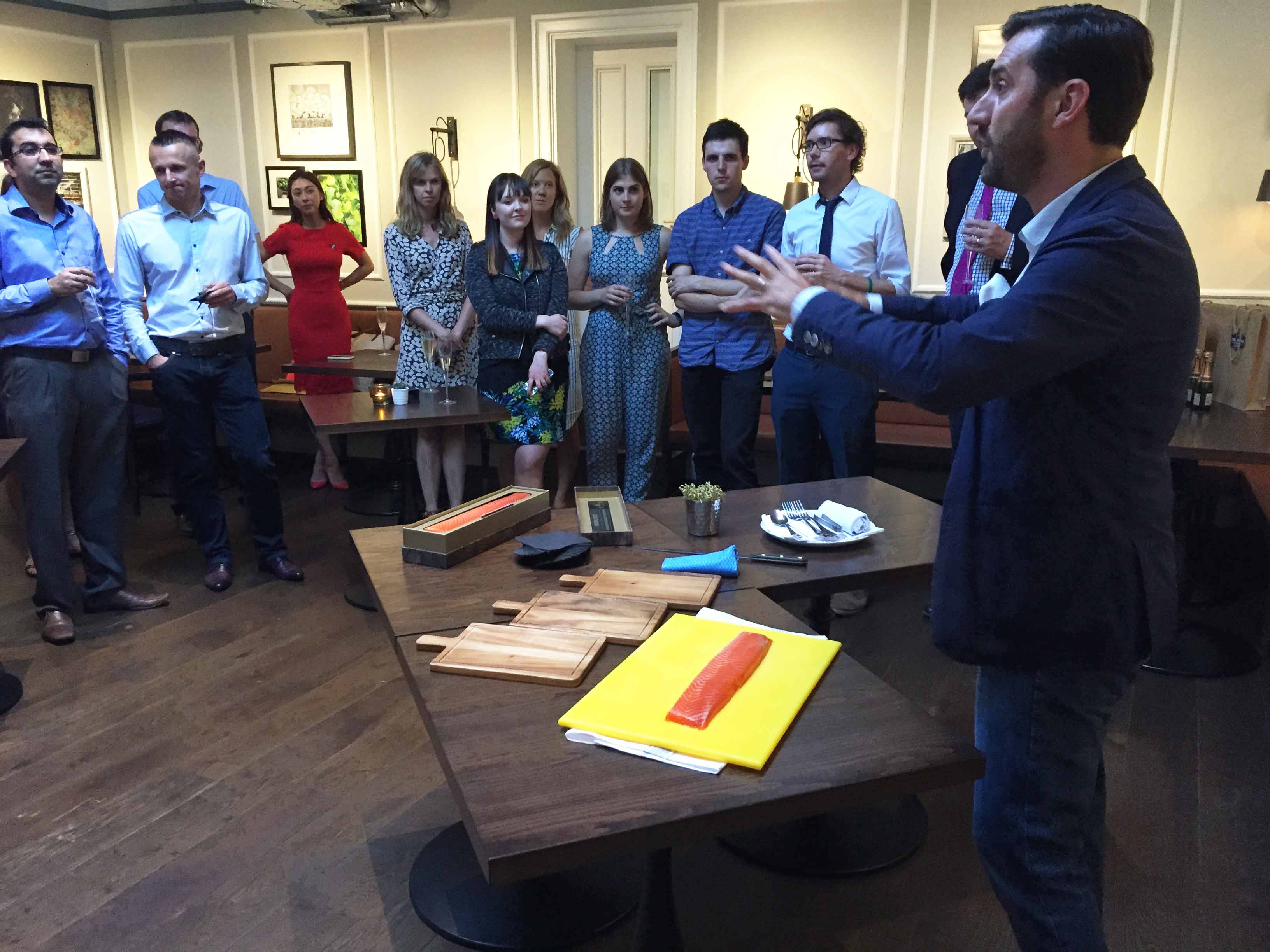
Anyway, he was telling us all about the fish and the guests got to sample the exclusive fillets, as well as some delicious canapés.
Not bad for a night out in London. If you are now intrigued about the ‘world’s most exclusive fish’ have a read on RR. Spink’s blog here, where they go into more detail about the actual product itself.
