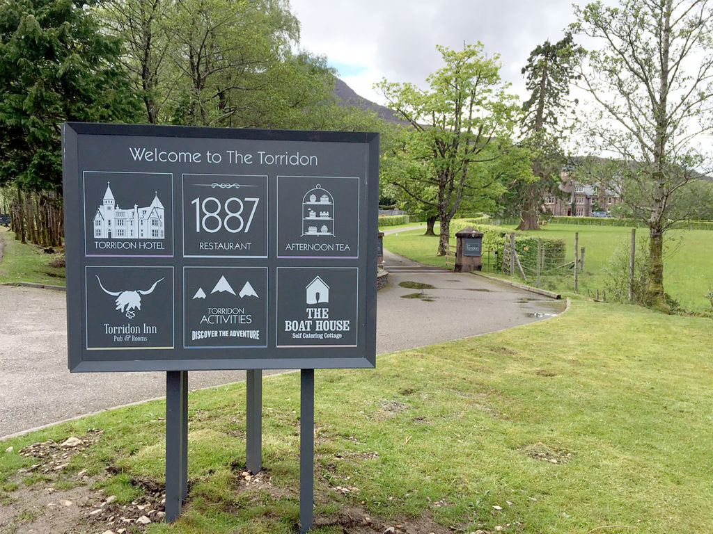
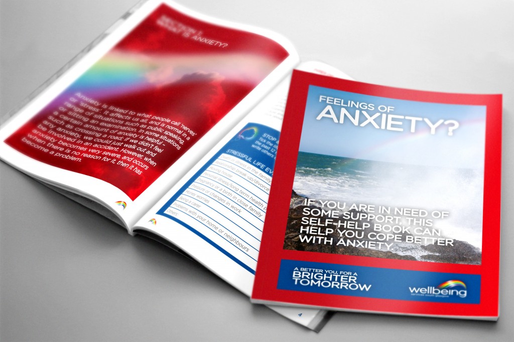
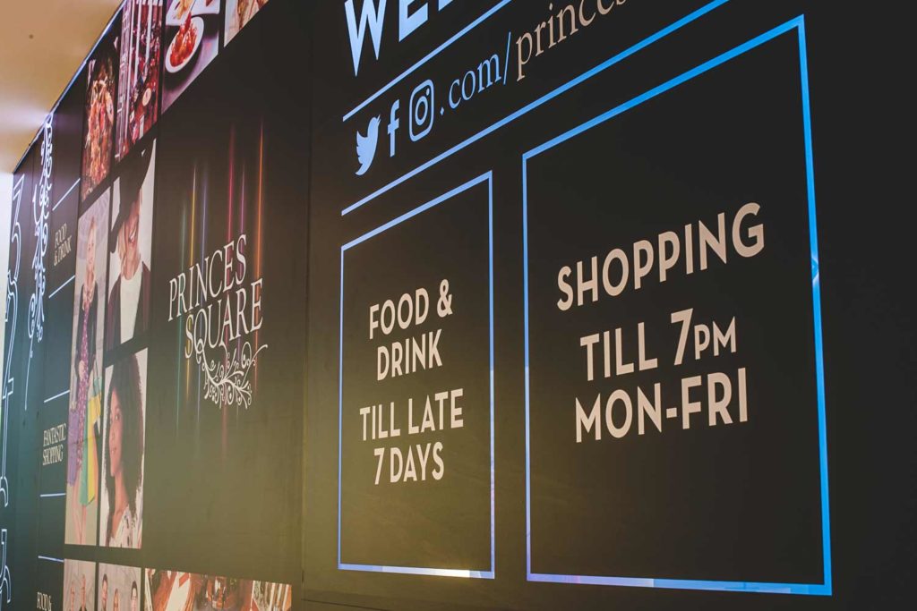
First thing Martyn did was to go and get some pictures of the wall to understand where our design would be situated and started doing some visualising with our creative minds.


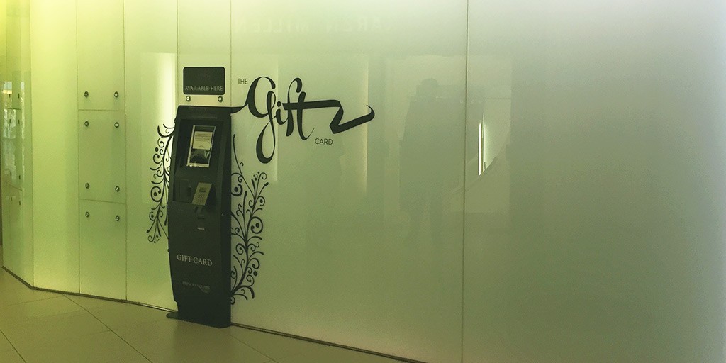
There were a number of things that stood out. Firstly, the wall changes colour. Cool! So we had to think about how to incorporate that.
Second, there are some things on the wall. A card machine, some bolts (you can see on the left in the picture above) and plenty of panels which have small joining lines.
This meant our idea had to work with these aspects – maybe even contribute to the design!
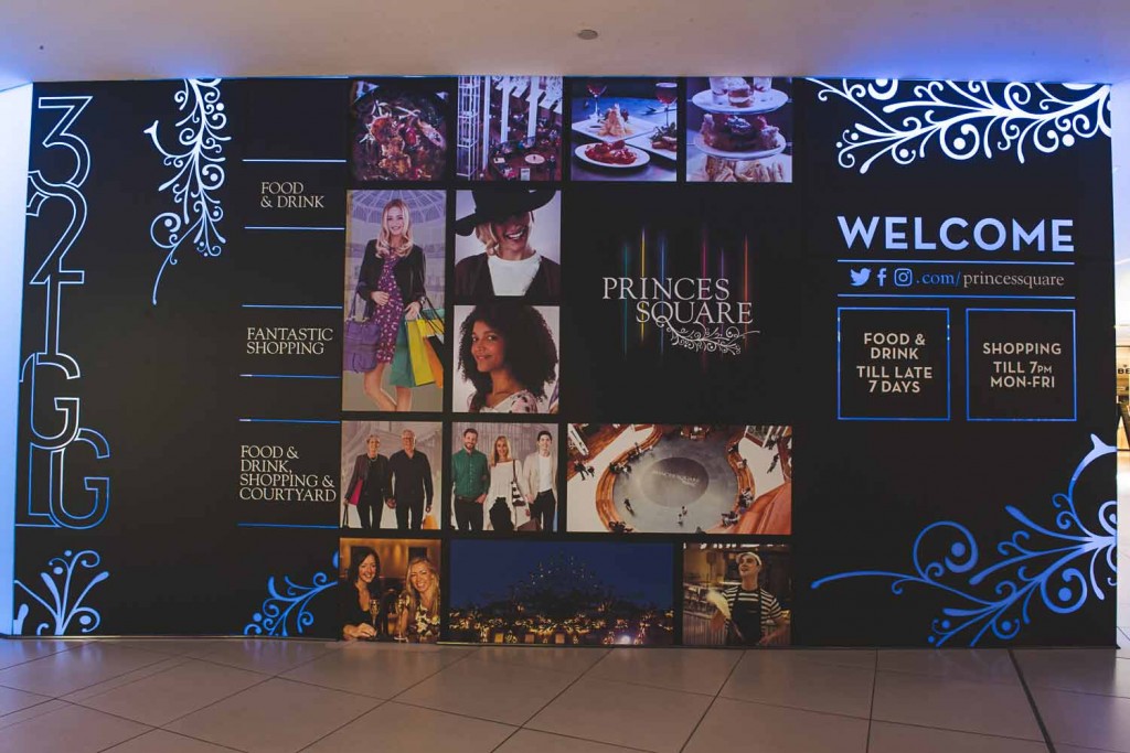
So we set about InDesign and have come up with a bold, colourful wall vinyl.

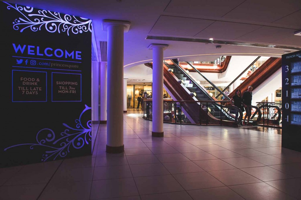
The clever thing about this vinyl is that it’s not just one sheet. It has been divided up into sections to make room for the bolts and gaps between panels.
Also, the places where you see pink are actually cut-out to allow the coloured lights to shine through.
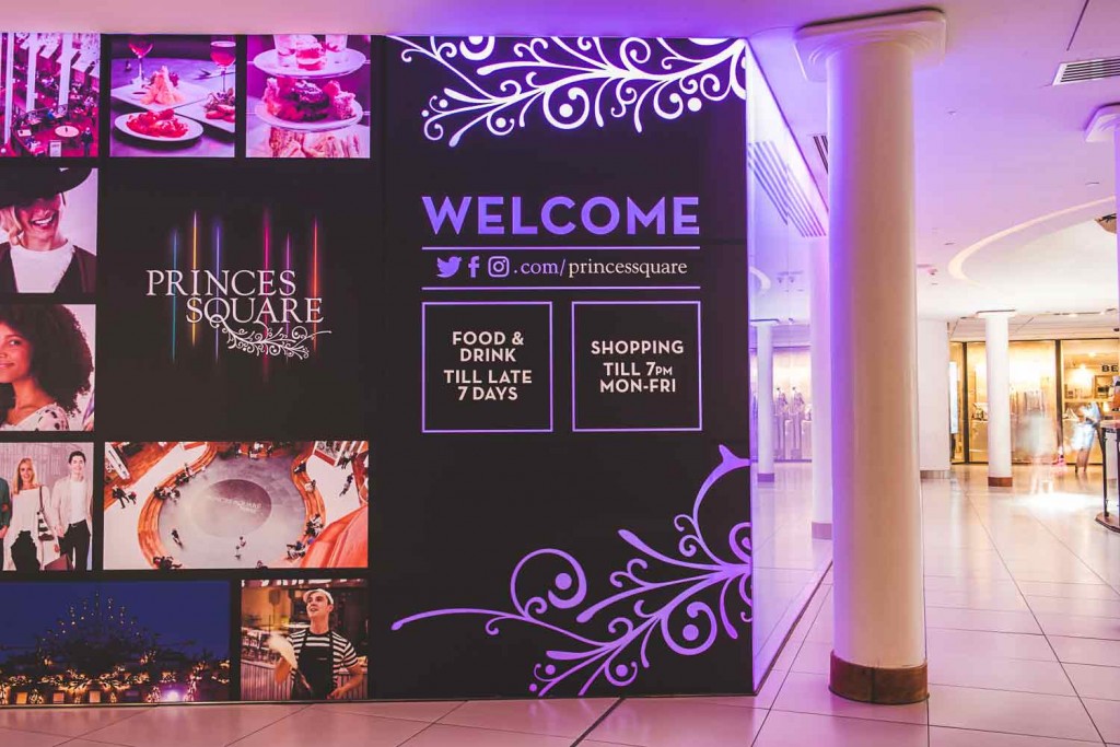
We sent our internal photographer (Ryan) down for a walk to Princes Square to get some pictures of the wall in action.
The Torridon are one of our major clients and we have been working together for some years now. We have worked on their branding, website, marketing materials and other design-related activities.
So when they decided they wanted a branded whisky bottle, we were keen to get involved and start designing.
The design brief was two-fold; we wanted to incorporate the branding of The Torridon as well as making it look like a whisky brand. To do this, we had to bring in two different styles that worked together and carry out research into what is expected from a whisky brand.
We came up with three quite different concepts ranging from the more traditional designs to slightly more contemporary.
It was also important to keep the end user in mind and create a design that would appeal to The Torridon’s customers. So once we had decided on the final three ideas, we put it to them to see which they liked best. We ran a competition on social media and asked the audience to vote on their favourite design.
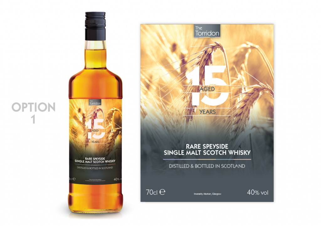
This is quite a simple design. No frills. A slightly more traditional idea, this label showcases the ingredients of the product and looks very clean and simple.
Here’s what people had to say…
“This is the ‘softest’ looking label and the one I like the most”
“Sleek, in a simple clean way.”
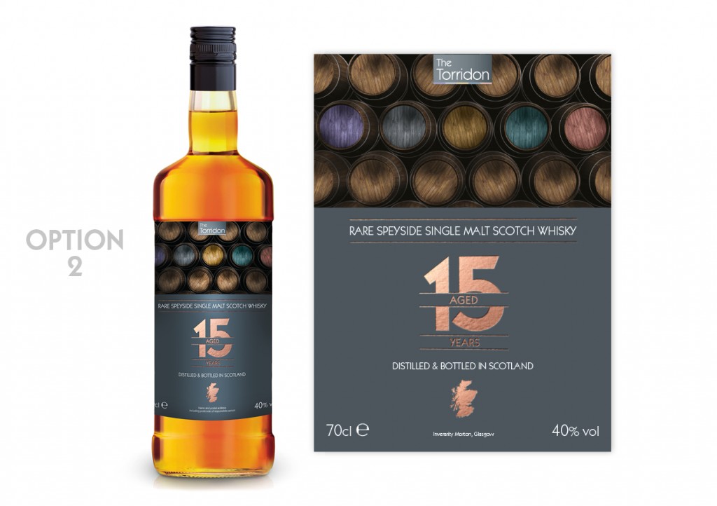
This design has more of a modern twist to a traditional whisky bottle. Using a copper foil, we wanted to ‘class it up’. We added subtle colour and grey tones, to create that contemporary look and fell.
Here’s what people had to say…
“It’s different!”
“Clear and modern!”
“It’s unique!”
“I like Option 2…. Colourful barrels!
“Nice, rustic yet modern…”
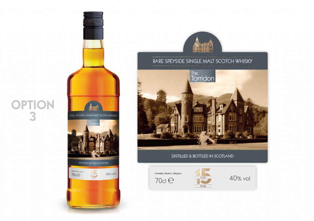
As this is an own-brand whisky, it made sense to do a design with the hotel in the forefront of the design. It doesn’t get much more ‘Torridon-y’ than this. This particular concept was inspired from other whisky brands, using sectioned labels in the packaging.
Here’s what people had to say…
“This one captures your venue in a classy way”
“I love Option 3! The hotel is majestic and truly one of a kind!”
“Love Option 3 because I love castles”
“Classy and timeless and ageless”
And just to throw another one into the mix, one voter said, “Is there one with Rohaise on it?? That would surely get everyone’s vote.” (Rohaise is one of the owners of The Torridon)
However, despite that excellent suggestion, we had to pick a winner from these three options.
And the winner was ……… Option 2!
Taking into account the contemporary look, this design incorporates the sophisticated branding of The Torridon and is a clear winner.
So, we put it to The Torridon customers to find out which design they preferred, now it’s your turn. Which is your favourite design?
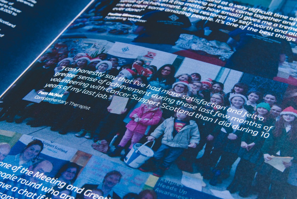
We have always worked closely with Cancer Support Scotland, not just from a charitable point of view, but also because they are one of our long-standing clients. So when they asked us to design this year’s Annual Review, we were more than happy to get stuck in.
We have actually been designing their Annual Review for a number of years now (they must trust us to do a good job!!) and we love the challenge of trying to make the design unique for each year. Of course, it has to be in keeping with the brand image and style, but it is great fun trying to be creative and figure out how to make it look different and interesting.
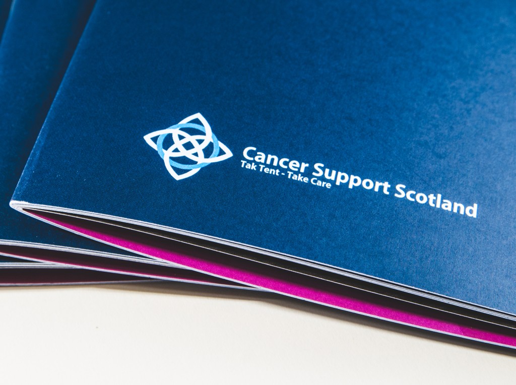
So for 2015, we decided to up our game and create a well thought-out report. In fact, here is something rather snazzy you might not have noticed. The ‘2015’ header is styled on the branding and incorporates the actual logo in the design. Isn’t it beautiful?!

We actually had very little time to do this. In fact, the whole design was basically completed in one day in order to meet the tight deadlines. Not bad!
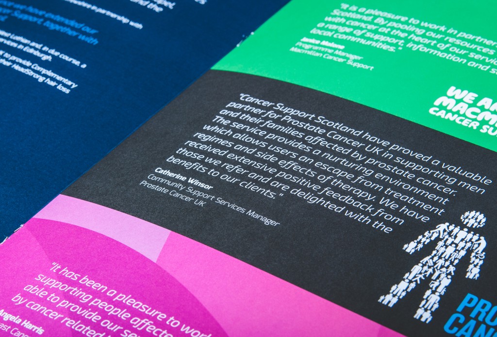
This project was actually rather well timed with the appointing of Craig as the Chairman for the charity. He first became involved as a Trustee and then became the Vice Chairman, before making the leap to Chairman. Congratulations Craig!
As we have strong ties with Cancer Support Scotland, we have also been taking on graphic design interns. We like to help up-and-coming graphic designers get their foot in the door in the creative industry. This 3-month internship is based part-time at SHINE and part-time at Cancer Support Scotland. Our last intern Michael, ended up working with us for a further 6 months. So if you are interested in this fantastic opportunity, you can click here to apply.
The concept of ‘design’ is very varied. There is so much more to it than just developing websites or creating marketing materials. To be effective designers we also have to be creative, organised and adaptable. SHINE is a creative agency in every aspect, not just in designing digital or print projects, but we also carry out more hands-on tasks, such as organising branded events.
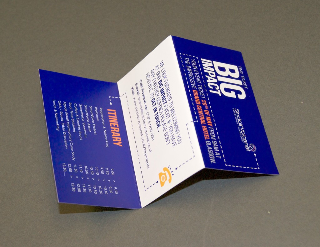
Sinclair Voicenet approached us to organise their ‘Big Impact Event’. This event was to showcase their new services to clients and customers. The programme for the day was to demonstrate a live case study on one of their clients, Ageas Retail Intermediary, and how Sinclair have helped their business.
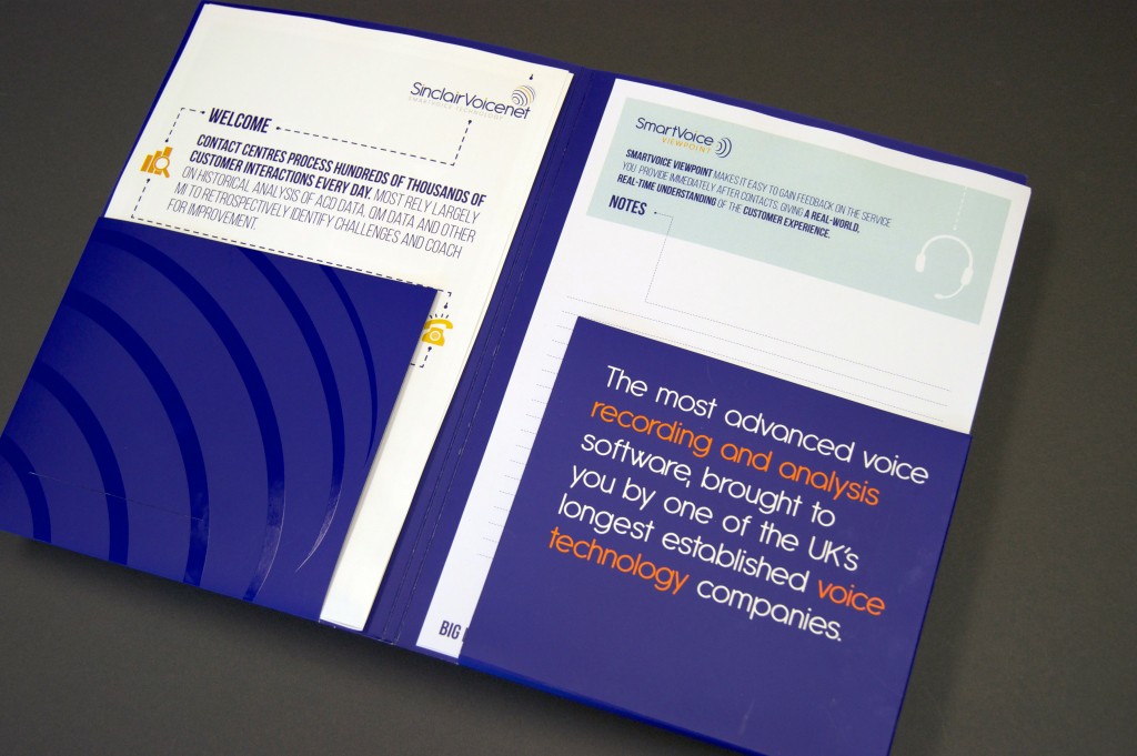
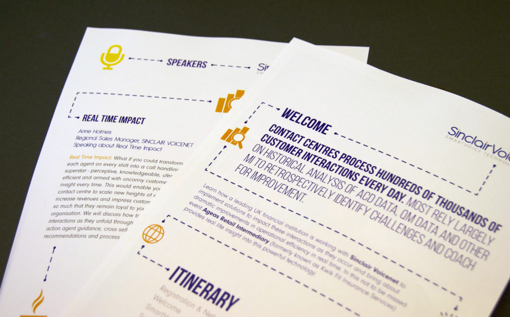
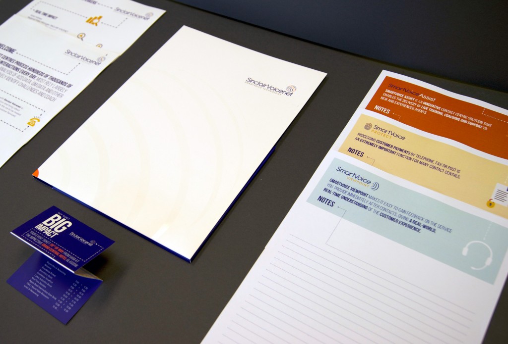
We were involved in every aspect of this event, from choosing and booking the venue, to organising the booking process for clients, to designing branded materials for the day. Sinclair has a number of different services that they offer and we wanted to ensure each had their own branding identity, but still had a ‘Sinclair’ feel. So we used a flat illustrative style of the original company logo to distinguish between the different services.
In the lead up to the event, we created miniature invitations, organised the booking process and sent a total of 6 branded emails with a countdown to the event. The planning paid off and we had a good response rate from clients.
For the event itself, we designed name badges, banner stands, notepaper, and pens – basically everything you would ever need for an event. Of course, everything was fully branded. For something a little bit different, we even had Sinclair rugby stress balls! These seemed to go down very well with the guests.
As the event was quite content-heavy, we decided the design should be very visual, easy to follow and simple. So, we had the idea a business journey or storyboard, with lines directing the reader through the programme. Just in case this didn’t do the trick, we also had sweets strategically placed around the tables – if in doubt bribe with sweets!
Sinclair was extremely happy with the event. So much so, that they are actually planning to run the exact same event again soon. Here at SHINE, we like to make our clients happy. We always strive to make each event better and better.
]]>The Torridon is a resort in the North of Scotland, featuring a luxury hotel, inn and boathouse. They were delighted to learn that they are on the route for ‘North Coast 500’ (NC500), which has been called Scotland’s answer to Route 66. As the name suggests, this involves a 500-mile scenic tour of Scotland’s North coast. You can read more about the ‘NC500’ and view the map on the official website here.
We have been working with The Torridon for a number of years now. We have since become their ‘out-of-house’ marketing department and manage all their design needs. Recently, they approached us asking for a new design for their signage. (To see other projects we have been working on with The Torridon, such as their new website and brochures, have a look at our page here.)
Creating an effective signage campaign can be challenging and the design should be simple, aesthetically pleasing and easy to understand. In-keeping with the luxury branding of The Torridon, SHINE used tonal colours with a high contrast to create a contemporary styled sign.
With the use of simple silhouettes, the signs feature graphics that provide illustrative information to help customers to interpret the signs and find their way more quickly. The symbols are a modern and simplistic take on traditional Scottish branding.
The design strategy used by SHINE builds on the basic principles for all signage, keeping the look simple and illustrative. This method is used in many other signage designs, such as in airports, where there is a strict code to follow. Read our recent blog about The Design Strategy Behind Airport Signage for more information.
As a creative agency, we are very interested in the design of signs and how effective they can be. This is why we have created a Pinterest board of innovative and cleverly designed signage around the world. Check it out here to see other examples of well-designed signage. We’ll be adding to the board often so please follow if you want to keep updated.
]]>We have been working on this project for a while now, as we wanted to make sure it was perfect and met the design brief. The client, Wellbeing, asked us to create 8 separate brochures each focusing on a different aspect of mental health, from depression to anxiety to insomnia.
Wellbeing’s new branding incorporates weather related imagery, focusing mostly on a rainbow for it’s use of colour and symbol of hope. They also use the colours to distinguish between the areas in which they work. Carrying this concept through to the project, SHINE formed different information booklets categorised by colour and topic. We also wanted to make sure the message was clear and consistent, so we used strong imagery to reflect the emotions behind each mental health condition.
Colour can be used to really engage with people and their emotions. Studies have shown that colours can be soothing and help to release tension. This, together with the imagery from the brochures, corresponds well with the brand message and the hope it promotes:

