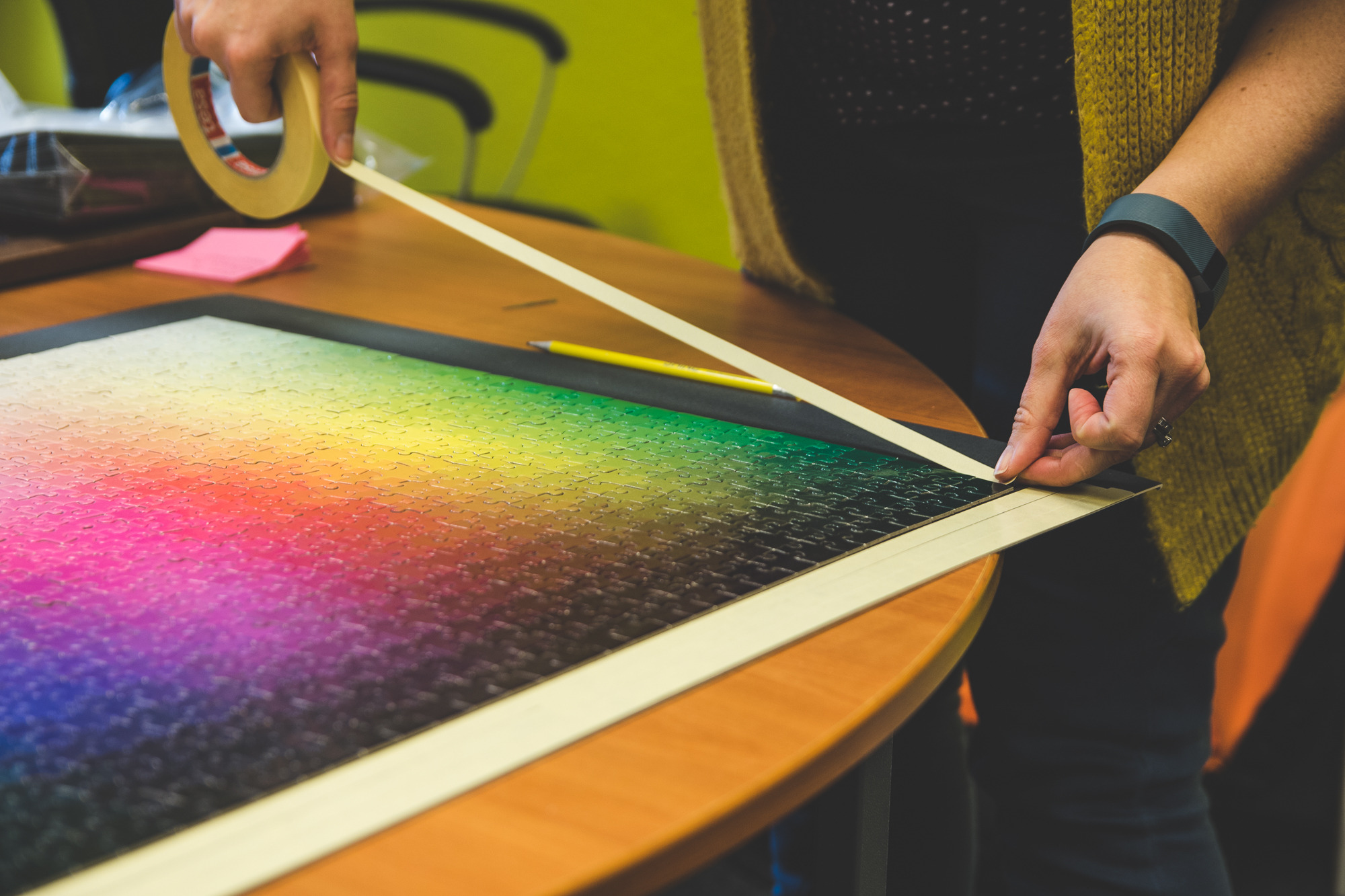
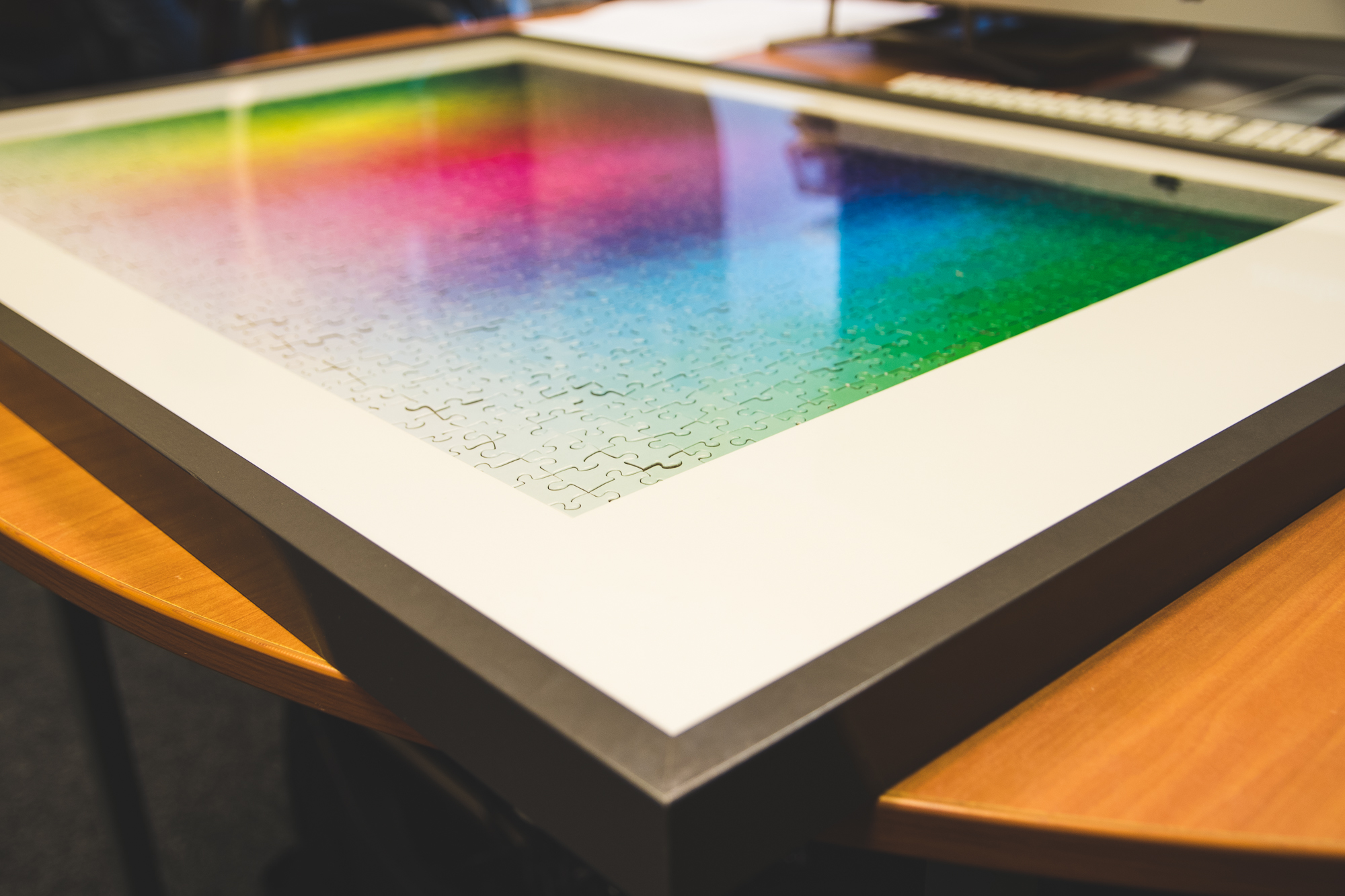
Remember the “1000-piece impossible colour jigsaw“? Well, we wanted to put it to good use and decided to frame it above the TV in the studio. We couldn’t break it up after all that hard work!
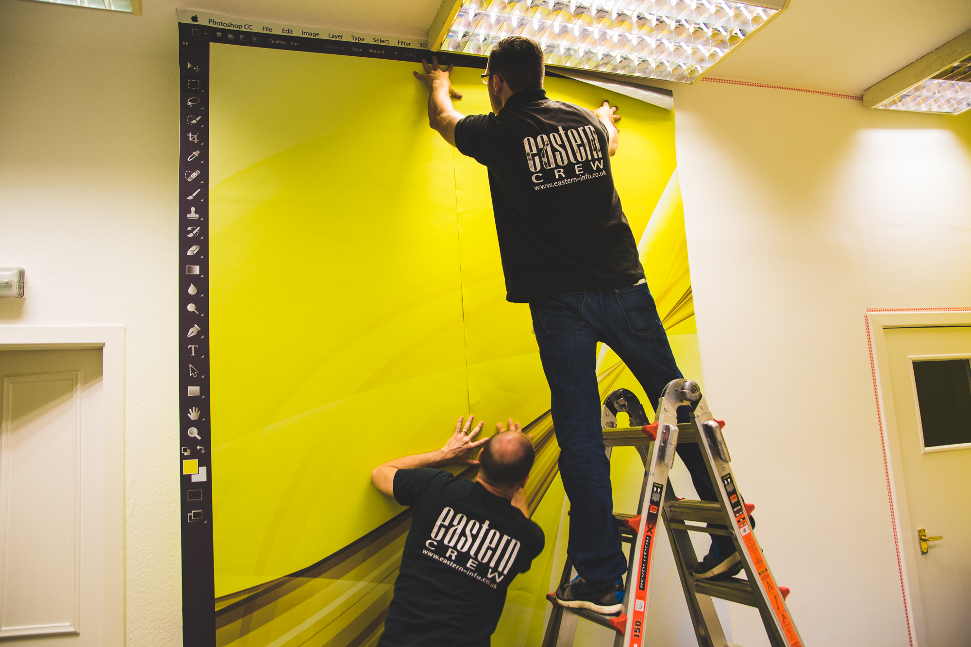
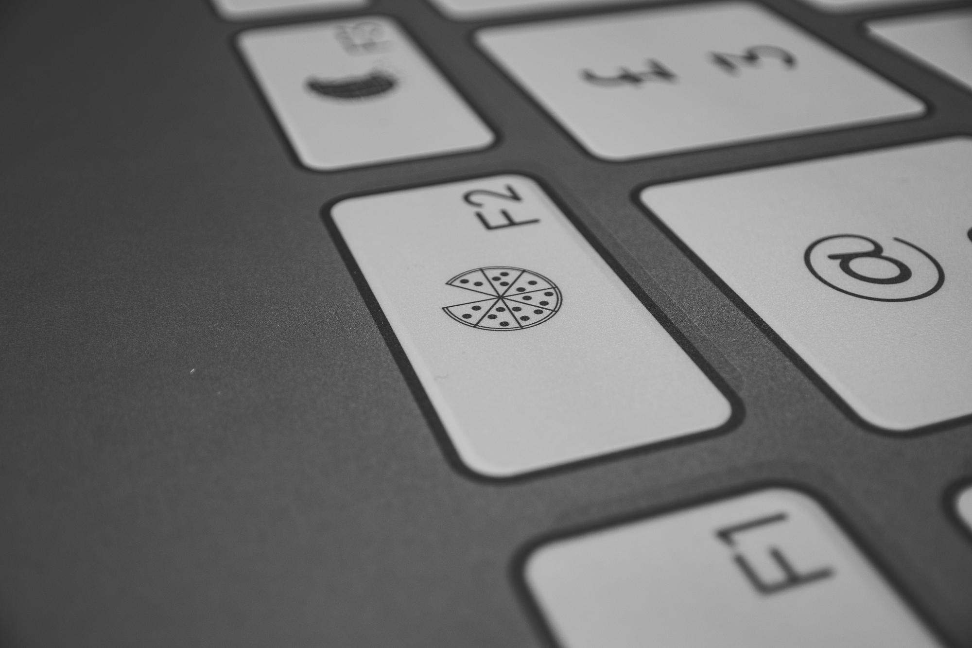
In Craig’s office, where we have all the “big people” meetings, Martyn came up with this rather clever idea to turn the room into a giant computer. We now have digital wallpaper in the form of a Photoshop desktop, and a keyboard themed table. All we need now is an oversized yellow mouse!
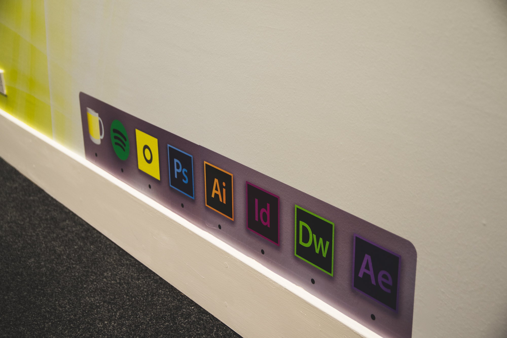

So far, the table has gone down really well with clients. There have been tweets, there have been comments and there has been a mutual understanding by all, for how wonderful this table is. There are a few jokes hidden in the keyboard, so you will need to pop in to see it face-to-face and spot them all.
(Added incentive: we always have biscuits and good coffee!! … We also design stuff…)

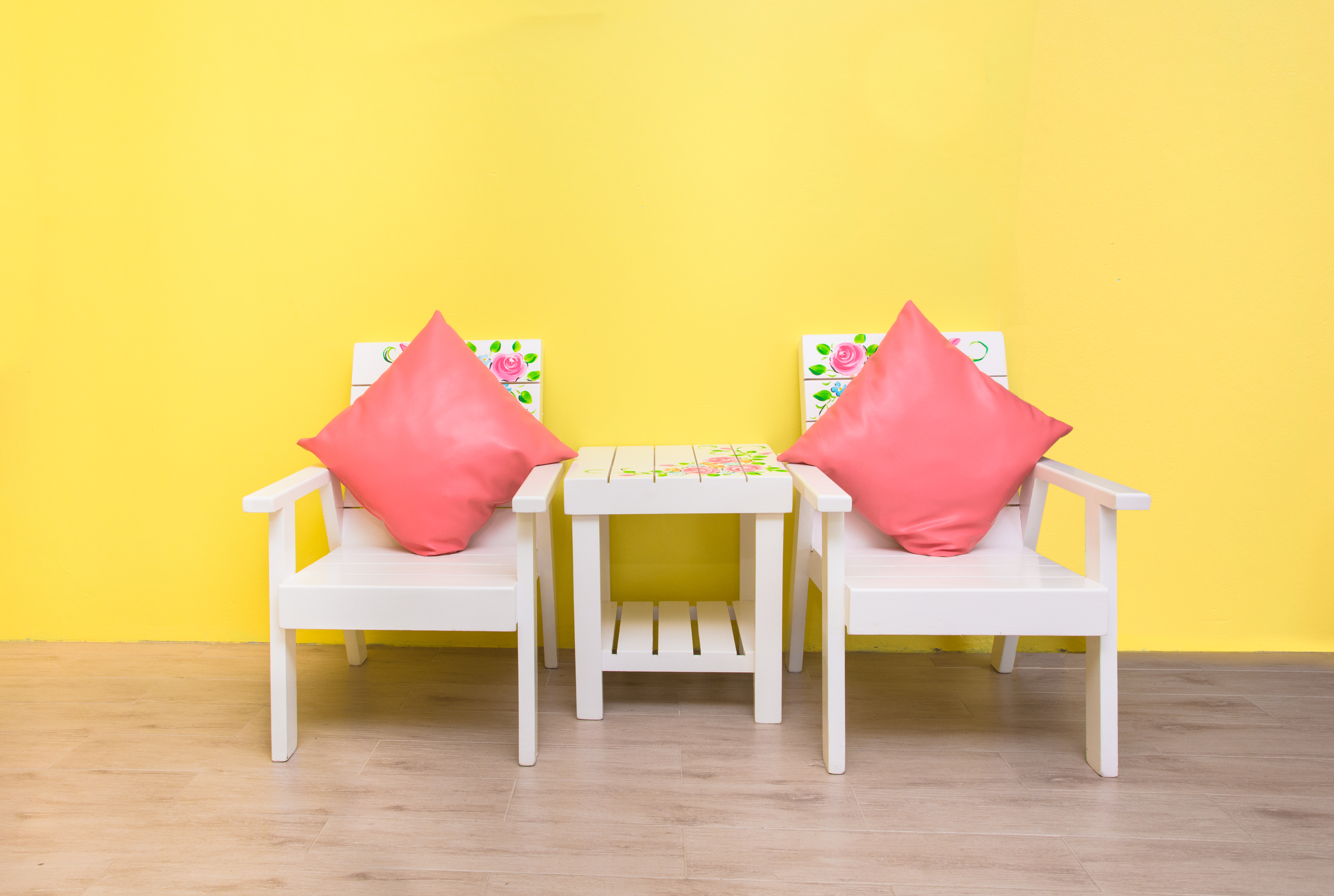
Finally, we also gave the entrance to the SHINE plaza a bit of a spruce up. There has never been enough yellow before, but now you can be in no doubt that you are in the right place.

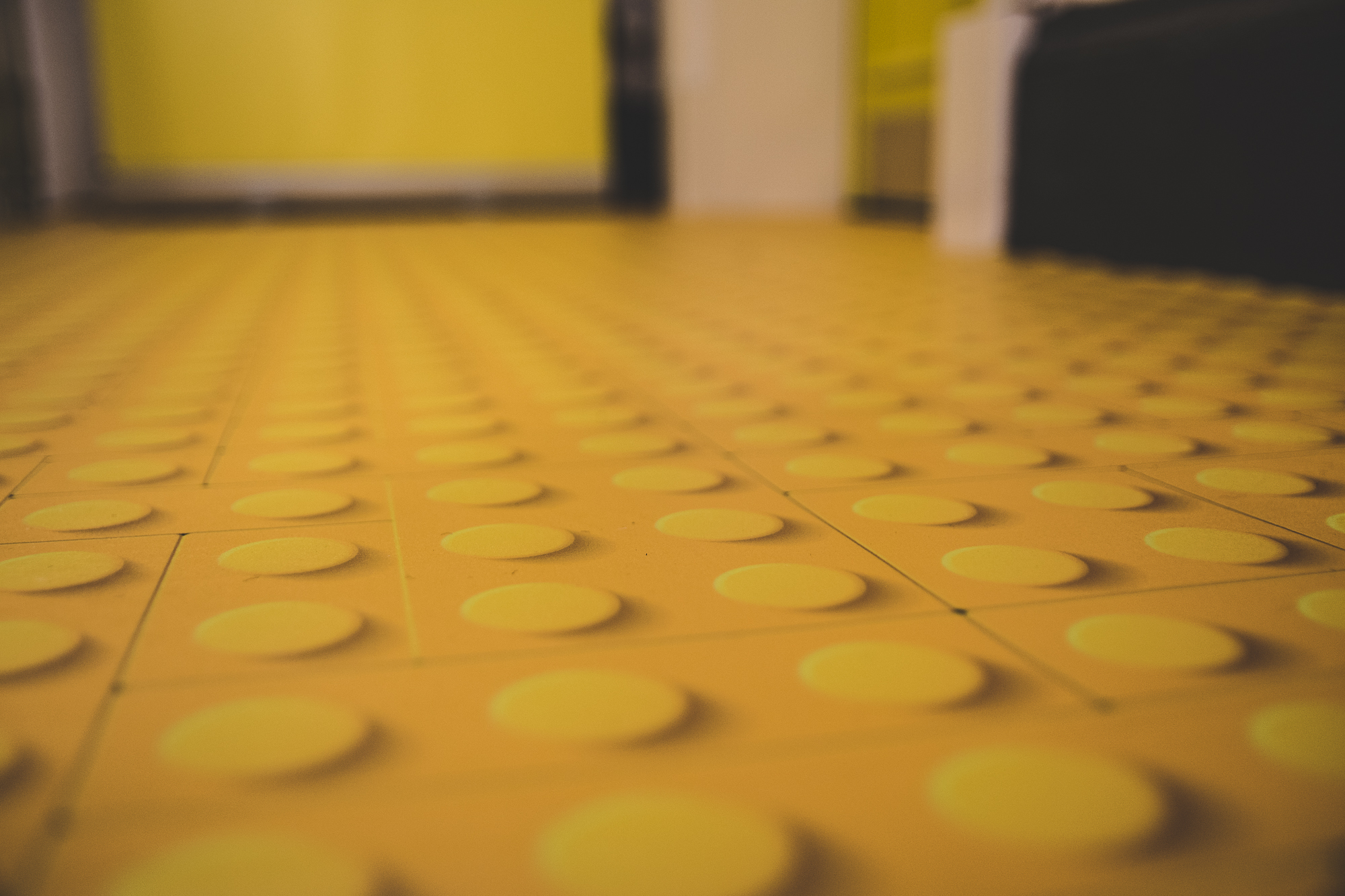
Our yellow lego road is going to come in very handy when we have visitors. Before, we would just say “we’re on the top floor”, but now we will just say, “Follow the yellow brick road…”
Thanks to the guys at Eastern for doing such a great job! ]]>
Colours are a very visual way of getting people’s attention. Whether it’s bright yellow or dark red, different colours create different reactions from people. The concept of colour psychology spans from this idea; that people feel certain emotions when viewing a particular colour. Colour psychology can be used in all sorts of ways, including personal use such as interior design, but it can also be used in branding (for a really great example of this, just look at SHINE!!)

Red can represent danger or excitement and is often used to get your attention with it’s bold personality. In contrast, green has a calming and peaceful effect, perhaps because it is associated with nature and the environment.
So, what about yellow? If we were to ask you to think of things that are yellow, what would you say?
The sun? Daffodils? Springtime, bananas, lemons, post-it notes? Something a bit more fun like minions or even SHINE? (obviously because of our See Yellow, Think SHINE campaign) When you see these things, how do you feel and what do you associate it with?
Lots of people think of spring or summer. Yellow is considered to be one of the happiest colours. It’s warm. It’s cheery. It gives people confidence in you. It represents wisdom, knowledge, energy, creativity and optimism. Of course, these are all reasons why SHINE is all about yellow – we are a happy, cheery design agency!
One of the wonderful things about yellow is that it stands out and attracts the most attention out of any other colours. This is why it is used for signage, as it can be spotted and interpreted from a distance (read more about the design strategy of signage here).
Of course there are many many positive things about yellow. But maybe we should provide a balanced view and present some of the negatives too… (not that there are many)
Some research has shown a yellow room can have a stimulating effect on the brain and therefore is good for studying… while other research suggests people in a yellow room are more likely to lose their tempers (maybe people are losing their tempers because they are studying…)
Have you heard of the phrase a ‘yellow house’? It used to be said when referring to a mad place (apparently, mental asylums used to be painted yellow and so the phrase stuck). So, some say yellow is the colour of madness. Of course we completely disagree with that; we’re all perfectly normal…
]]>Airports can be really stressful. Most terminals are massive with over 100 gates spread over the airport. It just so happens that every time you travel your gate is always at the opposite end of the terminal!! Last calls are announced over the tannoy and people are rushing past trying to catch a plane – cabin bags in tow. With all this going on, it’s easy to see why people don’t seem to appreciate it if you stop in the middle of their path to read a sign.
Travelling can be such a daunting task, particularly if you don’t know where you are going (although I would recommend knowing where your plane is going…) Language barriers and complicated signs can make it even more stressful and hard to understand. Airport managers have understood this and decided to develop a strategy for reducing stress and enhancing usability.
They created a guideline and a strategy for designing signs to make it easier to read while running past. Using ‘Wayfinding’ signs, the airports have carefully planned how to ease the stress and enhance consumer experience. Wayfinding signage is a design technique to simplify directions and help consumers find their way.
There are three main aspects to consider when designing Wayfinding signs, particularly in airports.
Easy Interpretation
Keeping the text to a minimum, airport signs generally use figurative numbers and directional symbols (such as arrows). This allows people to glance quickly while sprinting to make that final boarding call. It also creates a message that is universally understood by travellers, regardless of their dialect or language. There are is nothing more frustrating than a sign that it hard to interpret and you end up going in the wrong direction. Some signs are more effective than others, and issues can arise when the design has not been considered properly.
High Contrast
As there are many different types of travellers with various needs, the signs have to be interpretable by all. The use of colour is fundamental to this aspect, using high contrast in colours can help to improve the readability of the information, particularly for those who are hard of hearing or struggle to see clearly. The signs are designed to be eye-catching and bold.
Colour Coding
A colour coding system was also established to differentiate between the different types of information provided. Interestingly, not many people are aware of this. Across the UK, certain colour combinations have been chosen to aid interpretation.
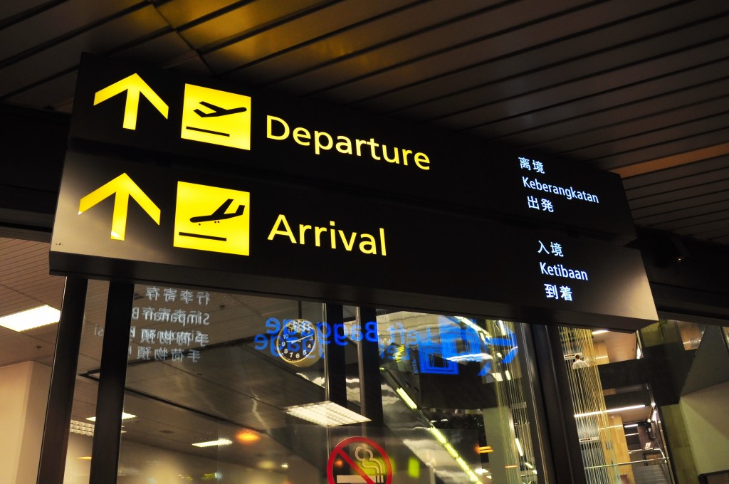
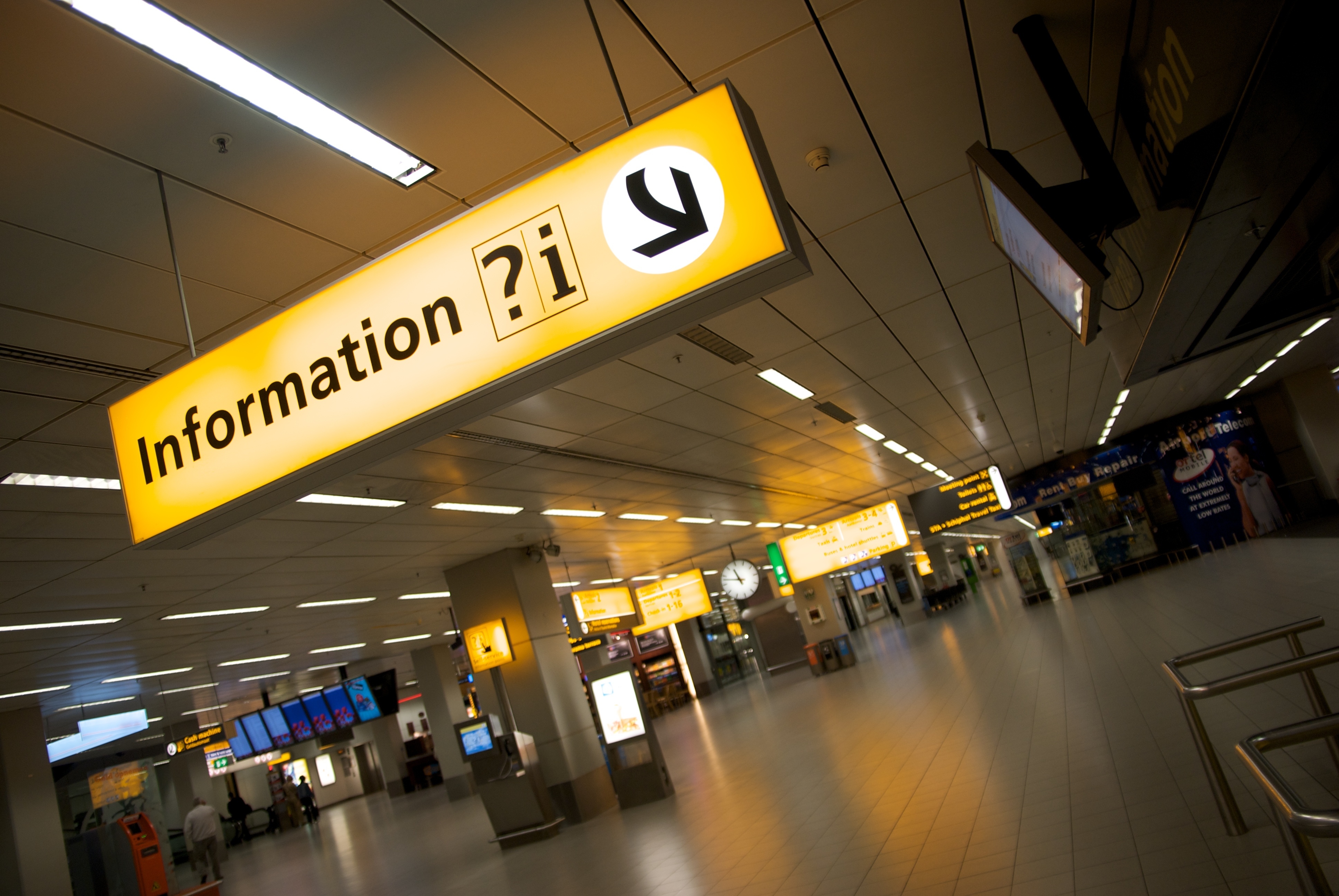
Directional signs (such as the one above), are to use yellow text on black backgrounds. While information signs represent where passengers can find answers to their questions. These signs reverse the colours of directional posts, instead using black lettering on yellow backgrounds (as shown below).
Of course, SHINE are particularly interested in the use of yellow in the signage. Yellow is bright and allows signs to stand out and be seen easily. Just another reasons to love yellow!
So there you have it. The design strategy behind airport signage. The next time you are in an airport, consider the thought-process behind the signs that you see (and remember to think of SHINE when you notice the yellow!!) There is much more than meets the eye to these simple designs…
We have also created a board on Pinterest for signage design, a whole collection of clever or innovative ideas which we will be adding to on a regular basis. Be sure to check it out here.
]]>Why yellow pictures? Well if you remember reading our blog about branding, we talked about our brand image and how ‘yellow’ is kind of our thing. We love it. Yellow is such a happy colour and we want our clients to be happy when they think of SHINE.
Recently we got to thinking about how we could do this. We wanted our branding to be so strong that when people see yellow in everyday life, they will associate it with SHINE. We have started to share images with yellow in them, using #seeyellowthinkshine. The images are designed to cheer you up when you see them and make you smile when you think of SHINE. So that’s the method behind the yellow madness.
So, the next time you see daffodils (which should be often as they are everywhere at the moment) – think of SHINE.

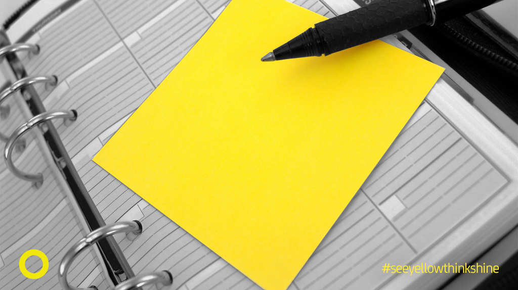
The next time you see yellow post-it notes – think of SHINE.
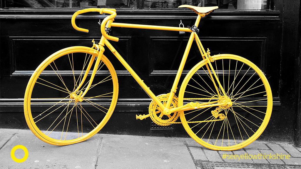
And the next time you see an all-yellow bicycle (?!!) – think of SHINE.
Keep an eye out for anything yellow, picture or object, and send it in to us by post, email, tweet us or use #seeyellowthinkshine on social media. We would love to hear from you.
We have loads of ideas for this campaign, including upcoming events and competitions, so be sure to follow us on social media if you aren’t already. Our new marketer also loves Pinterest and this will be used more by SHINE in the coming weeks.
]]>