Murrayshall
Escape the ordinary
We were approached by Murrayshall in 2020 and tasked with revitalising their brand to sit in line with their forthcoming plans for estate expansion.
Our job was to tackle the lack of knowledge of Murrayshall and what it offers whilst growing awareness to a new audience further afield. With a 4 star, bespoke luxury offering ready to launch, we aimed to define a new value proposition that would appeal to an affluent market without alienating the local audience.
With a £30 million expansion on the horizon, the hotel wanted to move away from the traditional country house ‘identity’ hotel to a contemporary resort. This played a major part in how we approached the rebrand.
Over the course of the year, we worked closely with the team at Murrayshall to develop the brand identity, creative direction, tone of voice and new digital platform for Perthshire’s best kept secret.
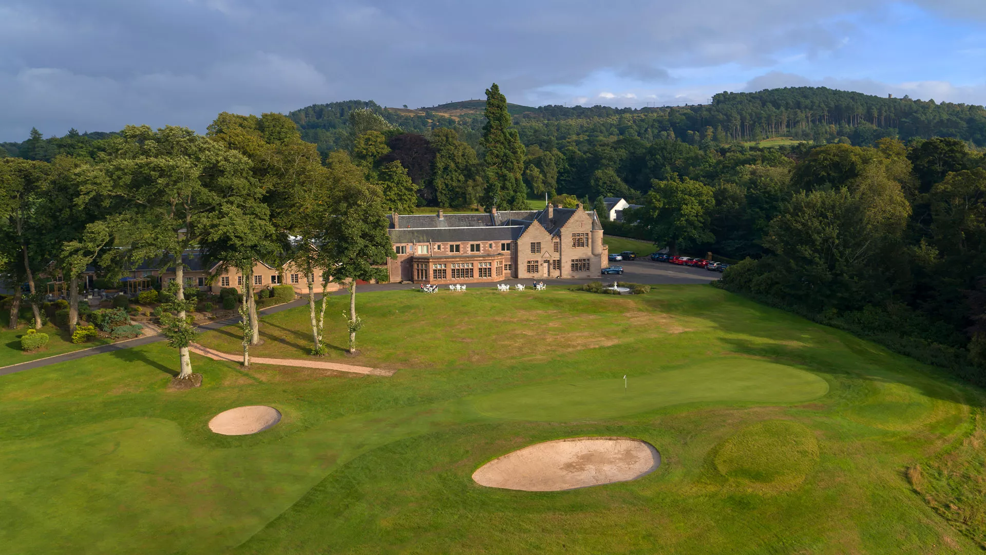
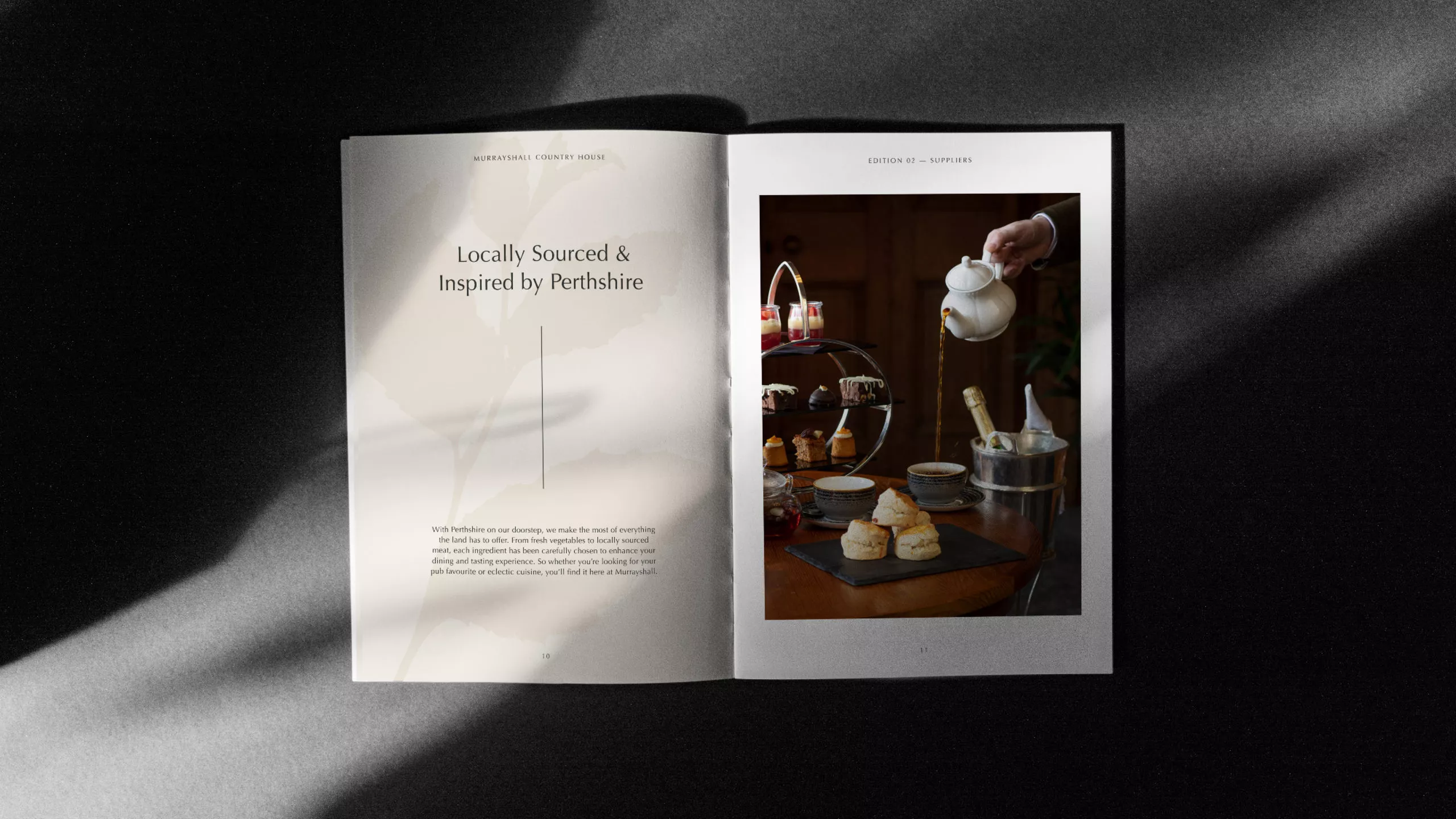
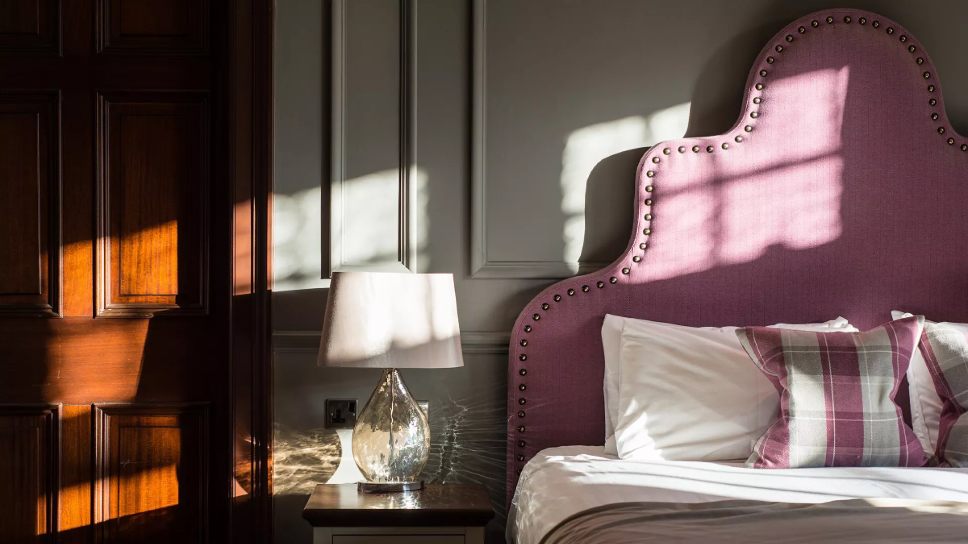
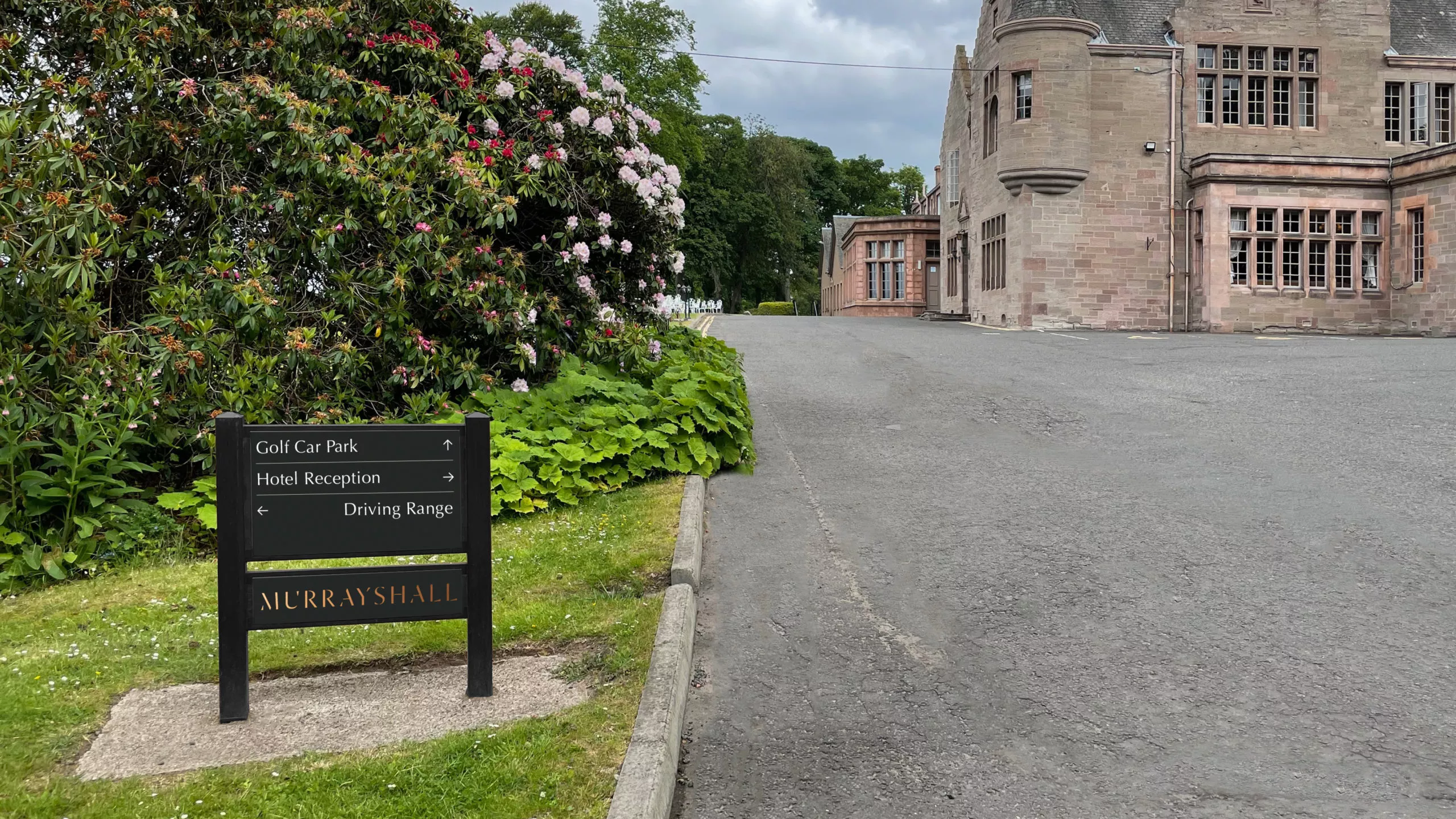
Murrayshall is proud to call Perthshire home, and our identity celebrates the hotel’s unique location within it – highlighting that the offering is not just golf or accommodation, but luxury hospitality surrounded by 400 acres of stunning woodland. From Perth to secluded countryside in less than a 10 minute drive.
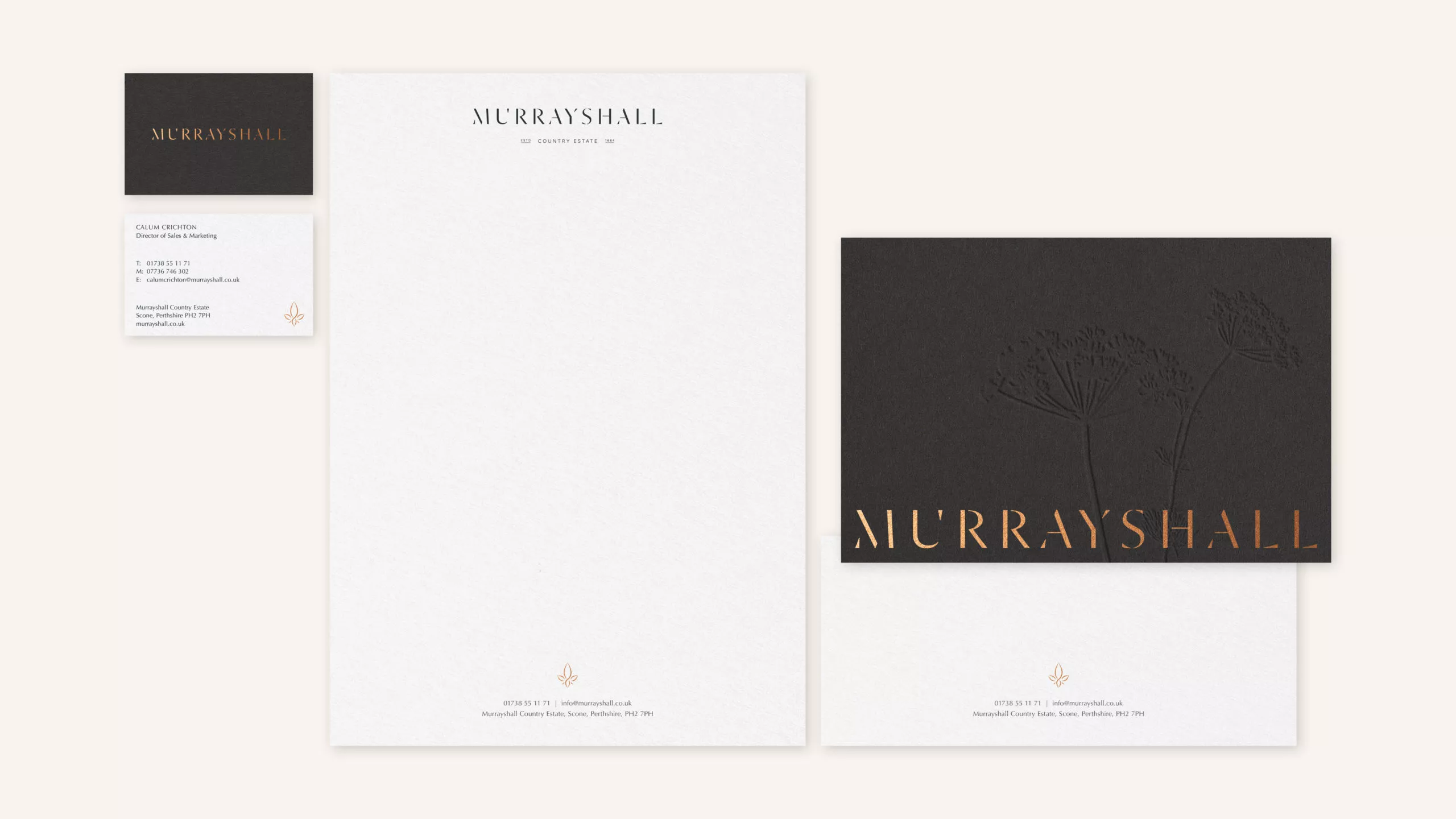
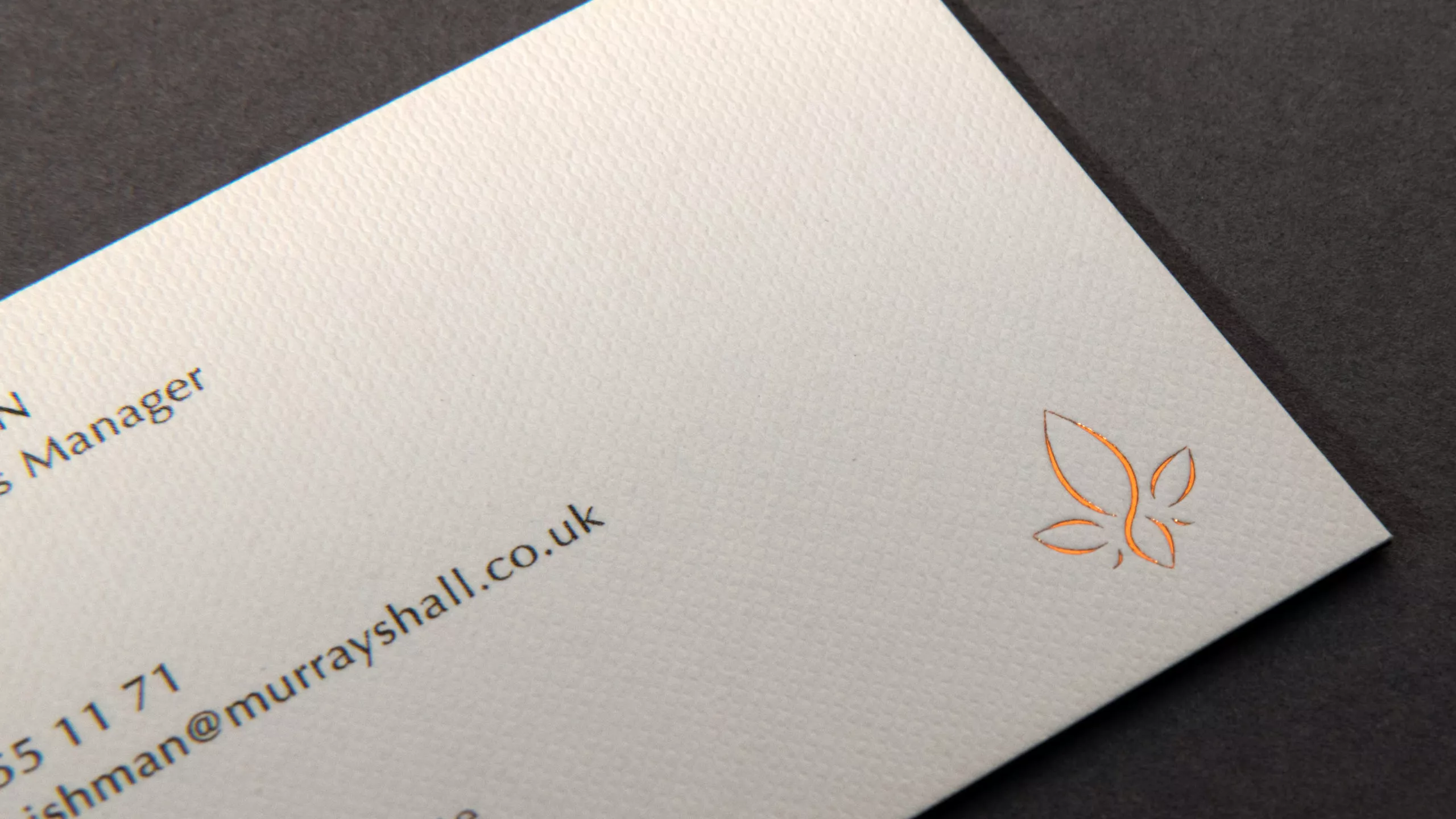
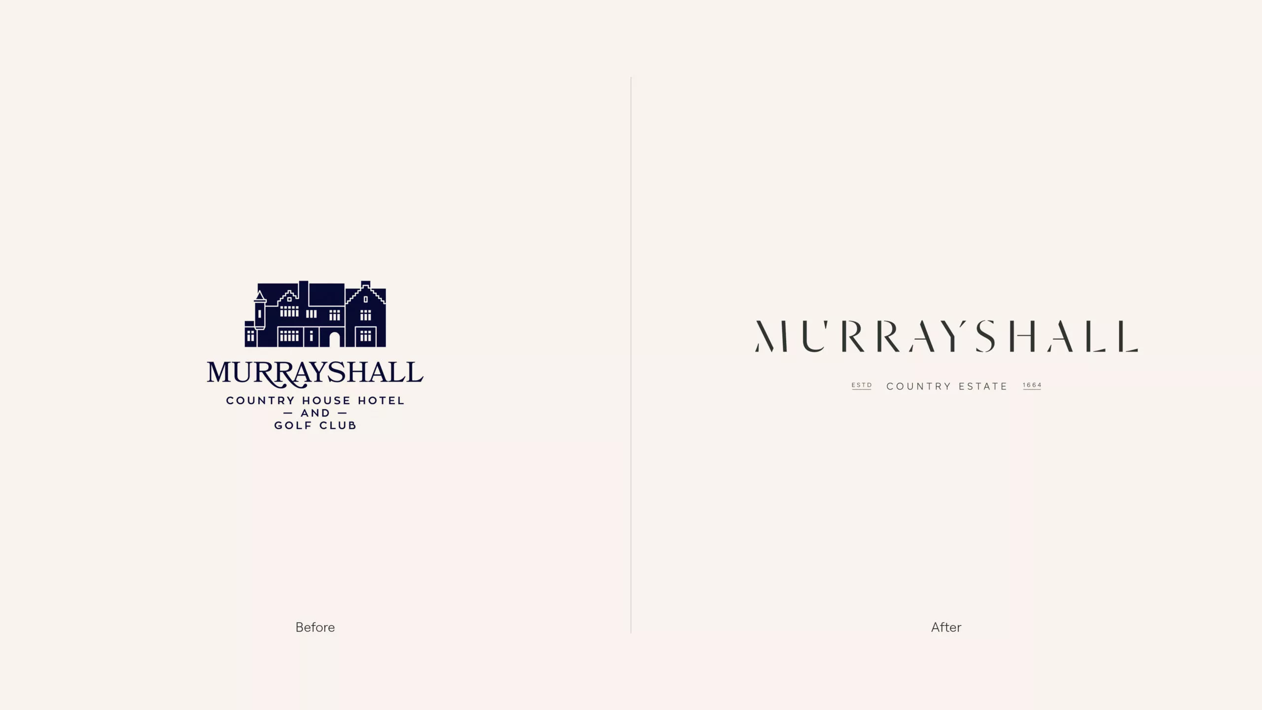
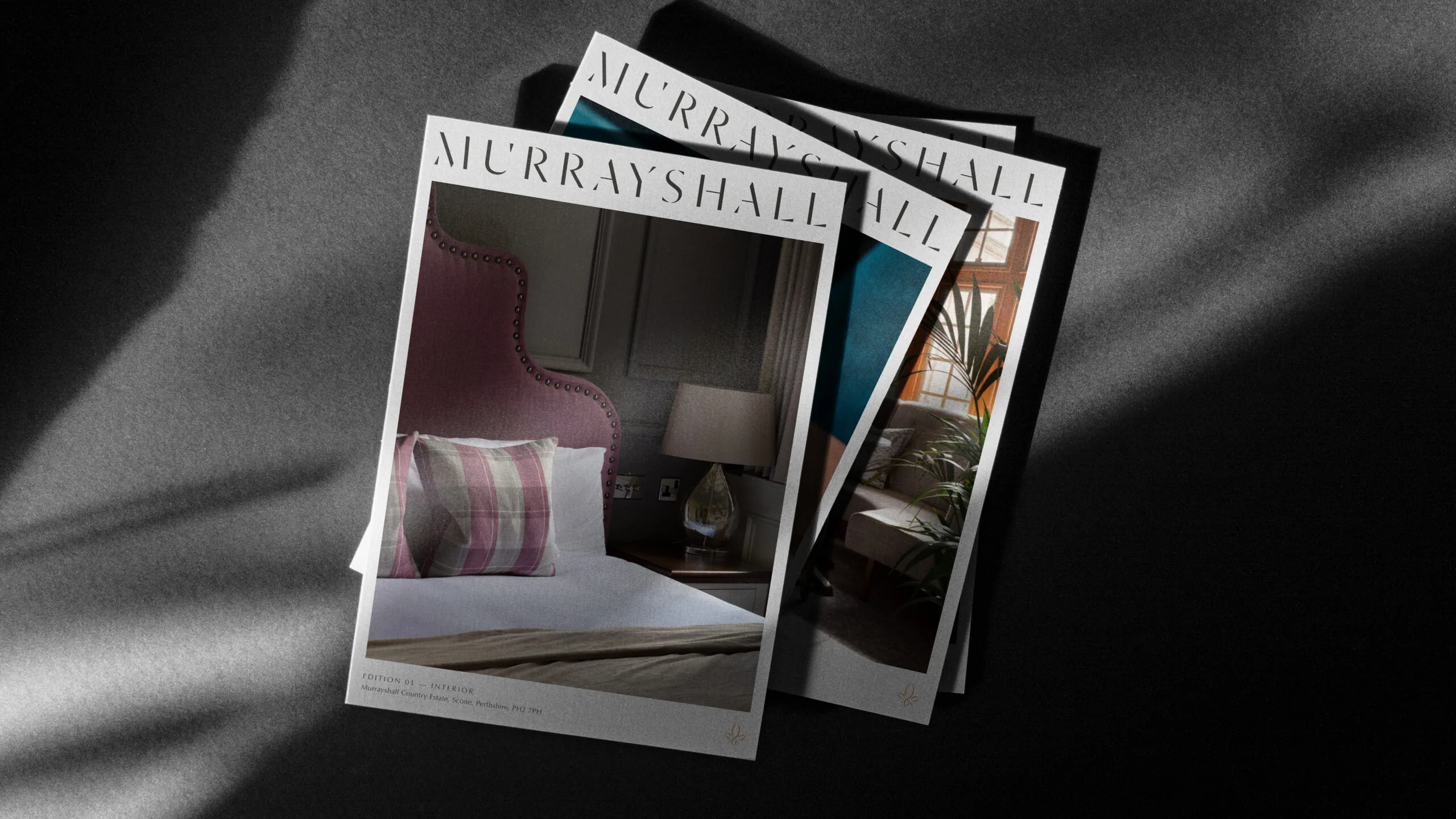
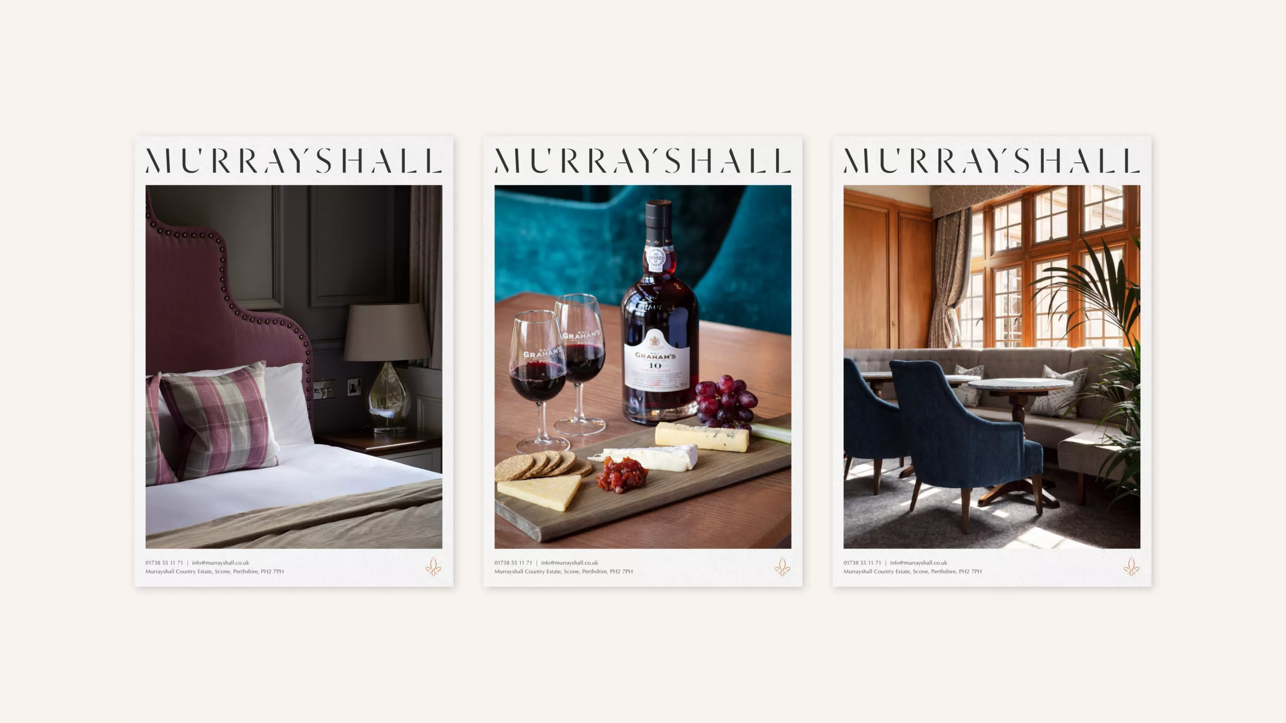
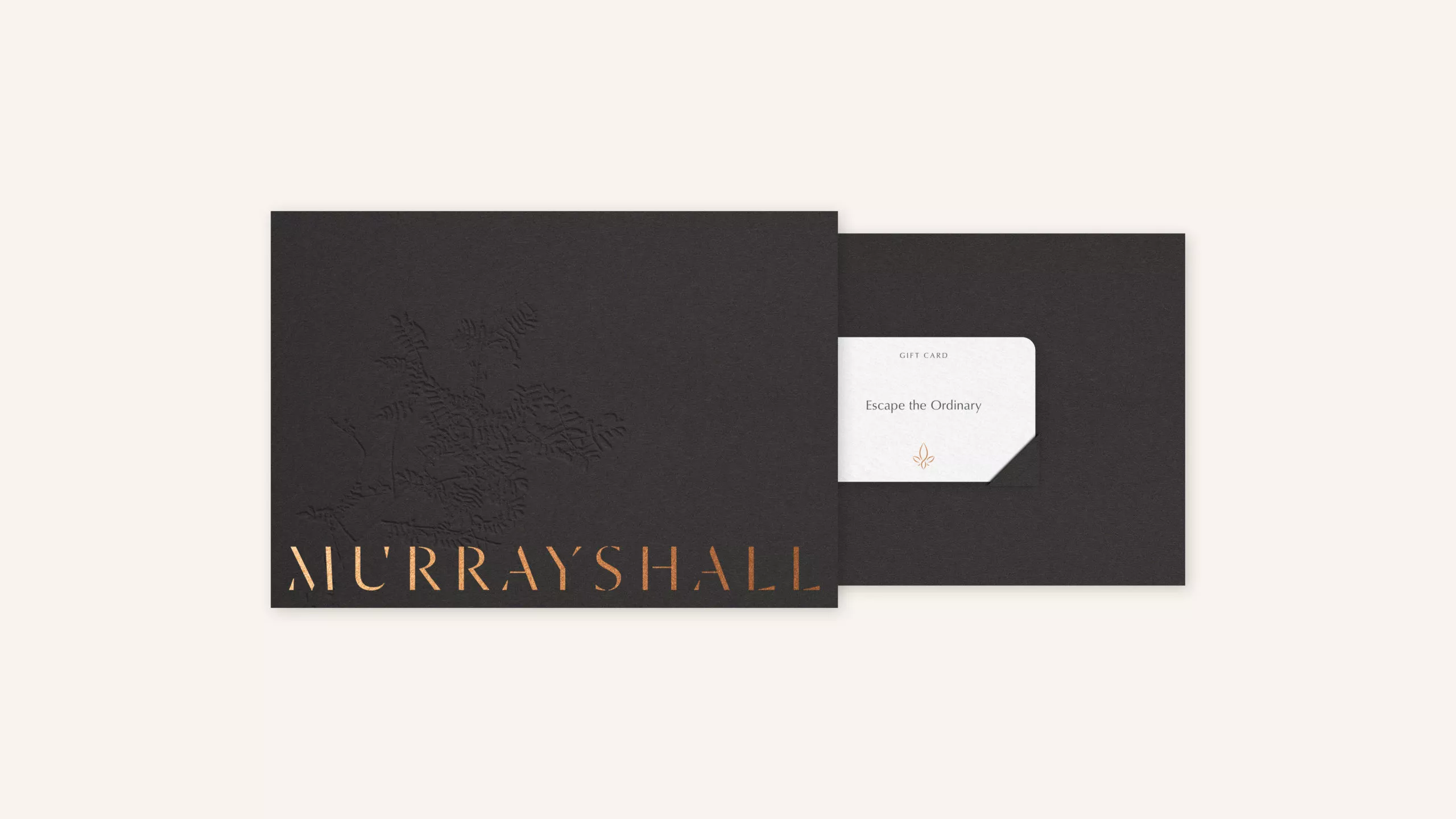
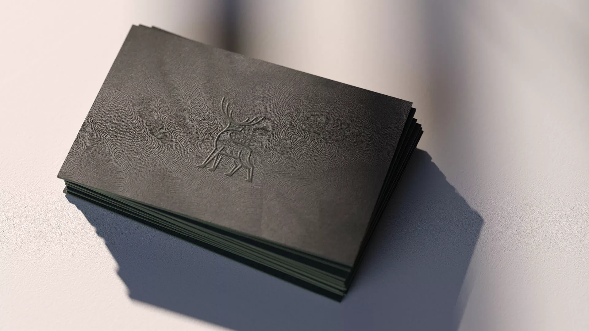
The logotype takes inspiration from the shadow and light cast by the sprawling countryside, revealing beautiful forms and distinct shapes. A fleur-de-lis is used as the secondary device in the new identity system as a nod to the history of the estate. Not only does the fleur-de-lis appear on both the Lynedoch and Murray family crests – both former owners of the property – but it is also know to symbolise life and light.
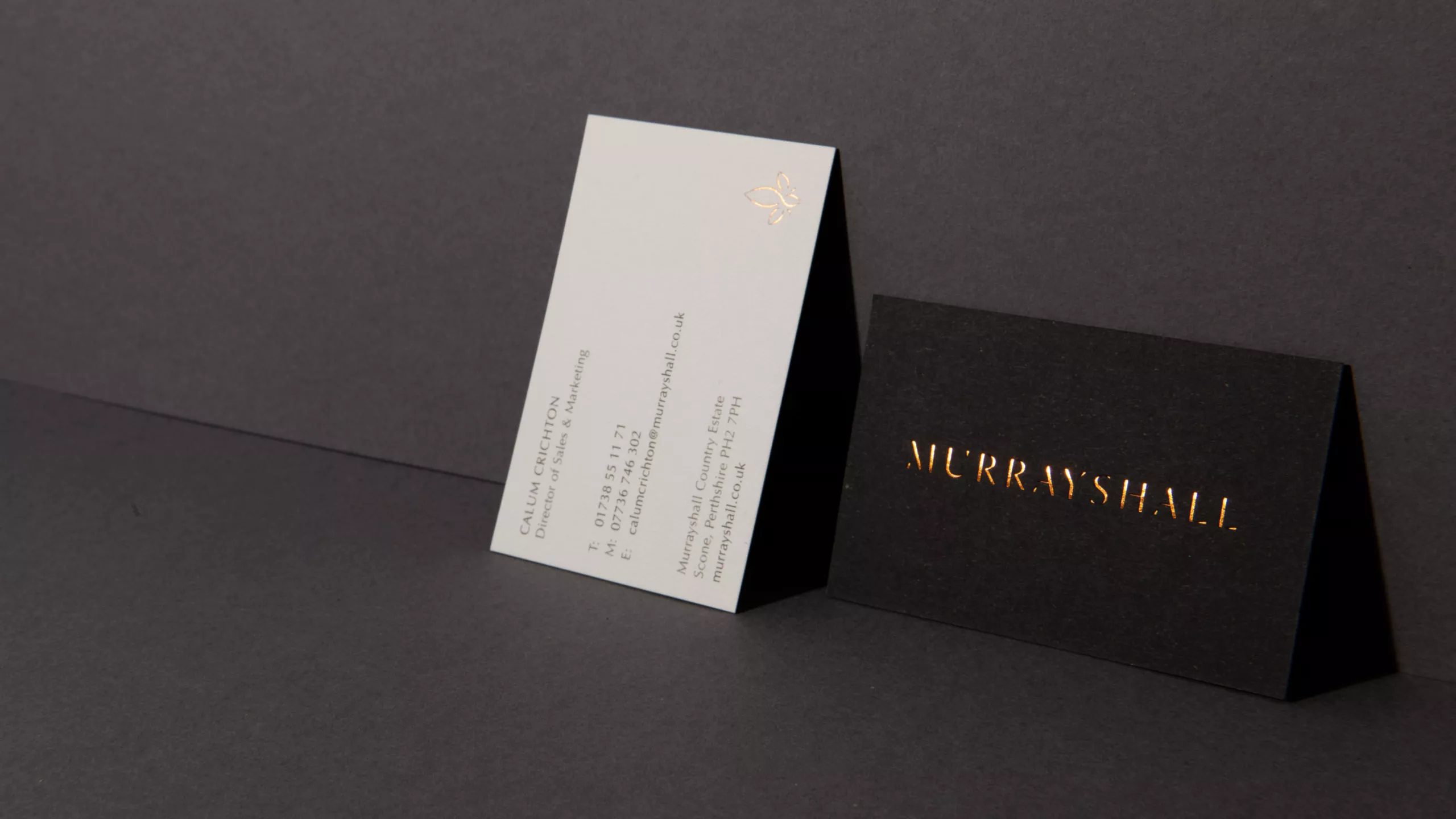
In application the colour palette consists of a warm tonal range to mimic shadow and light. The finish builds on the deliberate juxtaposition of elements which is reflective of the hotel’s contemporary interiors and traditional exterior.
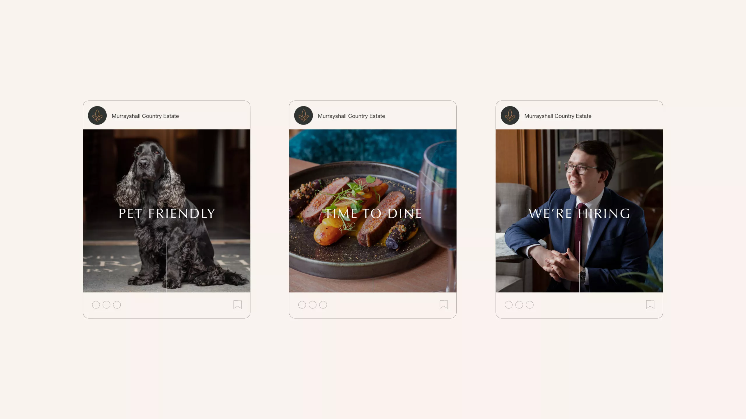
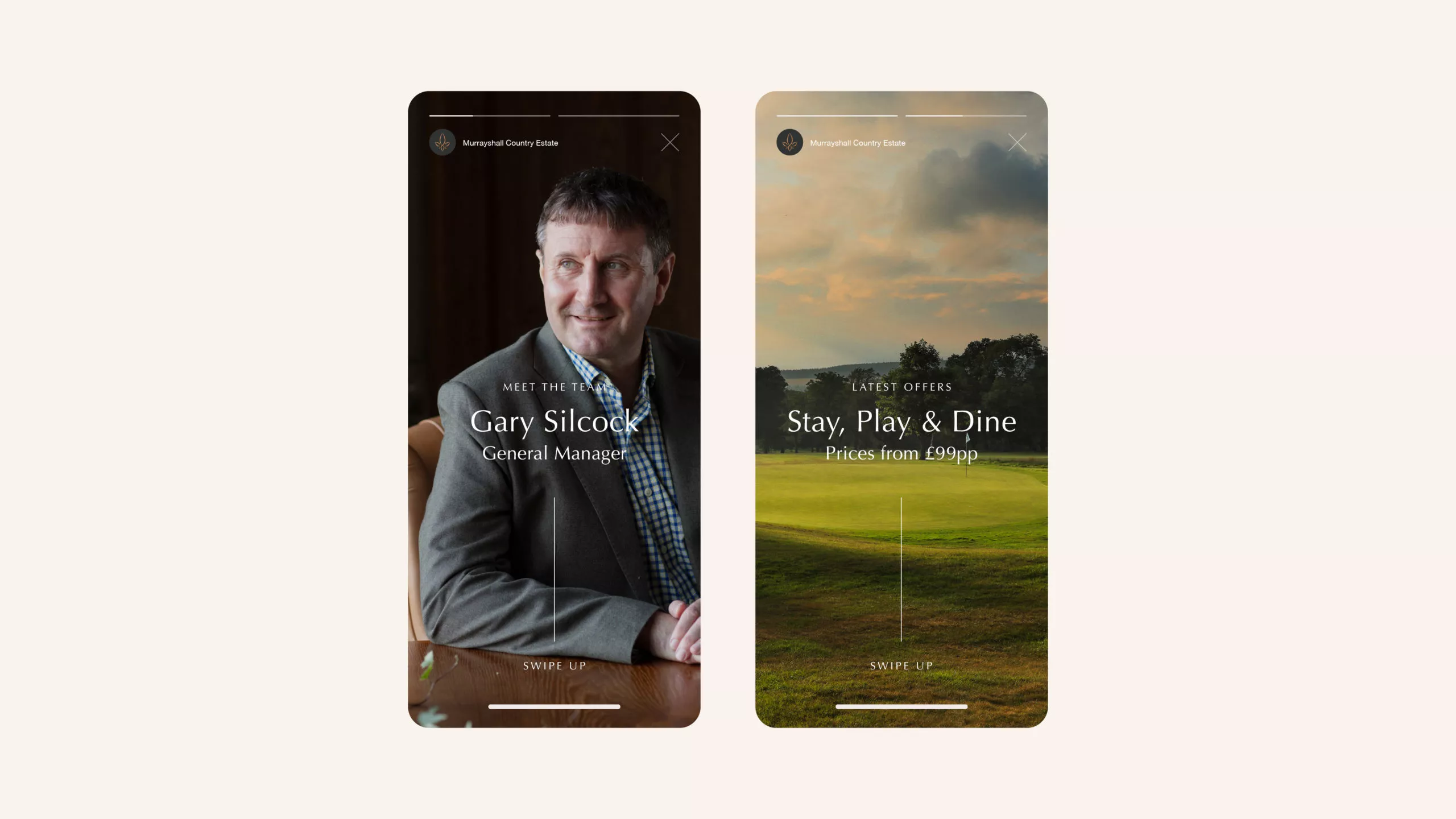
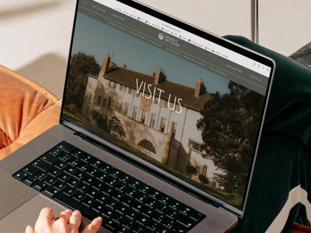
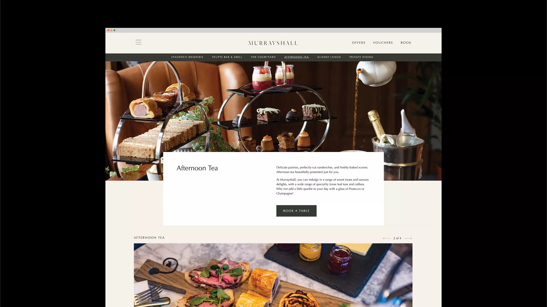
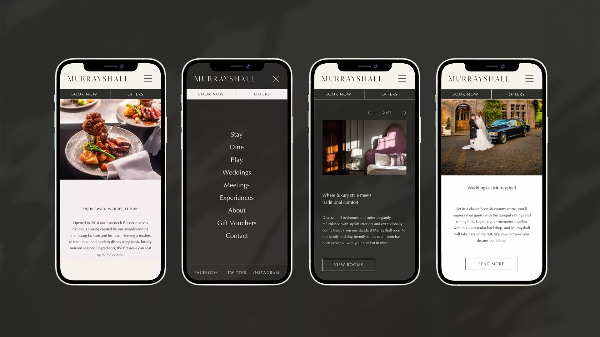
Our brief for the Murrayshall website was to inspire potential visitors into seeing the property in a new light. Although the primary focus would still be driving hotel bookings, it was essential to help people understand what else the resort could offer beyond this.
Atmospheric video content and photography was undertaken to capture the beautiful surroundings and varied pursuits of the resort. The videos were created with dramatic lighting and high contrast shadows to complement our typography and reflect the brand concept.
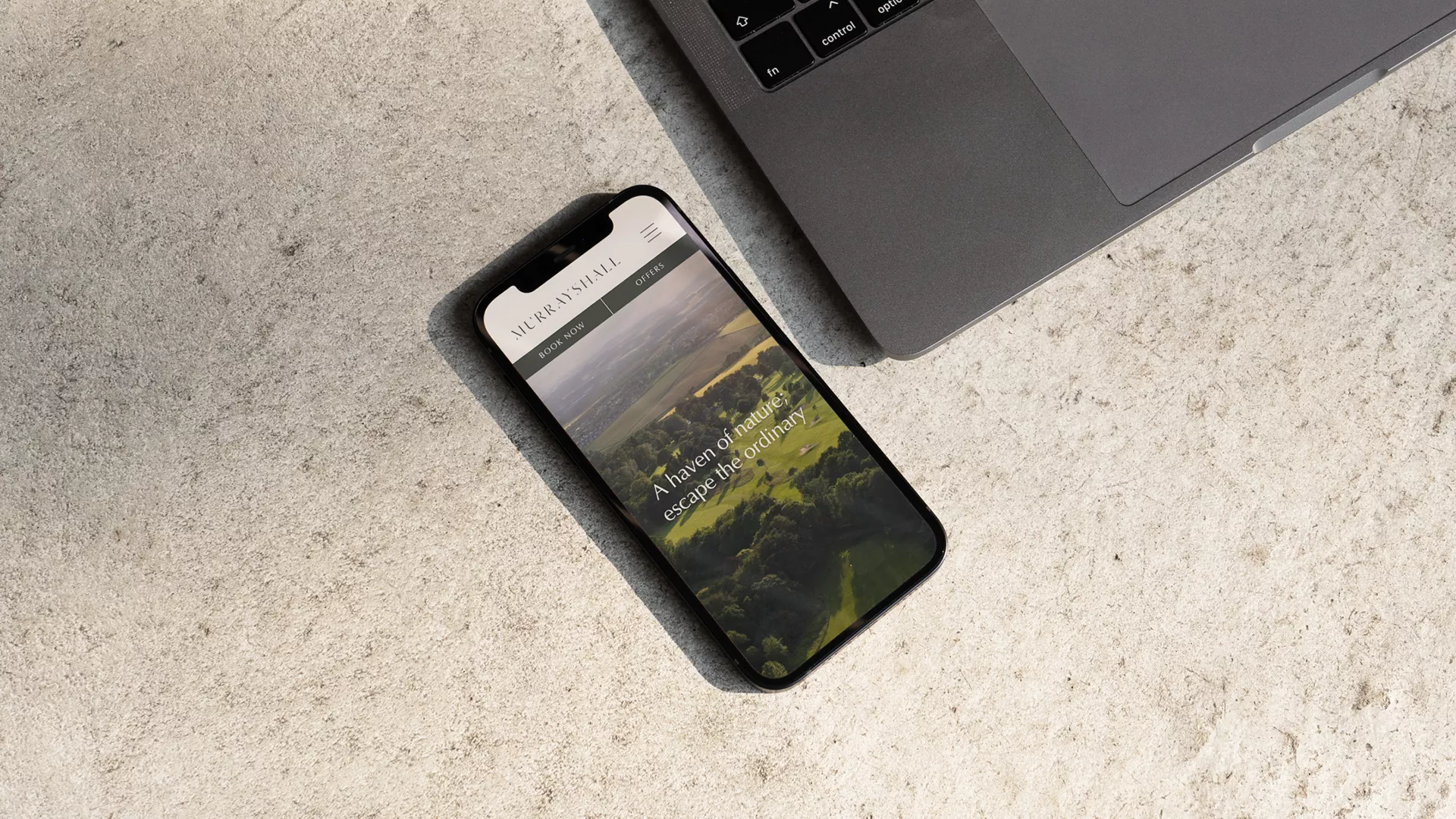
This content was then utilised with a minimal colour palette and elegant type to create a welcoming feel that would encourage users to engage and explore. Multiple booking systems for the hotel, golf, gift vouchers and restaurants were all seamlessly integrated to drive instant enquiries and create seamless online purchases.
Related Case Studies
What We Do
We strip back the unnecessary and untangle the complex. Behind every creative project, there is a collaborative process and solid creative strategy built to deliver meaningful impact.