A place like no other.
The Torridon
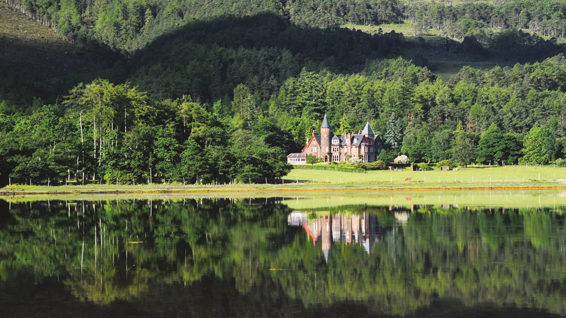
In early 2020 we were tasked with the rebrand for The Torridon, a historic Victorian hunting lodge which is now one of the leading 5-star hotels in the UK, located in the North-west of Scotland, welcoming guests from around the world.
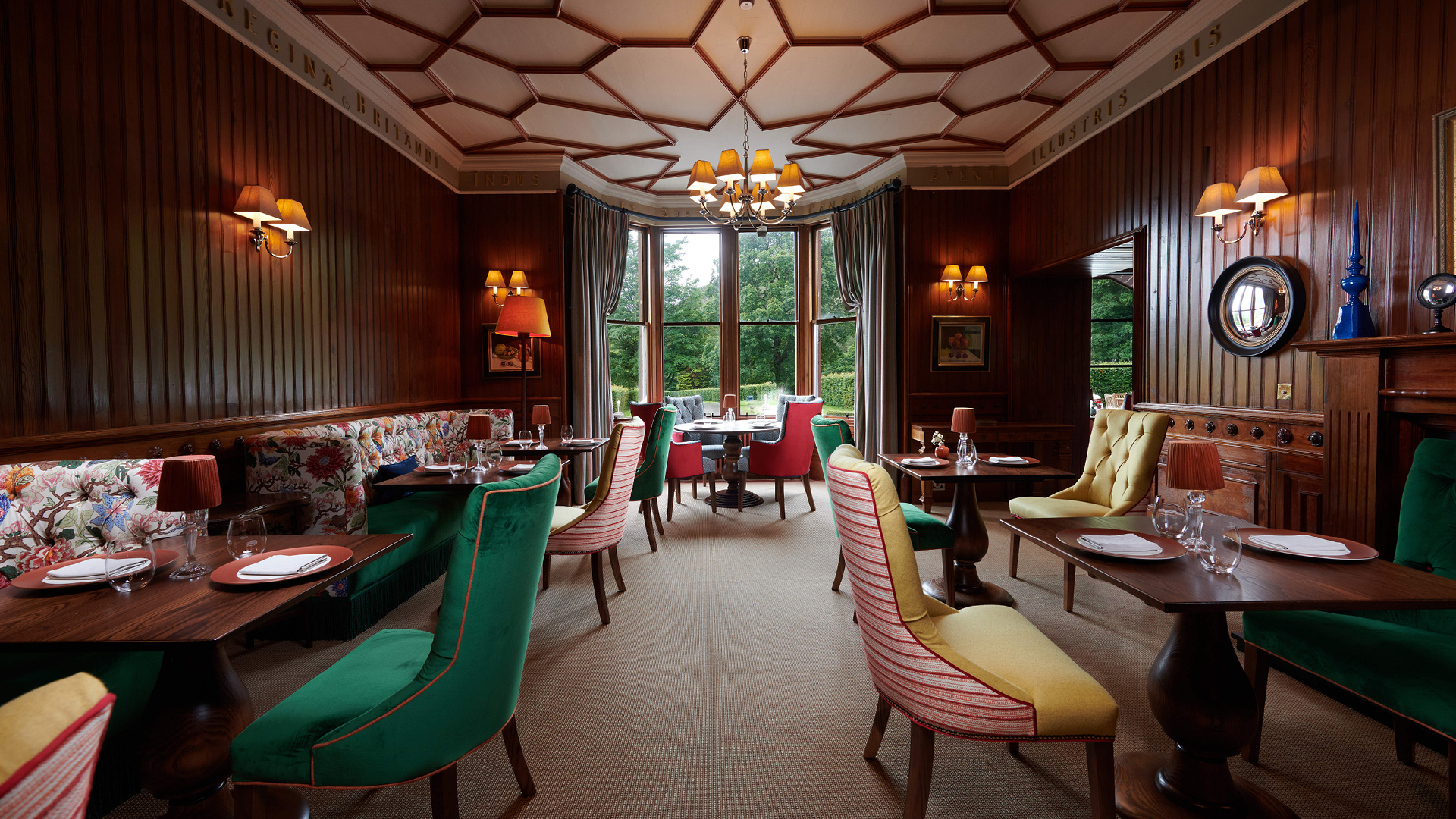
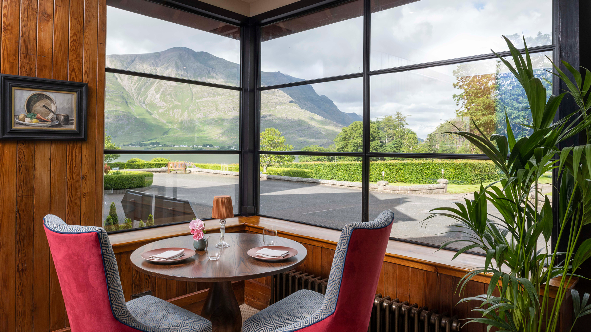
In the last 5 years, The Torridon has progressed from a 4 Red Star hotel to a 5 Red star hotel, expanded its offering and grown into one of the top hotels in the UK. This rapid progression meant that The Torridon outgrew their brand and the need to reconsider their vision was clear. With focus on guest experiences and a mantra of ‘quality in everything’, owners Dan and Rohaise have worked tirelessly to restore the hotel’s Victorian features, large whisky bar and more recently a new modern restaurant.
Over the course of the year, we worked closely with the client to develop their brand identity, creative direction, tone of voice, website and progression of their internal brands from restaurants to activities centre. We knew that the identity had to reflect the hotel’s highland surroundings but also capture the values of authenticity, timelessness, tailored escapism and adventure.
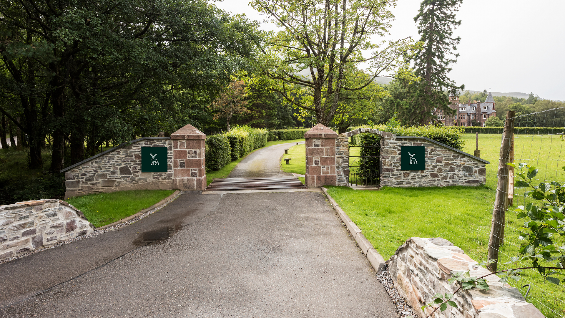
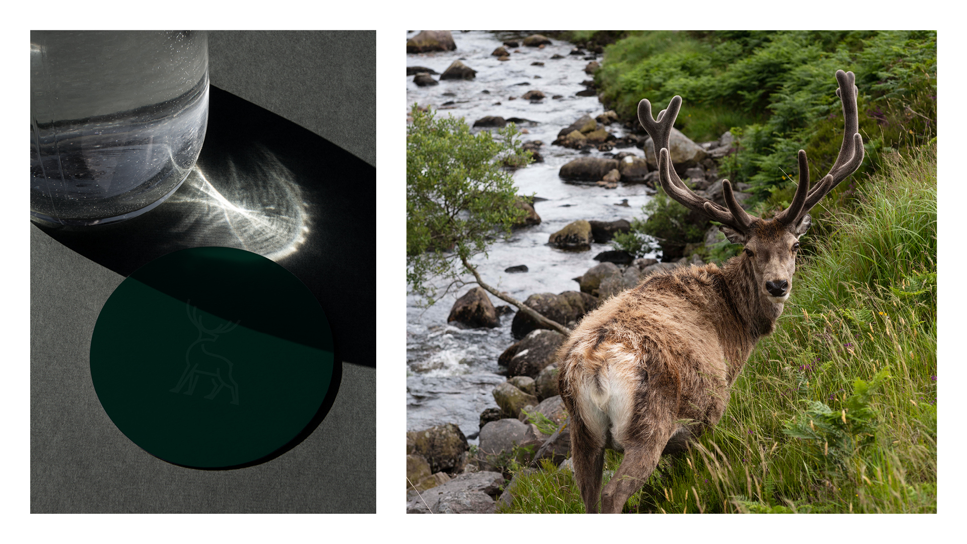
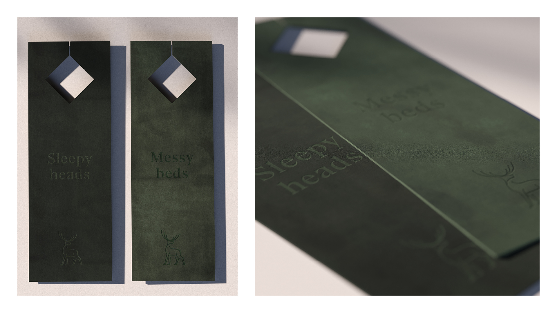
Stags are an iconic feature of the Scottish highland landscape and can often be seen roaming around the grounds near the hotel. Imagery of stags and deer are present throughout the hotel in different formats, there is the Andrew Kay sculpture which sits proudly at the hotel entrance and there are various stag mounts which connect the hotel’s past life as a hunting lodge to its new position as a leading, meticulously considered hospitality establishment, perfectly.
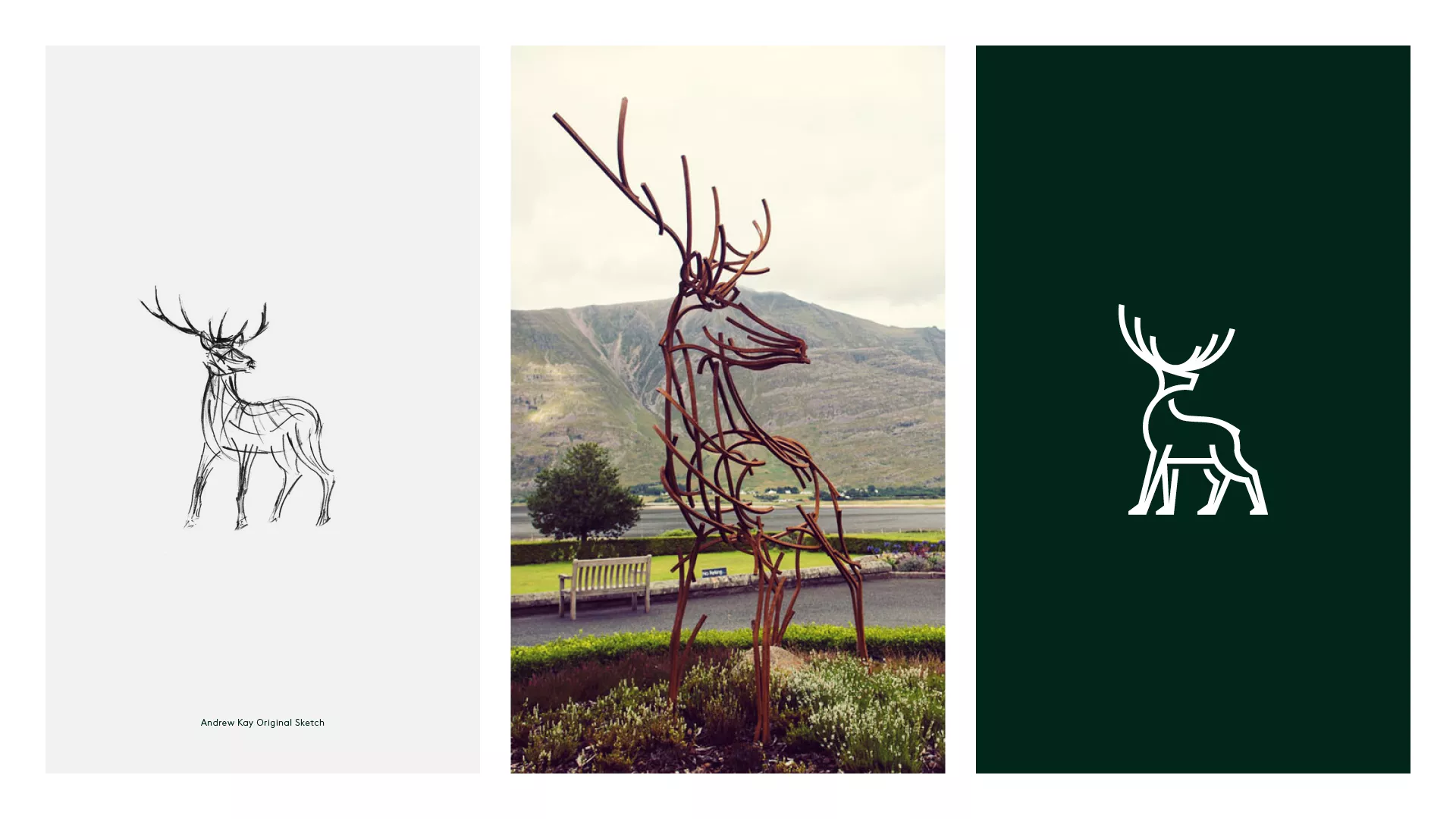
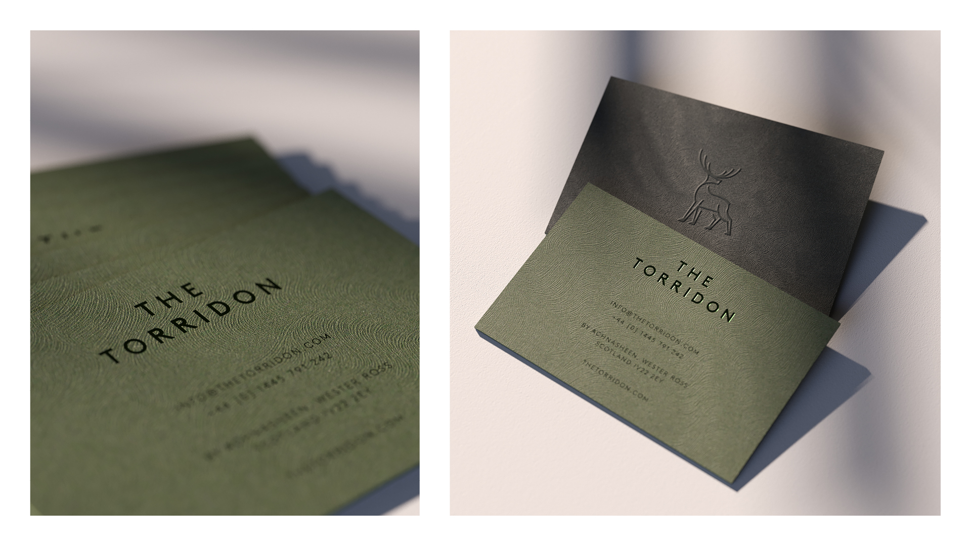
Throughout the process we visited various symbols and crafted monograms but the stag was always the perfect fit for the hotel and its location. It captures the hotels values whilst symbolising pride and adventure. We created the bespoke stag marque taking inspiration from the original sketches of the Andrew Kay sculpture with consistent, single weight lines which give the brand a contemporary look and feel. This aligned with the hotels vision of rethinking classic country and redefining luxury.
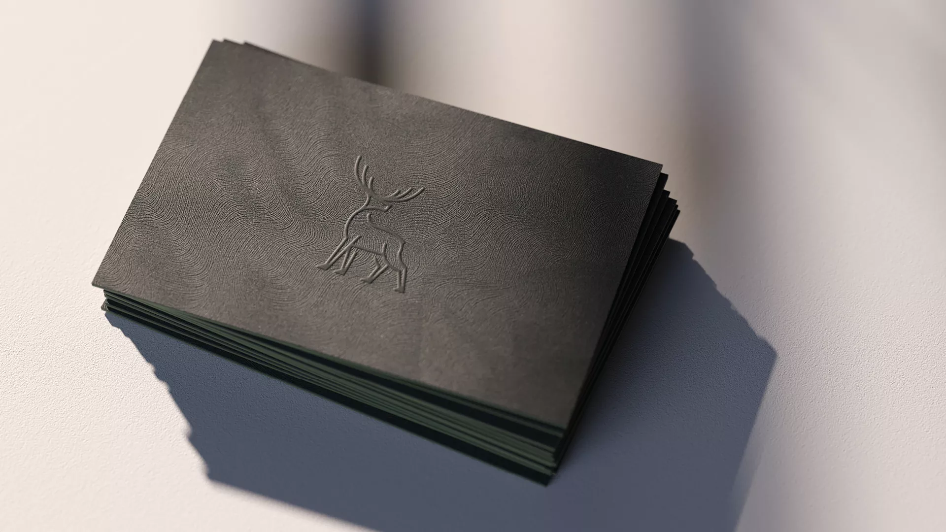
With digital platforms proving key in an ever-evolving marketing strategy, the stag icon can be easily adapted for social media and mobile web browsing at smaller scales without losing its elegance and character. It also acts as an ornate and recognisable logo for the overall resort when used as a sign off in the various restaurants and bars touch points.
A contemporary take on a traditional serif typeface was introduced to compliment the modern brand. This was inspired by hand carved writings found on the clocktower of the hotel, crafted to appeal to The Torridon’s diverse target market from the affluent adventurer to those who just want to be looked after. This bold and modern approach reflects the rugged nature and beauty of the landscapes, it’s quirks and a suitable nod to the history of the hotel.
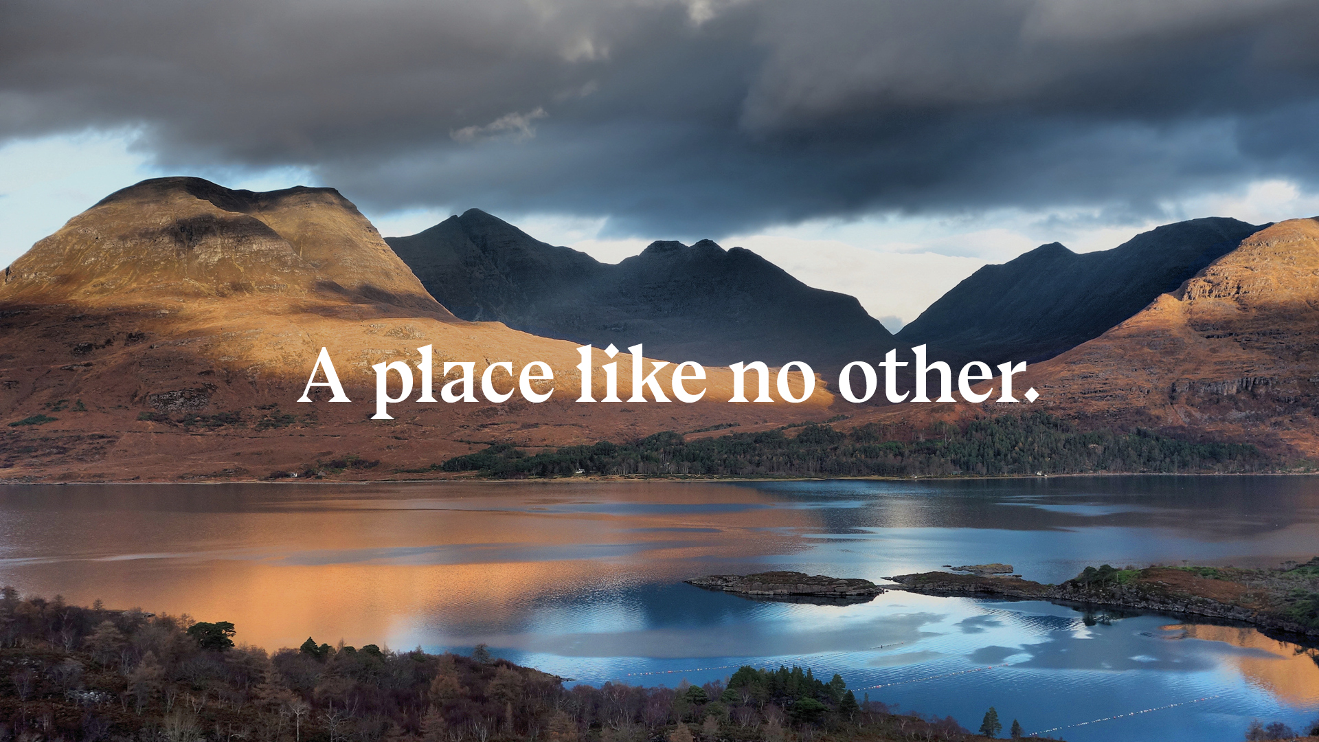
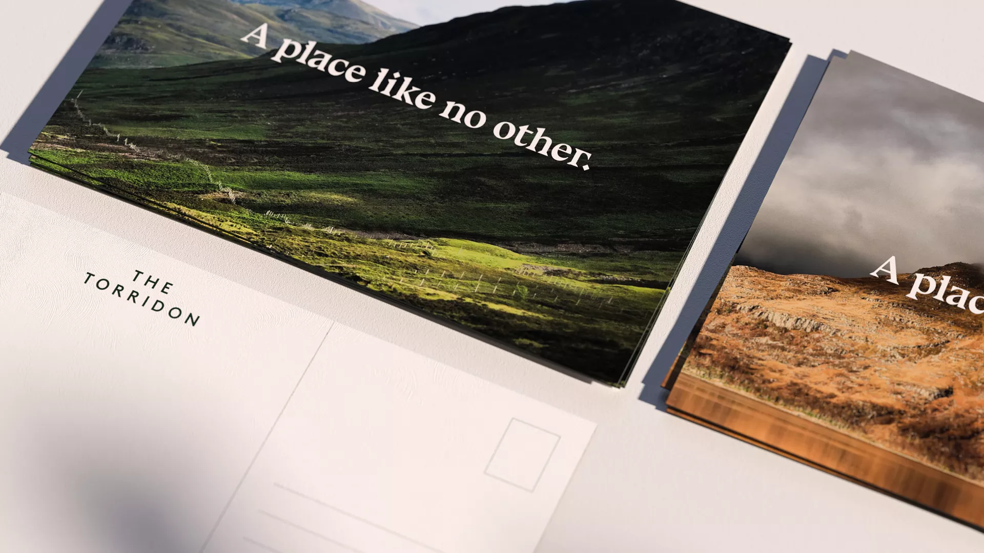
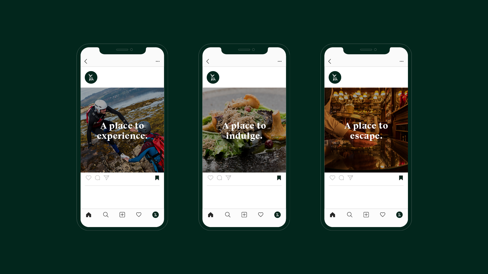
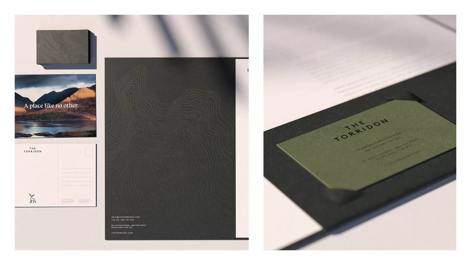
We developed a new tone of voice for the brand which relaunched with a campaign titled ‘A place like no other’. With such a diverse audience and with so much to offer it was key that our tone of voice was able to capture the imagination of a global audience. Secondary brand statements such as ‘a place to escape’ and ‘a place to experience’ along with a new suite of photography meant that striking visual combinations could be created to really focus marketing and advertising unlike before.
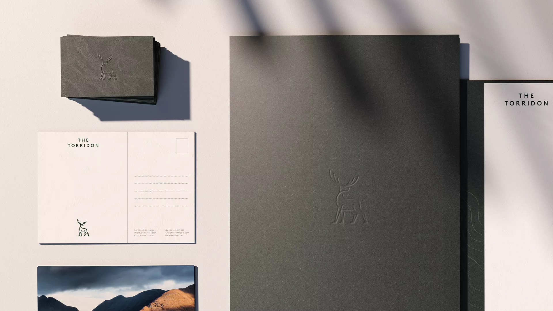
Touch points were designed with tactile finishes and a rich colour palette which take inspiration from the traditional features found throughout the hotel and the Scottish landscape. The Torridon is a place that you can almost feel to the touch and we wanted the touch points to have a similar sensory effect. Secondary elements such as custom patterns and illustrations were also created for use across the brand.
As part of the overall resort rebrand, The Torridon took time to restyle and relaunch the on-site restaurants and bars. We developed stand alone identities for each with their own specific brand direction. This was key to differentiating the various bars from high end whisky bar to traditional pub.
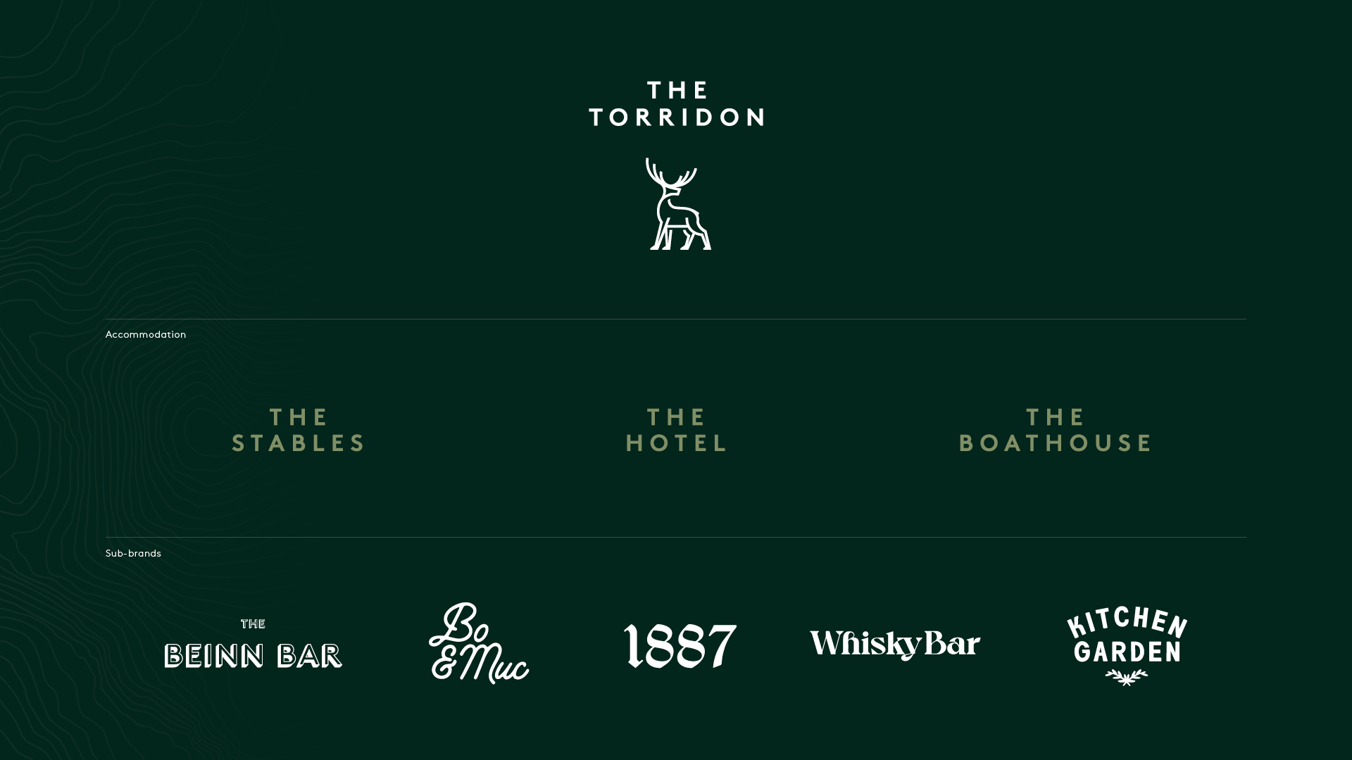
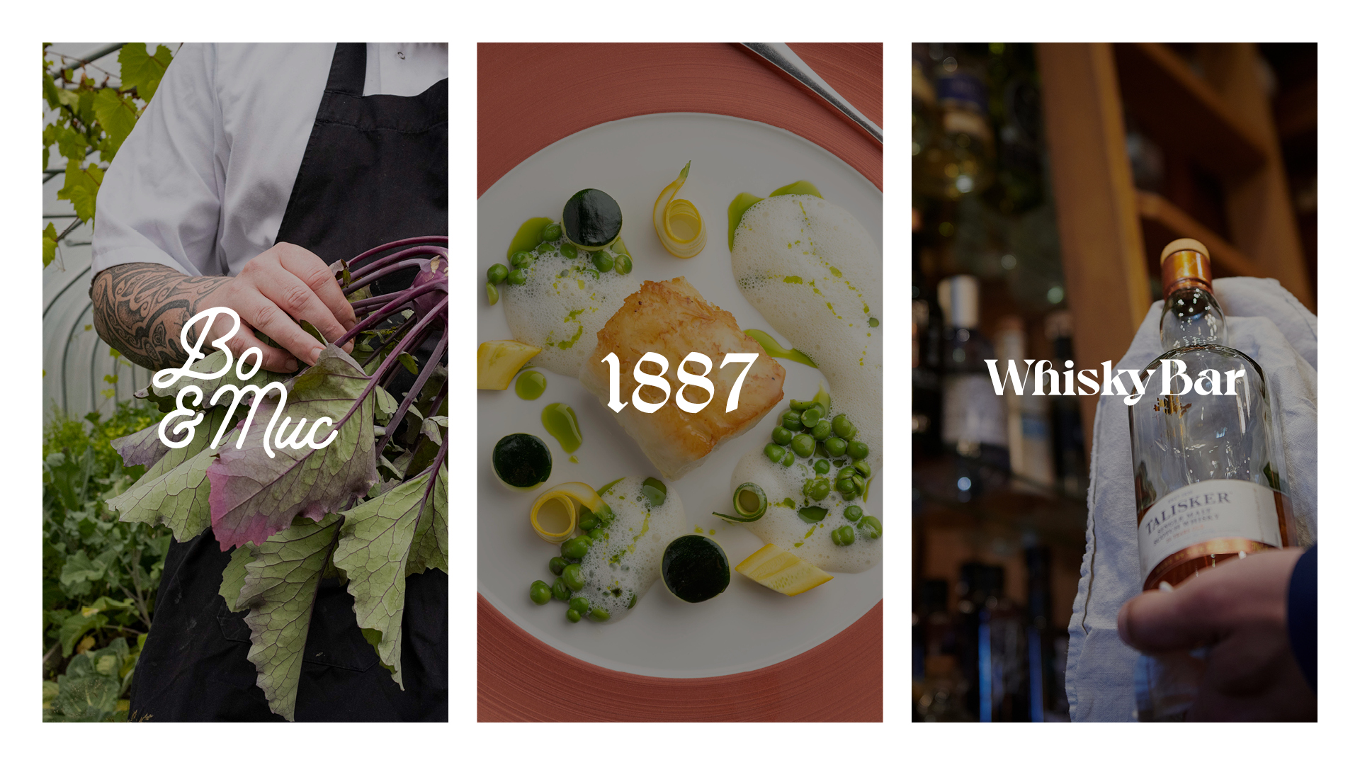
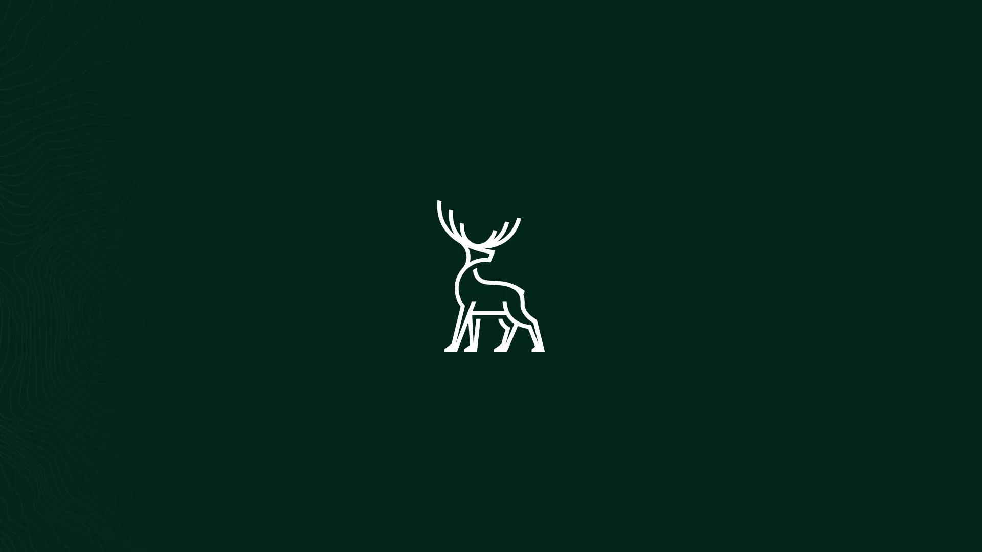
Image credits:
Interior and location photography by JP Photography & Rata Photo.
CGIs by Render.
Animation by Andy Tomlinson.
Related Case Studies
What We Do
We strip back the unnecessary and untangle the complex. Behind every creative project, there is a collaborative process and solid creative strategy built to deliver meaningful impact.