New Project: Wellbeing Booklets
30.04.2015
Wellbeing booklets – creating a link between weather, colour and mental health conditions.
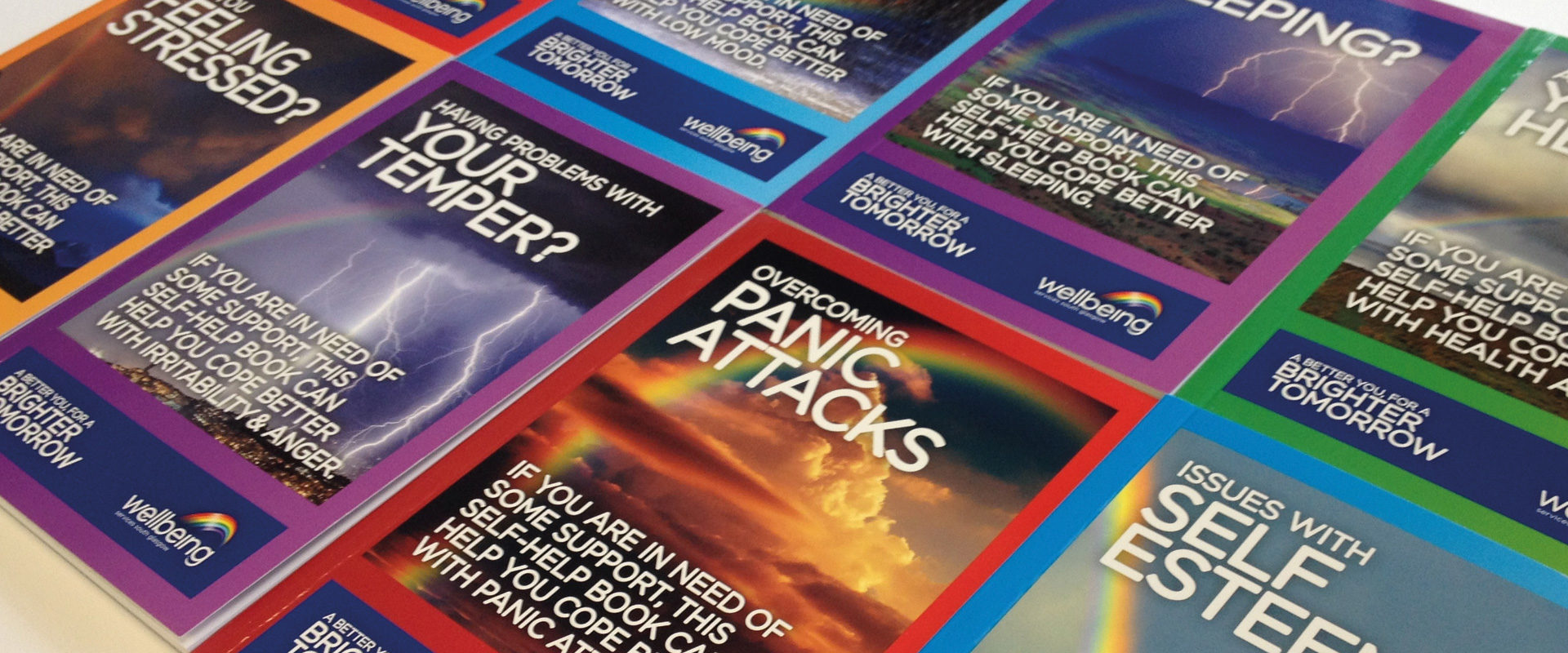
We have been working on this project for a while now, as we wanted to make sure it was perfect and met the design brief. The client, Wellbeing, asked us to create 8 separate brochures each focusing on a different aspect of mental health, from depression to anxiety to insomnia.
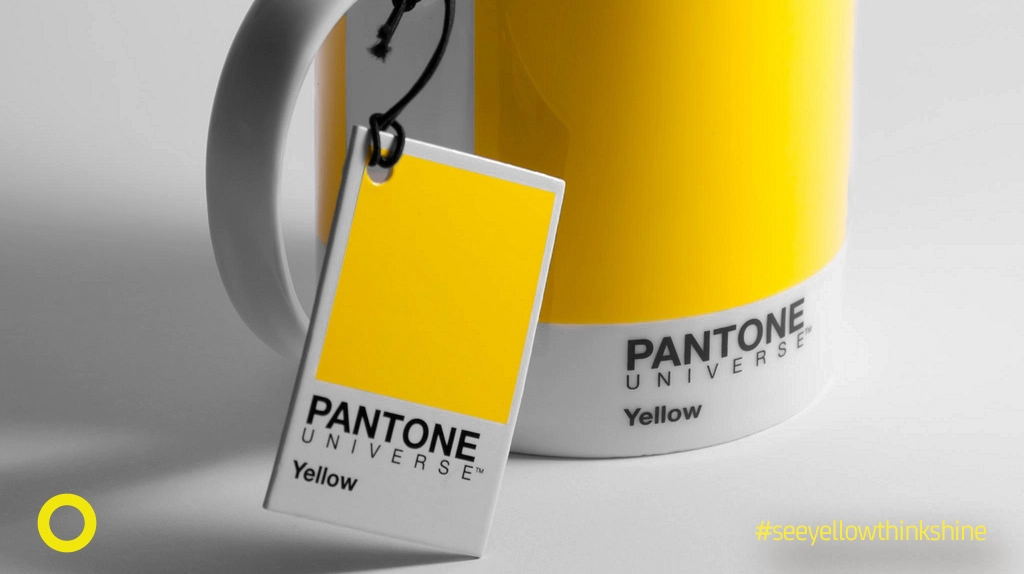
Wellbeing’s new branding incorporates weather related imagery, focusing mostly on a rainbow for it’s use of colour and symbol of hope. They also use the colours to distinguish between the areas in which they work. Carrying this concept through to the project, SHINE formed different information booklets categorised by colour and topic. We also wanted to make sure the message was clear and consistent, so we used strong imagery to reflect the emotions behind each mental health condition.
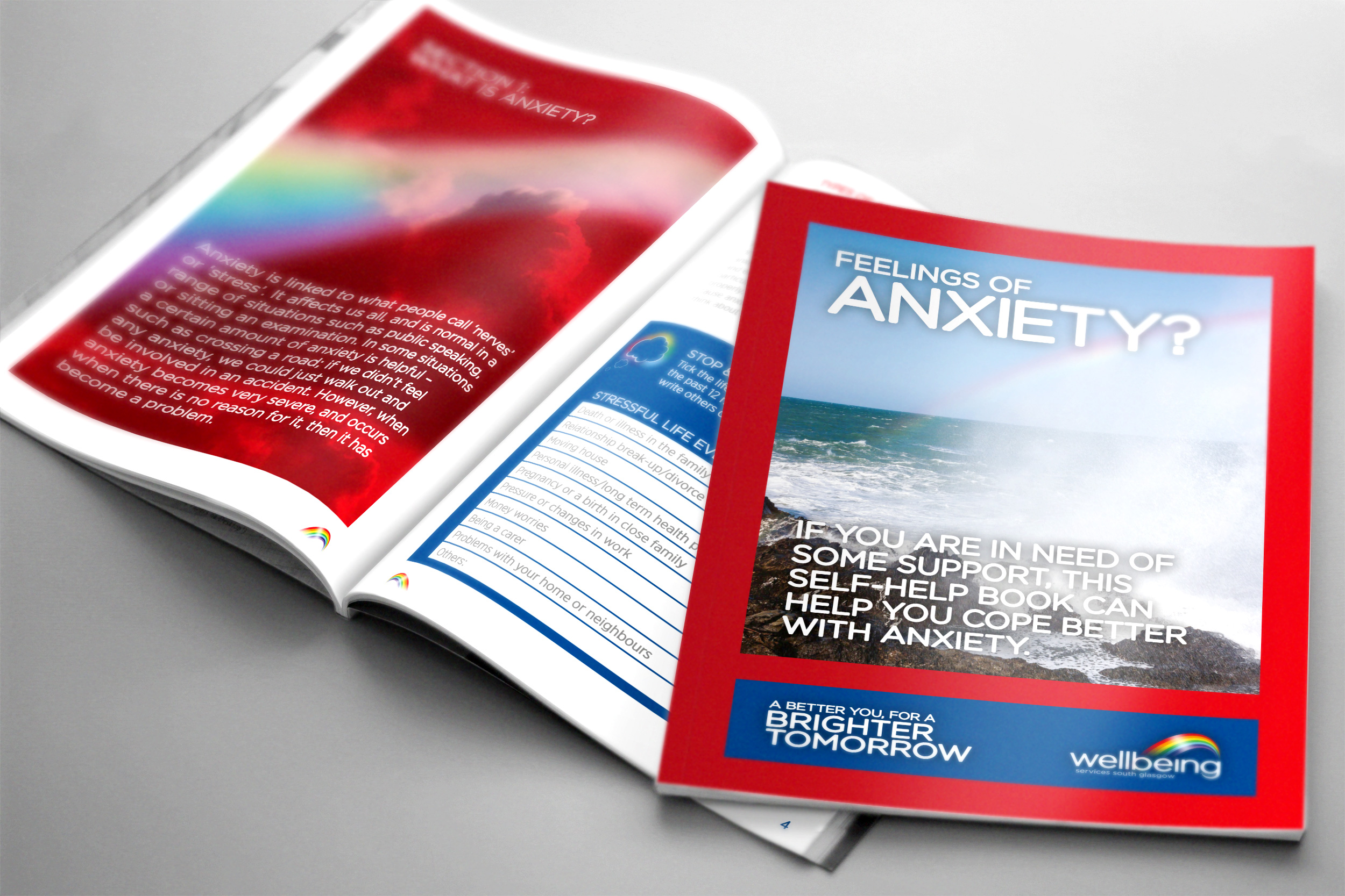
Colour can be used to really engage with people and their emotions. Studies have shown that colours can be soothing and help to release tension. This, together with the imagery from the brochures, corresponds well with the brand message and the hope it promotes: