The Design Strategy Behind Airport Signs
14.05.2015
Did you know there is actually a lot of thought and design behind airport signage? There are strategies behind even the simplest of signs…
Airports can be really stressful. Most terminals are massive with over 100 gates spread over the airport. It just so happens that every time you travel your gate is always at the opposite end of the terminal!! Last calls are announced over the tannoy and people are rushing past trying to catch a plane – cabin bags in tow. With all this going on, it’s easy to see why people don’t seem to appreciate it if you stop in the middle of their path to read a sign.
Travelling can be such a daunting task, particularly if you don’t know where you are going (although I would recommend knowing where your plane is going…) Language barriers and complicated signs can make it even more stressful and hard to understand. Airport managers have understood this and decided to develop a strategy for reducing stress and enhancing usability.
They created a guideline and a strategy for designing signs to make it easier to read while running past. Using ‘Wayfinding’ signs, the airports have carefully planned how to ease the stress and enhance consumer experience. Wayfinding signage is a design technique to simplify directions and help consumers find their way.
There are three main aspects to consider when designing Wayfinding signs, particularly in airports.
Easy Interpretation
Keeping the text to a minimum, airport signs generally use figurative numbers and directional symbols (such as arrows). This allows people to glance quickly while sprinting to make that final boarding call. It also creates a message that is universally understood by travellers, regardless of their dialect or language. There are is nothing more frustrating than a sign that it hard to interpret and you end up going in the wrong direction. Some signs are more effective than others, and issues can arise when the design has not been considered properly.
High Contrast
As there are many different types of travellers with various needs, the signs have to be interpretable by all. The use of colour is fundamental to this aspect, using high contrast in colours can help to improve the readability of the information, particularly for those who are hard of hearing or struggle to see clearly. The signs are designed to be eye-catching and bold.
Colour Coding
A colour coding system was also established to differentiate between the different types of information provided. Interestingly, not many people are aware of this. Across the UK, certain colour combinations have been chosen to aid interpretation.
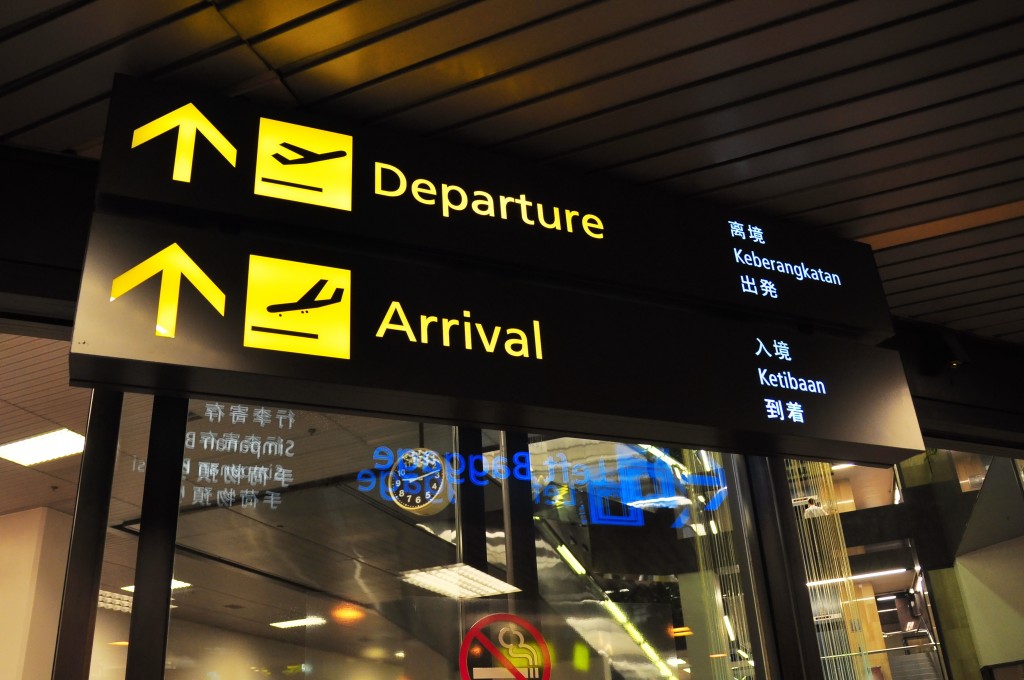
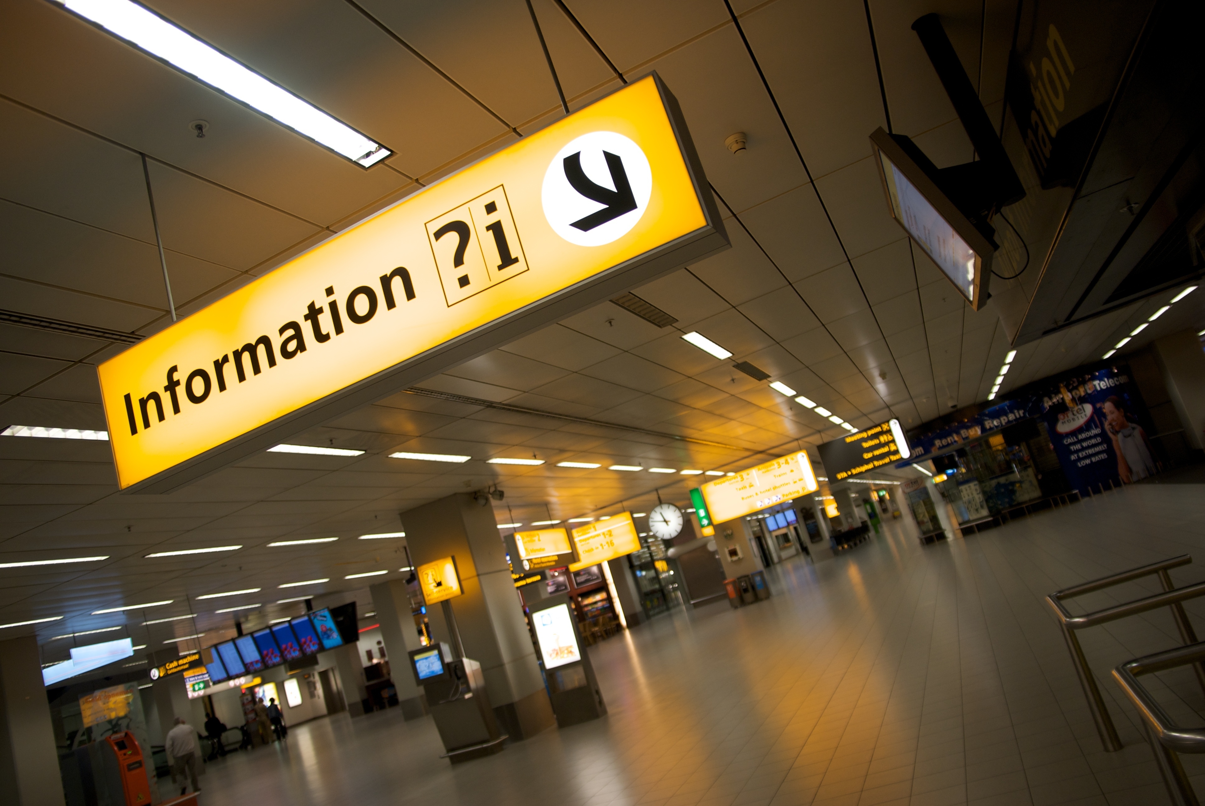
Directional signs (such as the one above), are to use yellow text on black backgrounds. While information signs represent where passengers can find answers to their questions. These signs reverse the colours of directional posts, instead using black lettering on yellow backgrounds (as shown below).
Of course, SHINE are particularly interested in the use of yellow in the signage. Yellow is bright and allows signs to stand out and be seen easily. Just another reasons to love yellow!
So there you have it. The design strategy behind airport signage. The next time you are in an airport, consider the thought-process behind the signs that you see (and remember to think of SHINE when you notice the yellow!!) There is much more than meets the eye to these simple designs…
We have also created a board on Pinterest for signage design, a whole collection of clever or innovative ideas which we will be adding to on a regular basis. Be sure to check it out here.