The Psychology Of Colour
09.09.2016
Striking fear in the comic book character, Green Lantern, our favourite colour yellow is psychologically the happiest colour in the colour spectrum!
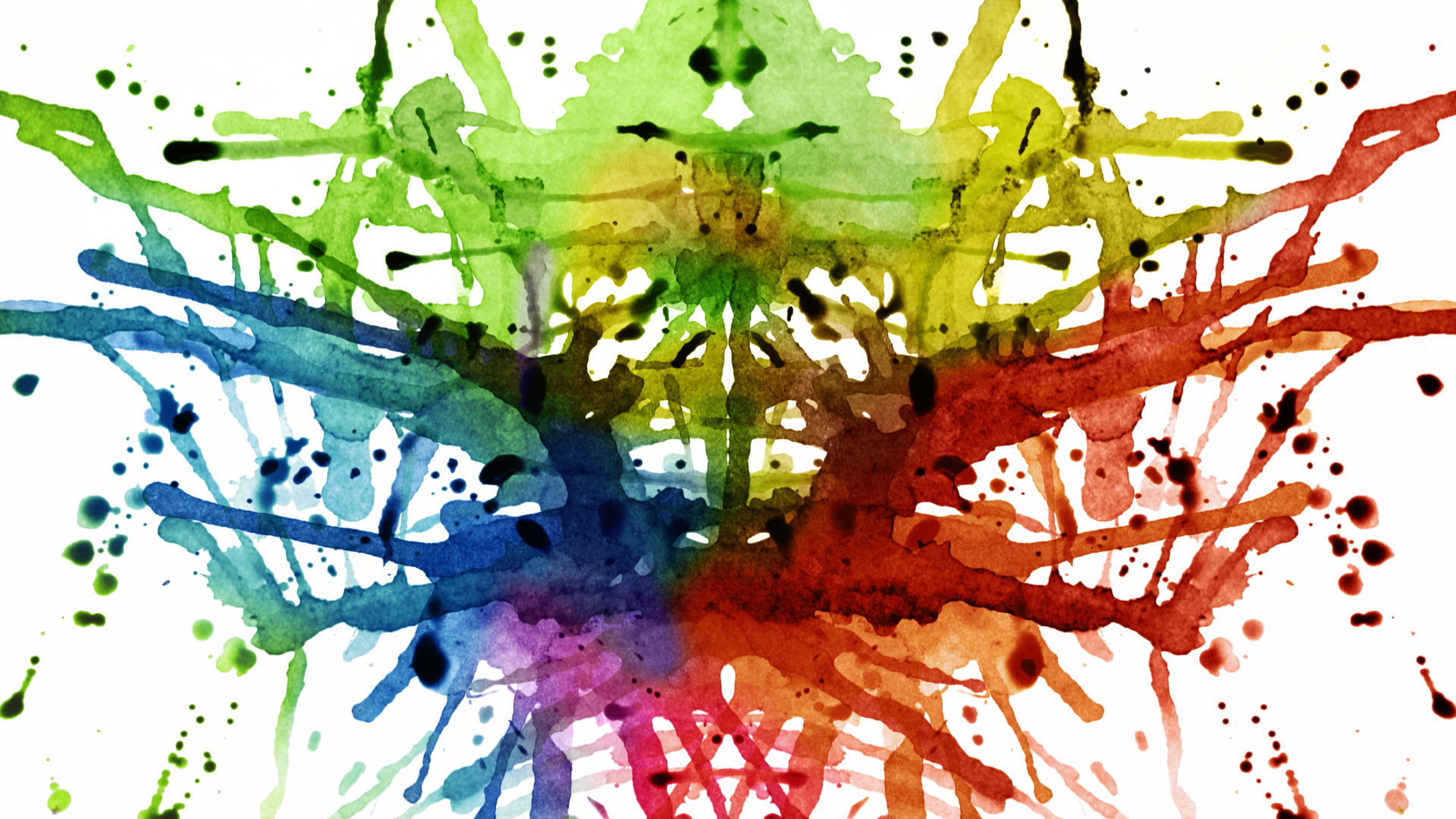
In reality, there is no accurate findings of the effects that colours can have on individuals because it’s all down to the personal preferences, experiences, culture and background of a person that will determine the way that colours influence their emotions. However, when it comes to branding, colour can have a detrimental impact. Different colours ooze certain connotations and can provoke emotions in people for the positive or the negative!
Let’s take a look at some well-known brands and the iconic colours they have chosen.
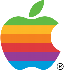
In light of the recent launch of the iPhone 7, we’ve taken a look at the history of Apple’s oh-so-famous fruit icon. Take a look at the 1977 logo compared to today’s current one!
Whilst in most cultures, black tends to mean mourning, Apple have revolutionised their previously multi-coloured logo to the clean-cut, simplistic and contrasting black on a white background to give a sense of balance and a modernised take on their world-famous logo.
The colour red, you would think, is a symbol of the opposing emotions of anger and love. However, a lot of brands that use the colour red, use it to make a bold impression and create excitement.
Companies like LEGO and Nickelodeon, who are trying to attract young people and children, often use reds and oranges to grab their attention and get them excited!
Then, you have the greens – the earthy, organic, healthy brands. The likes of Wholefoods and Animal Planet’s brand colour is green, to represent their environmentally considerate, organic and pure intentions.
So, why yellow for us? Well, the colour yellow symbolizes creativity, clarity, warmth and happiness. So really it’s no surprise that we chose it to represent us, because that is how we want people to feel about our happy, shiny, circle of creativity!
Posted by SHINE / 09.09.2016
