A Branding Journey
29.01.2019
You only have 7 seconds to make a strong first impression. We know how important they are, but not everybody knows that the “first impression” is actually only a seven second window upon first meeting someone.
Let’s think about your brand. Imagine that the first time someone ‘meets’ your company, they are solely reliant on your brand to make this impression. Not you giving them the well rehearsed dialogue, the consciously thought out sales pitch. Or on a primitive level, simply what your business does?
“A brand is what people say about you when you are not in the room”
– The Design Therapist
In an article on forbes.com they state… If your business exists primarily in a digital environment, your website will be your main source of first impressions. Website visitors won’t make an effort to read your entire site’s content before making a quick assessment about staying, so keep things concise. They’ll only give you a few seconds — in fact, visitors may form an impression of your site in as little as 50 milliseconds. A concise tagline or headline at the top of your site should let customers know exactly what they can expect from the rest of your content.
Include photos and videos that evoke a feeling. Those 50 milliseconds may not be long enough to guarantee even a tagline will be read; instead, convey emotions and the power of your brand through photos and videos.
How to grab the attention in a crowded Martketplace – Westpoint Homes
At the start of each creative journey (and it is just that, more a twisty road than as the crow flies!) we work closely with our home-builder client Westpoint Homes to pin-point the demographic for each new development, this ensures we are engaging with the right audience. Allowing us to pitch the creative tone, colours and brand just right. The aim to retain the relationship to the overall company brand, without weakening either one. After all, the group company brand represents the trusted, established and known entity, which maybe buys you a few more seconds.
We will then either be given a chosen name or craft a name in the studio for the development, given location, history and all unique factors to the site. This is where someone will live, someone will call home. Not everyone wants to live in ‘Obscure Name No One Can Spell Crescent’.
More often than not this leads to the first sparks of an initial visual route. Our challenge: to evoke emotion, pique interest and aspire to desire.
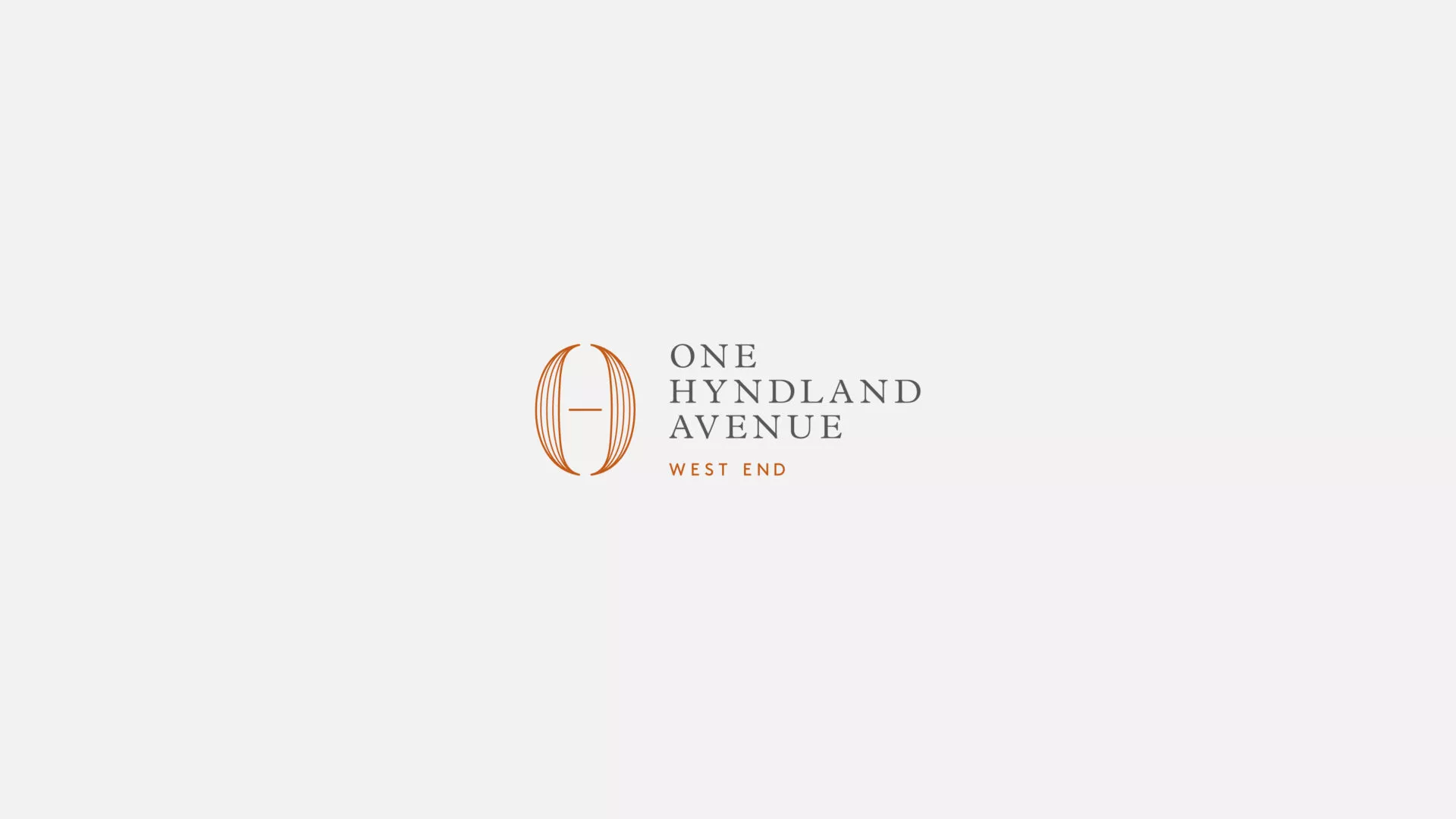
For the latest development the proposition was slightly different to the previous builds. With penthouses, duplexes and apartments in the heart of Glasgow’s West End, we looked to the aspirational.
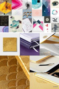
We generated mood boards to capture the overall feel and tone. A brilliant and quick exercise to easily establish what you want the direction to be. We create Pinterest boards and populate them with our initial ideas for style etc, we then encourage our clients to go in and delete any they don’t feel work for them and add in any they feel sit well with their own vision, sometimes hard for companies to pin down on their own.
The results
The client favoured a blend of traditional and modern to represent the developments situation among red sandstone tenements with the modern luxury that this development will bring in its design and interiors. We looked to London penthouse developments for style coupled with a desire to root it firmly in its location.
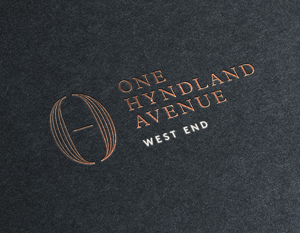
The chosen name is One Hyndland Avenue and the client liked the idea of a modern take on a mongram to bring in the O, H and A. And so it was pen and pencil to paper…
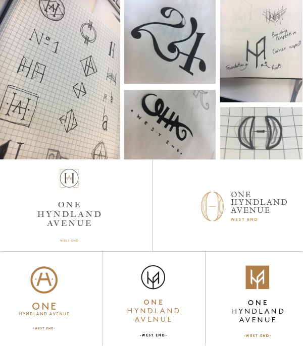
The client was immediately drawn to a single option that encapsulated the overall positioning of the development in both their vision and the wider marketplace. With elegance and grace an ornate ‘O’ represents ‘One’ with thin line detailing to give texture and form. Hints at the letter H and A help create the structure of the shape and whilst abstract they are represented.
![]()
Make sure you keep checking our website as the next steps in the brochure design evolve, from floor plans and maps to location photo shoots, virtual reality and more exciting developments.
To see more of our branding work have a look at our portfolio. If you think we can help you take your brand to the next level and want to come on the journey with us, please get in touch.
Posted by SHINE / 29.01.2019