What is in a brand?
16.06.2017
A rose by any other name…
Does your ‘brand’ go deeper than merely a visual mark that distinguishes your company from your rivals?
Does it evoke an emotional response, is there hidden meaning in the colour choices or simply hidden meaning.
A brand portrays the ‘personality’ of the company, the tone and character – the spoken, unspoken, tangible and intangible. With most consumers first interaction with your brand being a digital one, does your brand shout loud enough to be heard in the busiest marketplace there is? Where you are no longer just vying for visibility in your own locality, but on a global scale.
Is it memorable enough to stay front of mind to a consumer who has had ‘About 919,000,000 results delivered in 0.63 seconds’. Think big, it’s no longer just a ‘logo’.
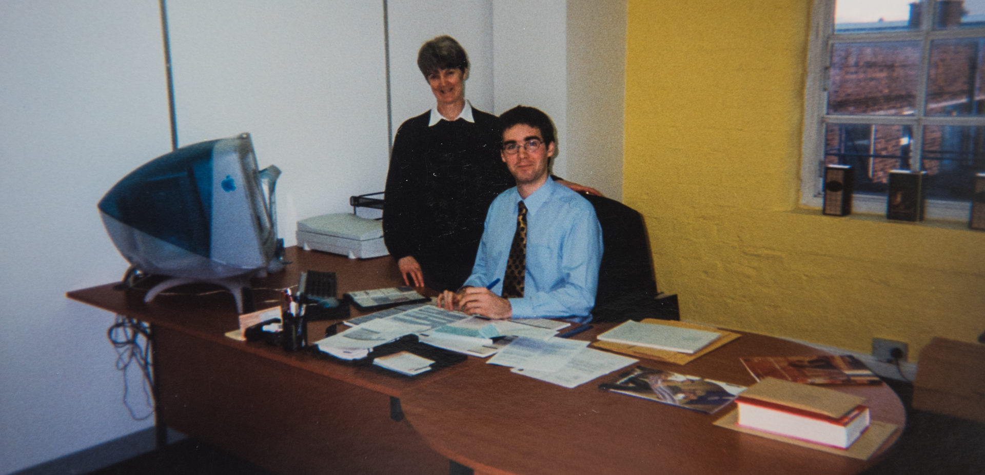
As a designer it is my job to get you to look beyond what it means to you, the owner, and really look at what it is your customer wants from you, what you have that will make them engage, work or buy from you. What would resonate with them, key notes that will trigger a response.
Lets look at some of the biggest ‘brands’ and what they are trying to say to us. You will instantly recognise all of these, after all every one of us are consumers.
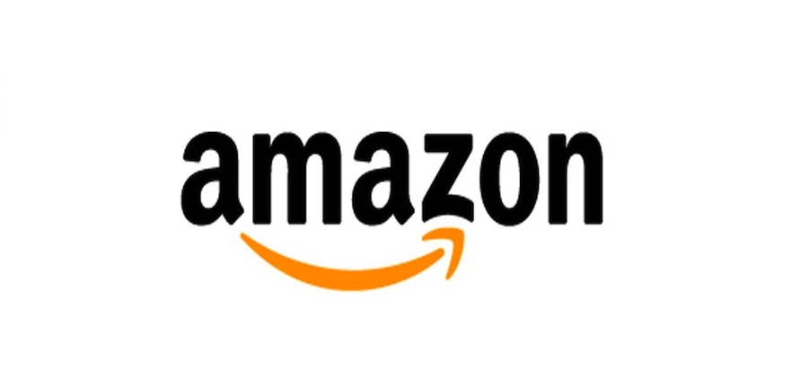
AMAZON
A strong recognisable household name that most of us probably engage with on a daily basis. You will have most likely noticed the arrow that is swift in nature, you may also have picked up on the fact that it looks like a happy little, if somewhat cheeky, smile with a nod to a creased cheek. Look deeper and you see that the arrow does in fact go from A-Z, giving us a little insight into what it does on the tin. All products from here to there with confidence.
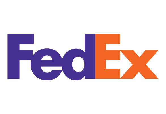
FEXED
The name “FedEx” is a syllabic abbreviation of the name of the company’s original air division. I wonder how many consumers can name the original company? This spoken abbreviation of Federal Express adopted by many consumers became the official brand in 1994 such was the pull of the people. The company also aligned their colours to their positioning… The Purple Promise: “I will make every FedEx experience outstanding.”
Did you also notice the subtle perfectly formed little arrow within the negative space of the E and X? You now can’t un-see that. Sorry. It’s not there by accident, subliminal or not it echoes the forward thinking, dynamic nature of the company and what it wants us to ‘feel’.
It’s when I get the ‘why didn’t I think of that’ moment when a clever brand really hits home for me as a designer and as a consumer. Have you ever bought a bottle of wine purely because of the label? No! Just me then!
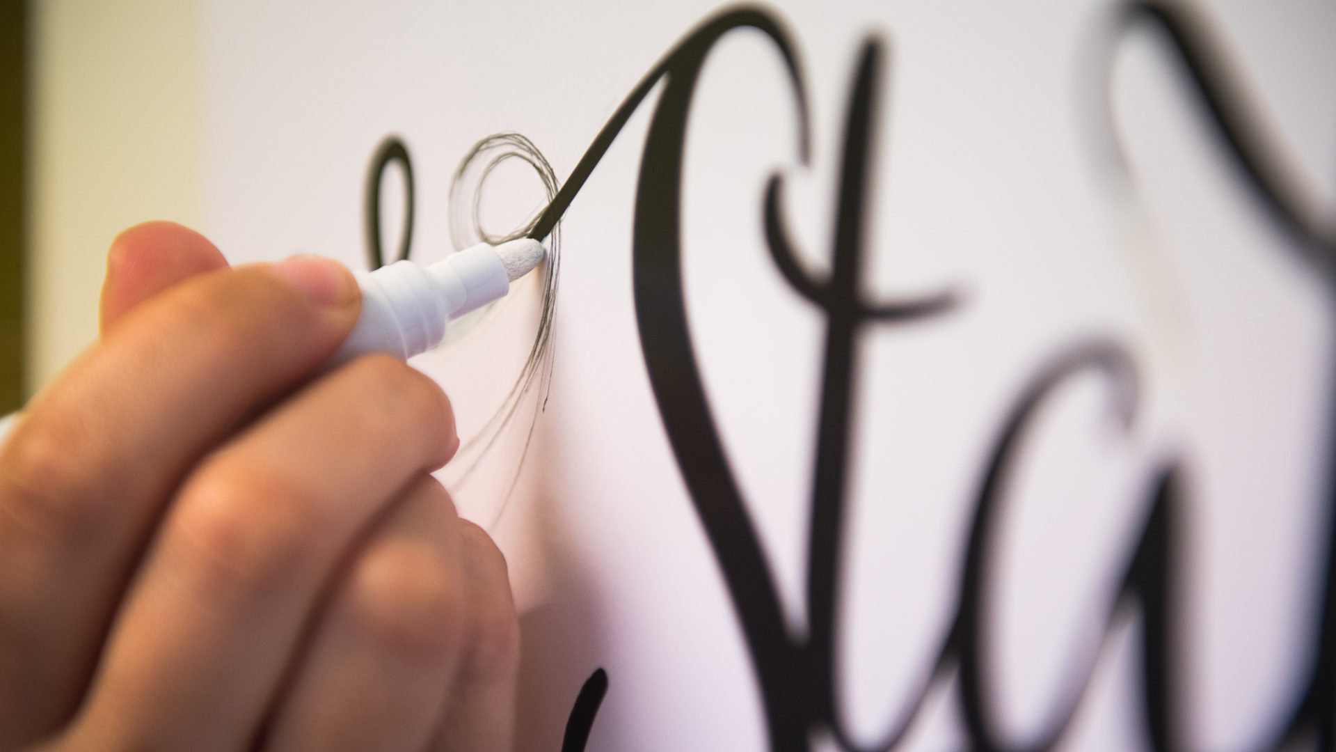
You have heard me reference negative space and I’ll show you some examples as it’s one of my favourite little design quirks…
Read the narrative between the lines
Most successful designs that use negative space as part of the concept do so in a natural synergistic way. It is usually happenstance and cannot really be forced into play. A design should be able to stand on it’s own and the ‘lightbulb!’ moment is a bonus that allows the design to convey more of it’s narrative or brand message.
It’s like the illusion picture, that has us all squinting, once you’ve seen it you can’t unsee it…

What do you see? The old lady or the young woman?
The following are a few that I think work particularly well. They allow the viewer to interact with the same brand but see a different side, perhaps balancing a few messages.
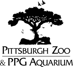
Pittsburgh Zoo use a very illustrative route to their narrative with the inclusion of birds flying from a tree top, look closer and you can see the trunk is formed by the profile of a Gorilla and lioness with fish at the roots.
The Guild of Food Writers makes the smallest change to a pen nib to eloquently give that nod to a spoon.
![]()
Give your eyes a little time to adjust and the A of Arrow will slowly emerge from the background.
![]()
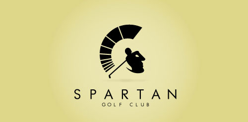
Spartan Golf Club has to be one of the most cleverly conceived. See if you can spot the golf swing from the Roman soldier.
If this has sparked your imagination, or it’s time for a fresh new look, get in touch with us. Let’s turn that daunting blank piece of paper into something that will stand up against your competition or a new direction to take your company into the next chapter.
To see some of our branding work have a look at our portfolio.
Posted by SHINE / 16.06.2017