Website Launch – Angus Soft Fruits
23.06.2017
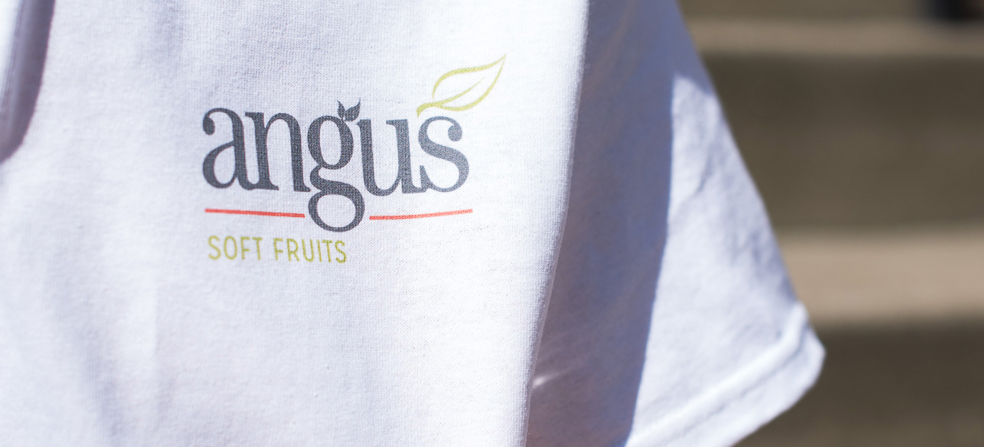
Angus Soft Fruits are the ‘berry specialists’ – They are a leading supplier of berries to UK and European retailers, and they were looking for a brand freshening and a new website.
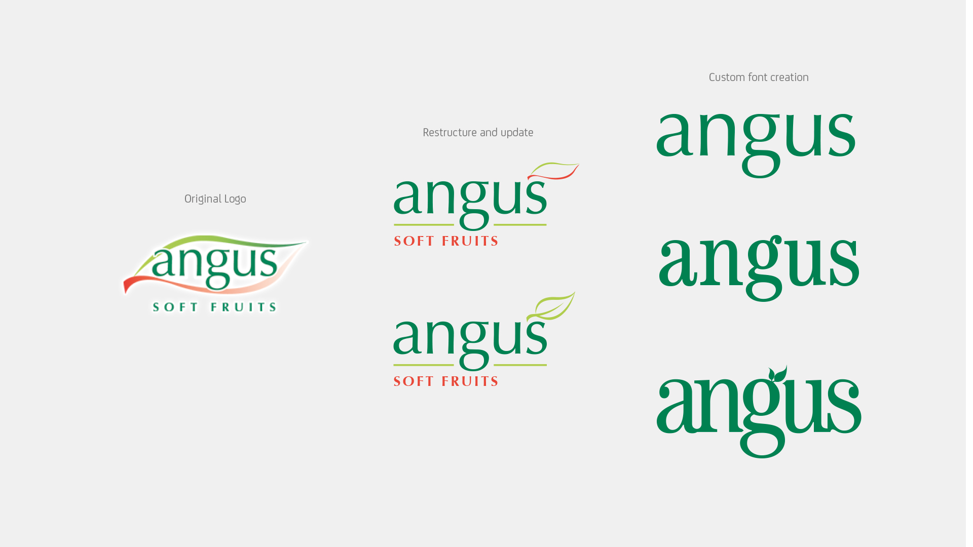
Martyn took care of the brand update:
Our remit for the main Angus brand was to ‘tidy up’ rather than change. We kept all of the same elements: leaf shape, lowercase name and the same sub-text. We just made a point of improving each element as much as possible while still remaining very much the same identity. We like to think of this one as ‘cosmetic surgery’.
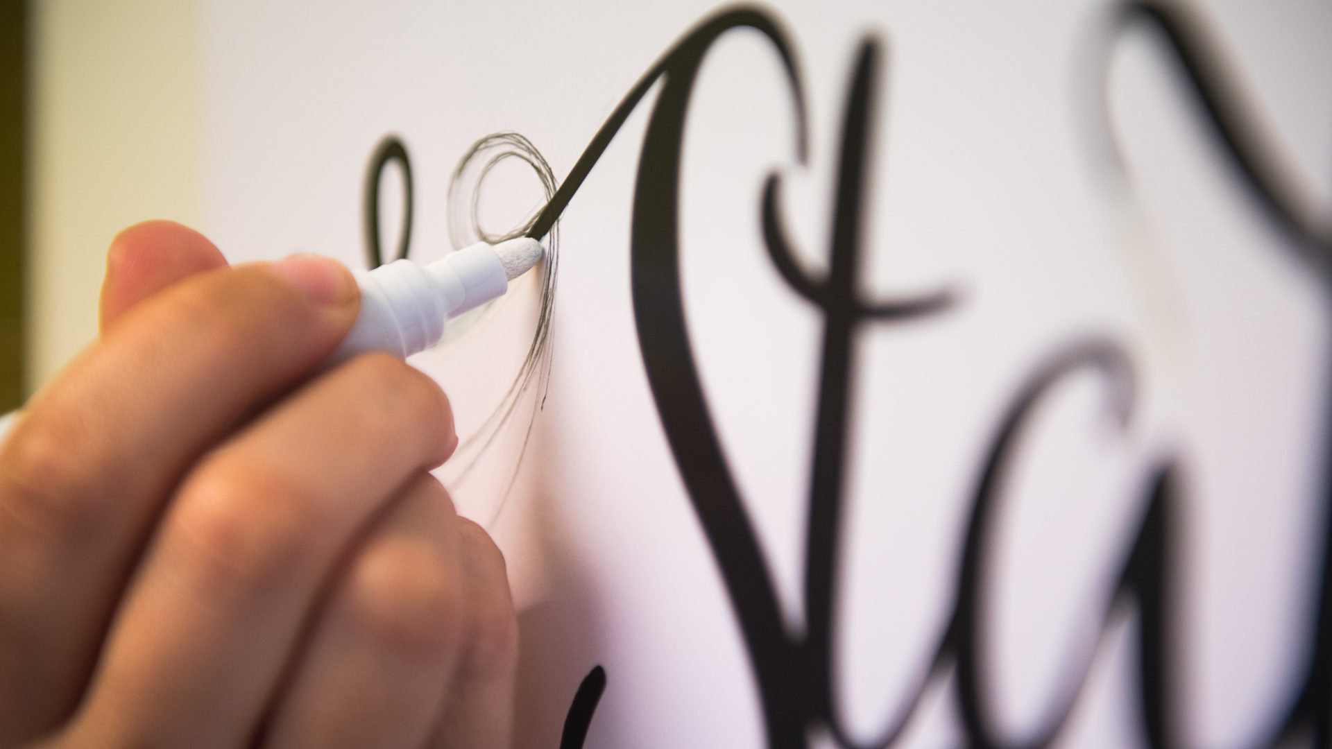
The Creation Process
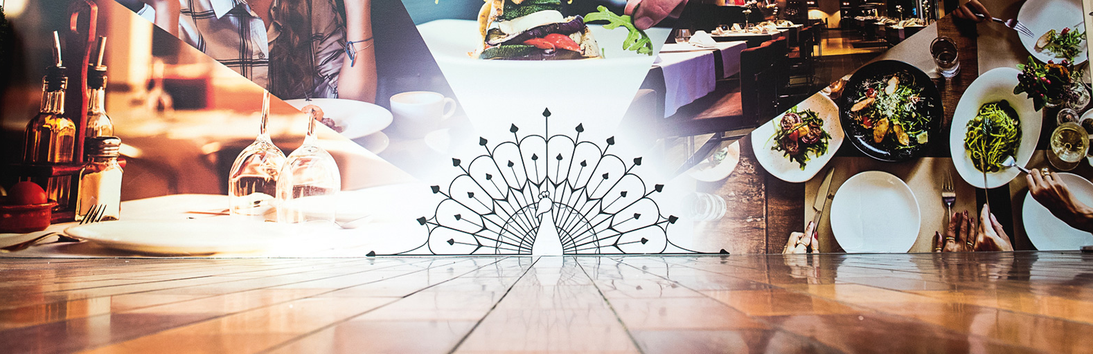
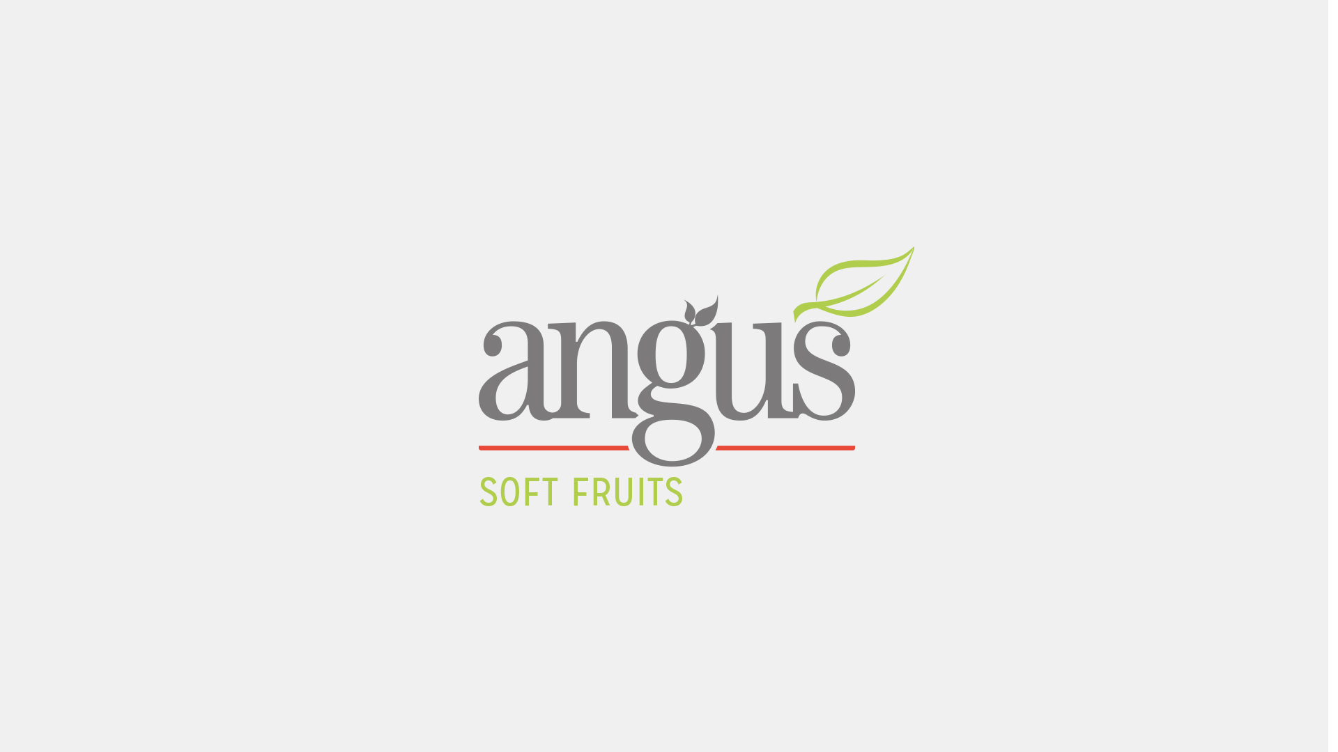
The Finished Brand Update
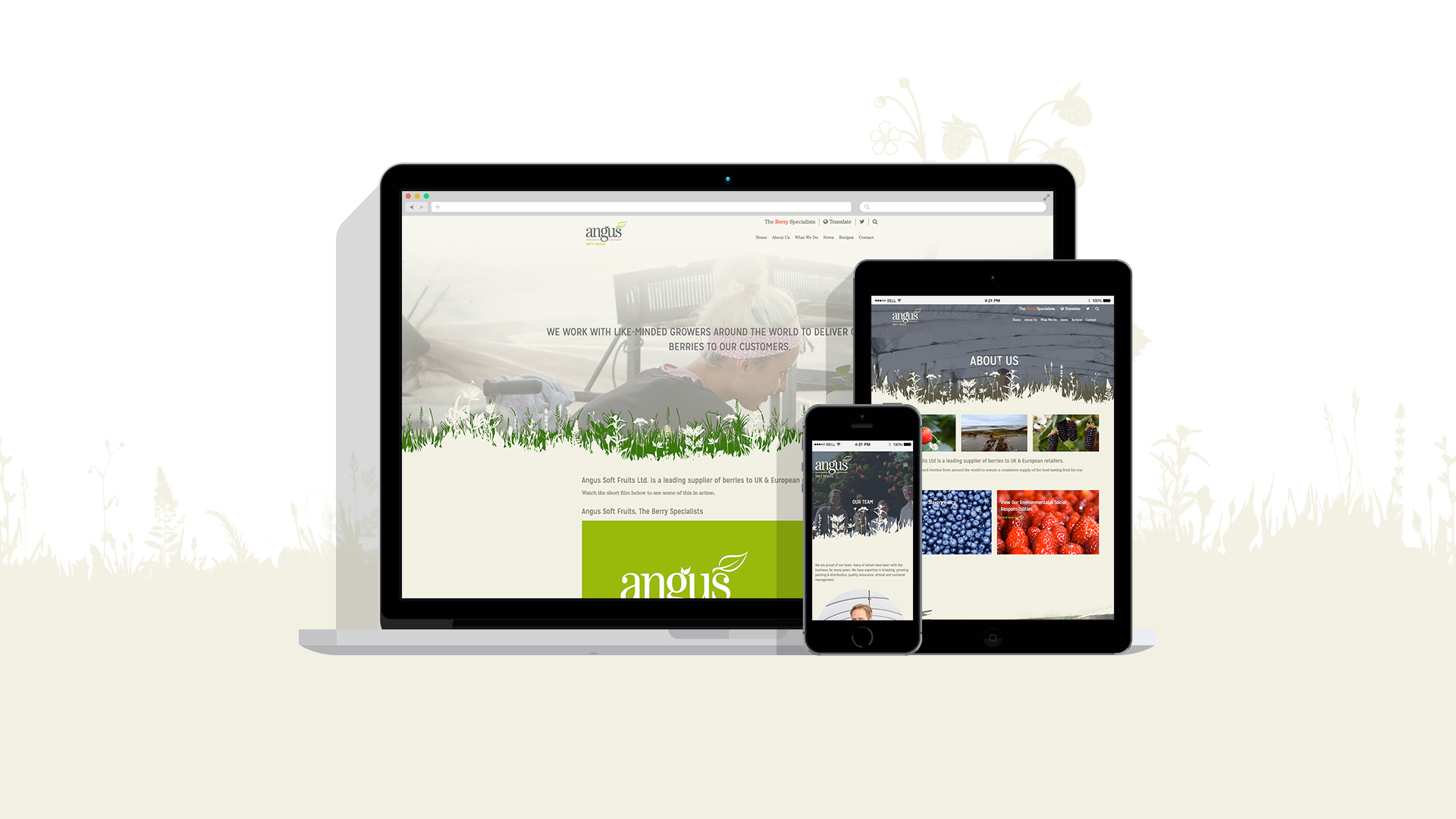
Karen worked on the design of the website to get the look & feel that the client wanted:
With a costal location and rolling hills we wanted to try to capture the natural surroundings of the Angus Soft Fruit growers. We used watercolour brush patterns to soften and separate the bitesize snippets of information on the website coupled with large image areas to really give a visual impact. I happened to mention…’wouldn’t it be lovely if the grass and butterflies could move with the viewer?’ Bryan worked his magic and made some lovely dynamic areas on the site that add layers and depth to help give the feeling of being immersed in the location and natural elements of the brand.
Make sure you on on the website and try out the scroll effect for yourself!
It was then time to implement the brand updates in to their new website. Peter handled the web-side of the project:
Angus were looking for a fresh new site that conveyed both their professional business model and how they grow, package and distribute soft fruit from all across the world, but they also wanted it to relate to nature and the freshness of their fruit. To do this we introduced a layered parallax website that brought in graphics that conveyed a natural environment. Interspersed with this we used high quality photography of their sites and fruit. This allowed us to mix the natural with the professional.
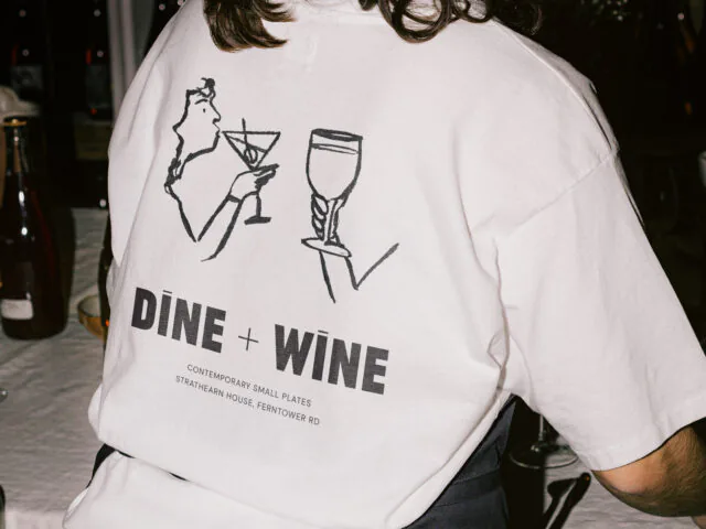
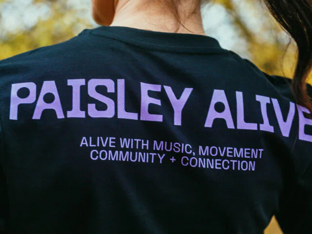
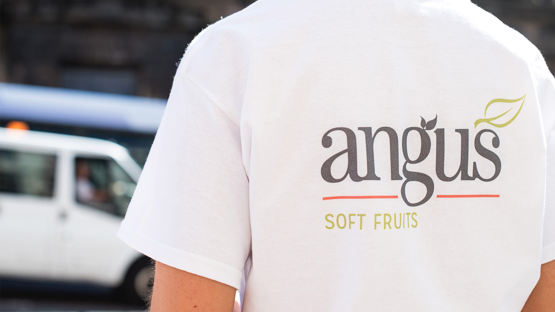
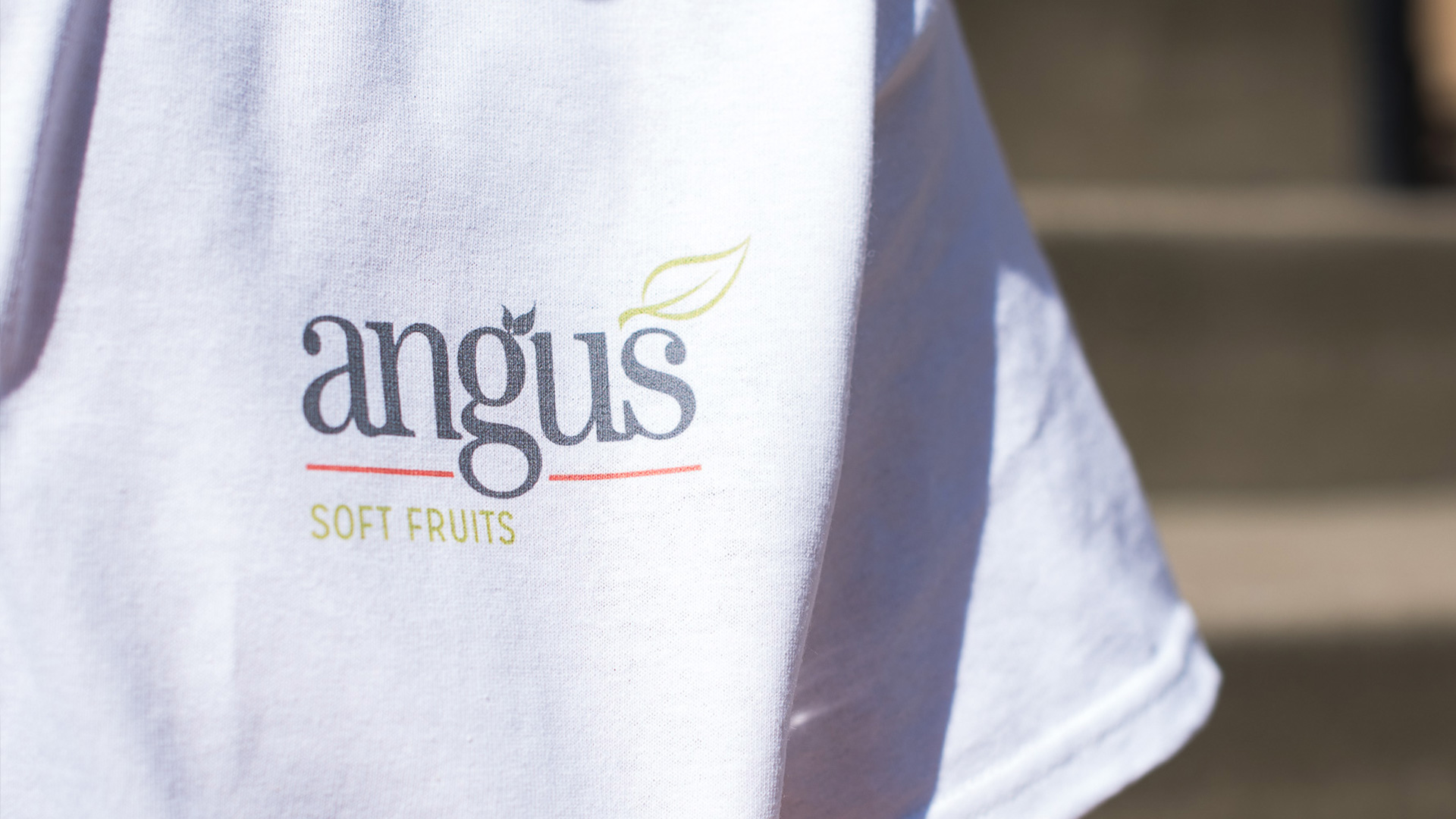
Angus Soft Fruits exhibit at The Royal Highland Show every year, so we designed some branded t-shirts for them to take along.
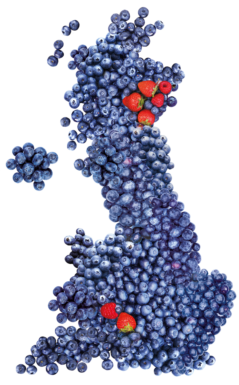
We were also asked to make a map of the UK out of berries to represent where they are based! Not an everyday request.. But looks really good!
If you are looking to freshen up your brand, or maybe even a full rebrand and a new website to show off to your customers, get in touch! Find out what we could do for you.
Posted by SHINE / 23.06.2017