Designing a Whisky Label for The Torridon
06.10.2015
The Torridon gets its own branded whisky…
The Torridon are one of our major clients and we have been working together for some years now. We have worked on their branding, website, marketing materials and other design-related activities.
So when they decided they wanted a branded whisky bottle, we were keen to get involved and start designing.
The design brief was two-fold; we wanted to incorporate the branding of The Torridon as well as making it look like a whisky brand. To do this, we had to bring in two different styles that worked together and carry out research into what is expected from a whisky brand.
We came up with three quite different concepts ranging from the more traditional designs to slightly more contemporary.
It was also important to keep the end user in mind and create a design that would appeal to The Torridon’s customers. So once we had decided on the final three ideas, we put it to them to see which they liked best. We ran a competition on social media and asked the audience to vote on their favourite design.
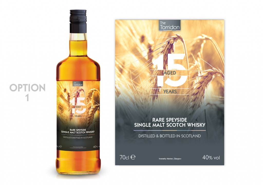
This is quite a simple design. No frills. A slightly more traditional idea, this label showcases the ingredients of the product and looks very clean and simple.
Here’s what people had to say…
“This is the ‘softest’ looking label and the one I like the most”
“Sleek, in a simple clean way.”
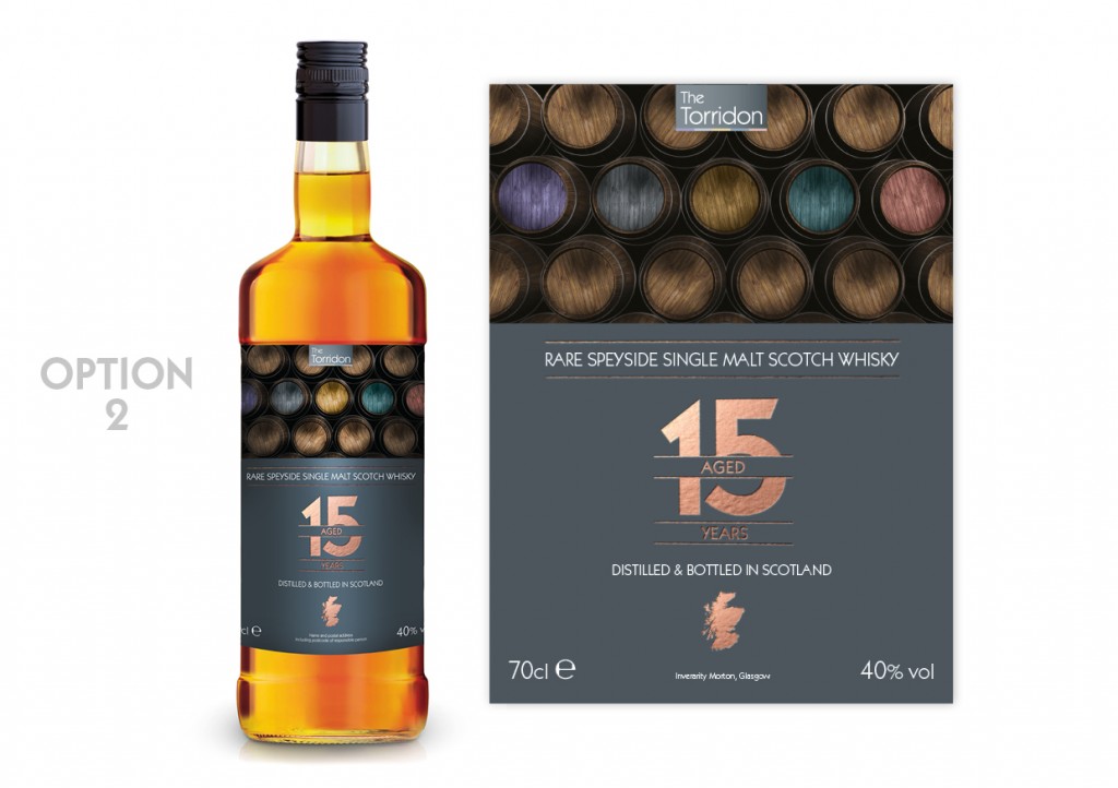
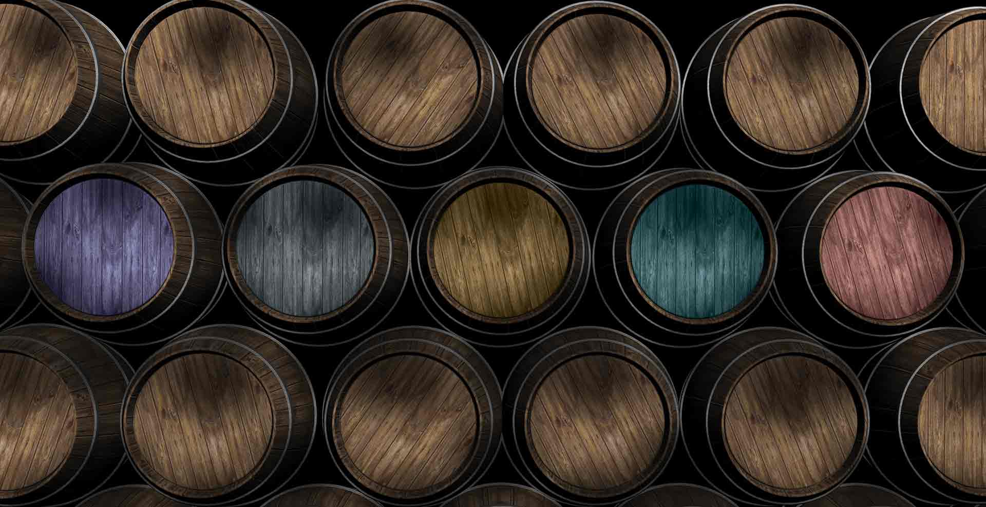
This design has more of a modern twist to a traditional whisky bottle. Using a copper foil, we wanted to ‘class it up’. We added subtle colour and grey tones, to create that contemporary look and fell.
Here’s what people had to say…
“It’s different!”
“Clear and modern!”
“It’s unique!”
“I like Option 2…. Colourful barrels!
“Nice, rustic yet modern…”
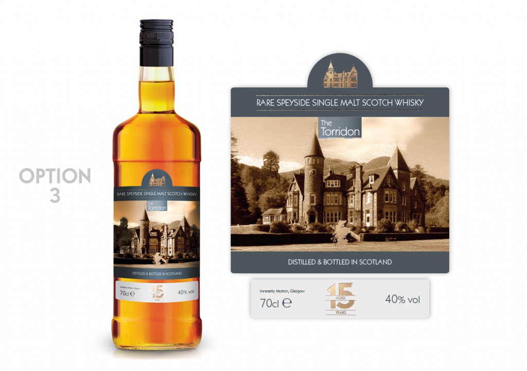
As this is an own-brand whisky, it made sense to do a design with the hotel in the forefront of the design. It doesn’t get much more ‘Torridon-y’ than this. This particular concept was inspired from other whisky brands, using sectioned labels in the packaging.
Here’s what people had to say…
“This one captures your venue in a classy way”
“I love Option 3! The hotel is majestic and truly one of a kind!”
“Love Option 3 because I love castles”
“Classy and timeless and ageless”
And just to throw another one into the mix, one voter said, “Is there one with Rohaise on it?? That would surely get everyone’s vote.” (Rohaise is one of the owners of The Torridon)
However, despite that excellent suggestion, we had to pick a winner from these three options.
And the winner was ……… Option 2!
Taking into account the contemporary look, this design incorporates the sophisticated branding of The Torridon and is a clear winner.
So, we put it to The Torridon customers to find out which design they preferred, now it’s your turn. Which is your favourite design?
Posted by SHINE / 06.10.2015
