Modernising Logos: From a Designer's Perspective
10.09.2015
So we’ve seen some of the world’s largest companies modernising and updating their logos in the last year or two…
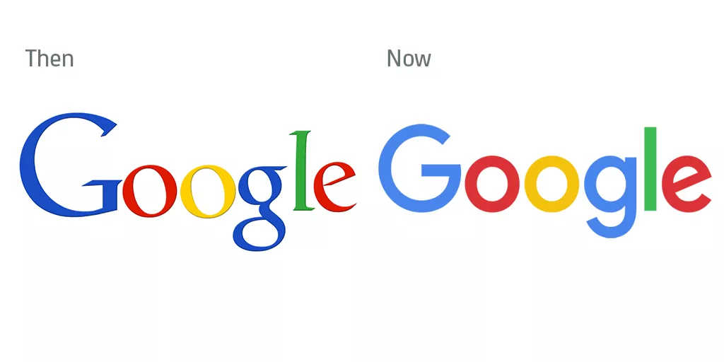
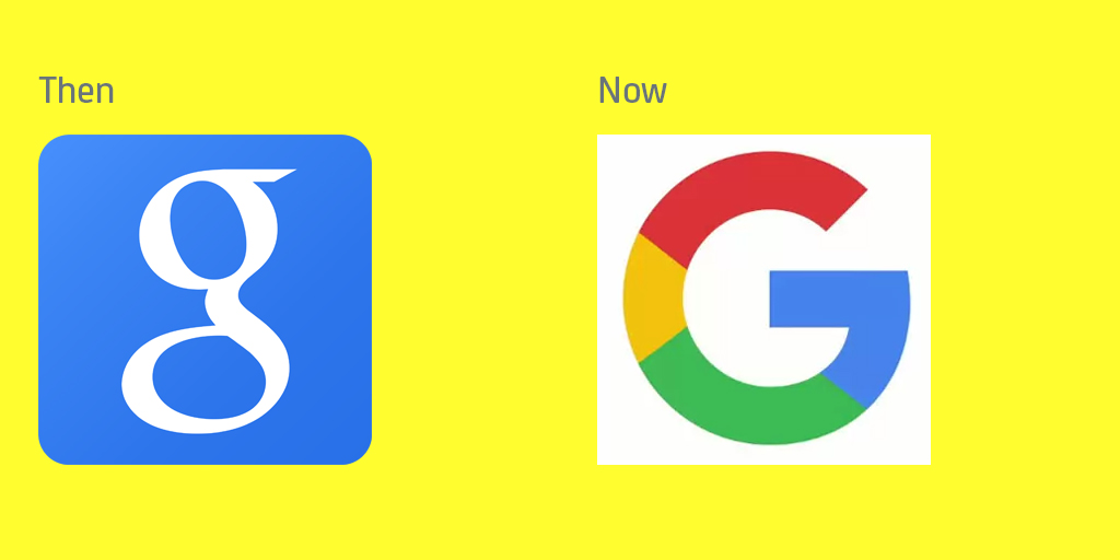
I’m sure that by now you will have seen Google’s new logo. They have simplified, modernised and made it appeal to younger users. They are actually not the only large company to modernise their image this year. Facebook also launched a new design of their logo. And in 2014, Netflix and STV released updated versions of their logos.
As an agency that love branding, we are fascinated when companies change their logos and love to have a good old chat about what we think of the colours, font and overall look… and whether it was worth doing or not….
We like Google’s new logo. What makes Google ‘Google’ is the colours and the simplicity in the branding. The new logo has kept this and simplified it even further. The old logo had a problem with the scalability on the serifs, so the new design overcomes this having lost the serifs.
Also, here is something really interesting and design-y! The bar of the squinty ‘e’ lines up perfectly with the ‘g’. Fancy!
![]()
What do we say about Facebook’s new logo? The font is slightly different…?

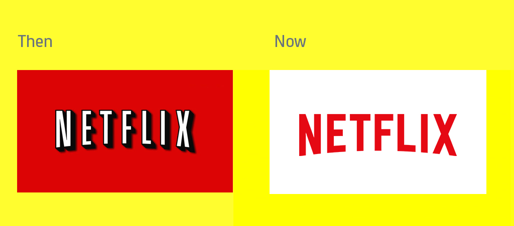
Netflix
The new logo is certainly simpler. Red on white is also an easier colour combination than white on red to read. The new design also works much better on a small screen such as a mobile (even though mobile screens are getting bigger and bigger…)
STV
We just had to get a local Scottish one in! STV seem to be doing the exact opposite of all other brands and making their logo less simple…

So what do they all have in common?
Most of these changes are fairly subtle. Whether it’s a slight change of colour, font or background, they all have one thing in common. Each is designed to be simpler (except STV) and more mobile friendly. In this age of mobile and tablets dominating the market, and users spending more and more time on mobile technology it makes sense that these companies are wanting to make their logo stand out easier on these mediums.
In fact, Google have gone one step further and adapted their logo for each channel that they have. There’s a blog all about how Google have made their logo adaptive, it’s quite an interesting read. Anyway, let’s just point out that Google’s new ‘G’ is quite similar to the Glasgow Commonwealth ’G’…
What can we learn from these big brands?
1. The major trend in logo design right now is a flat design. No complex embellishment, just vector-based designs. Keeping it nice and simple.
2. It is so important to keep your branding up to date and understand how your audience is using your brand to make it effective
3. The brand should be keeping on top of trends and continuing to be relevant to its target audience. You need to evaluate how your customers are using your services and make sure your brand message is consistent with this.
4. You don’t necessarily need a massive rebrand to modernise or update your identity. Sometimes a simple redesign or alteration is all that is needed…
Of course we want your brand be beautifully designed, so as a design agency, we will always seek to make your brand identity the best that it can be. Have a look at some of our rebranding projects here to see for yourself.
Posted by SHINE / 10.09.2015