Netflix – A brand evolution
27.08.2020
When we talk about branding, we talk about the bridge that connects product and customer through the medium of sensory interaction.
This can involve everything from customer satisfaction, emotional connection, personality and goals.
Branding is not just a logo, but something that encompasses your ideals, personality and values in a range of sensory products.
A brand tells a story that builds a relationship between a customer and a product. This includes:
• Positioning
• Benefit for customers
• Personality
• Aspiration
• An emotional connection
One brand that has excelled in developing a unique and instantly recognisable offering is Netflix.
Netflix’s device is clear, concise and direct that flows naturally throughout their entire offering. Although from when they initially started, technology has advanced leaps and bounds in ways no one ever expected, their brand structure has remained solid and relatively unchanged in terms of ideals.
Netflix is now known as the most popular ‘on demand’ video streaming service in the world.
To give you some context, during lockdown alone, Netflix gained 20 million new subscribers within the first month of quarantining! These numbers just highlight the huge powers and influence globalisation can have and has had for industries such as those in entertainment to be able to reach audiences that just weren’t accessible 15 years ago.
But before they introduced the streaming concept, Netflix first started off as a Movie and TV Show Rental Service since it’s beginnings in 1997.
Originally founded in 1997 by Reed Hastings and Marc Randolph, who were two software engineers who left the company they were working for to take a risk and develop a company that embellished both of their unique skills and interests.
Randolph who had an interest in the internet wanted to start an internet business but didn’t know what type of product to sell and Hastings who saw how retailers were charging people for renting movies, was disgusted by their practices and wanted to make renting more consumer-friendly. This lead to Netflix being born.
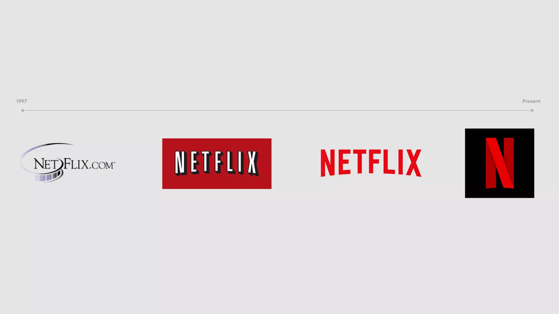
The Logo

The First Design
Netflix’s presence at the very start screams ‘computer generated’. Starting off with a very generic and over-used black text that was split by a circle spiral in the shape of a reel of film. The brand had very little character to say the least.
The ‘90s was a time when branding and marketing were really becoming hot. There was a huge competition to build meaningful brands that stood out in the ‘branding boom’. People really started to associate themselves with brands and buy into their whole brand, rather than just their logo.
Netflix quickly outgrew their first logo as it didn’t capture their values and ideals. It’s possible a logo such as this took influence from other logos such as Nike’s infamous swoosh, that paved the way for other brands to incorporate a simple shape or design that was instantly recognisable. Netflix did not make the right choice in how they developed their original logo and was far too similar to brands from the early ’90s and wasn’t until their rebrand in the 2000s that their brand really caught on.
The Second Design
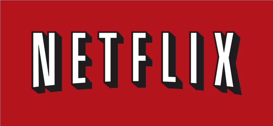
This brings us onto their second design which you will instantly recognise. This is when Netflix really came into its own with their branding, developing a typographic logo that flowed naturally through the products and services that they offered.
Utilising a semi-circle curve at the bottom of the typography brought a second 3-dimensional aspect to the already 3D type. The letters were arched in a way to cleverly look like an old projected curve, and that only continues in the shadowing behind the white letters, making the entire title of Netflix to look like a projected movie on a screen.
The device is utilised a bold red as the background, the same iconic colour of traditional theatre curtains that were prominent across America for years.
Although at first glance the brand appears simple, once analysed the logo embellishes some of the most iconic and profound nods to movies and theatre of decades gone by.
The Third Design
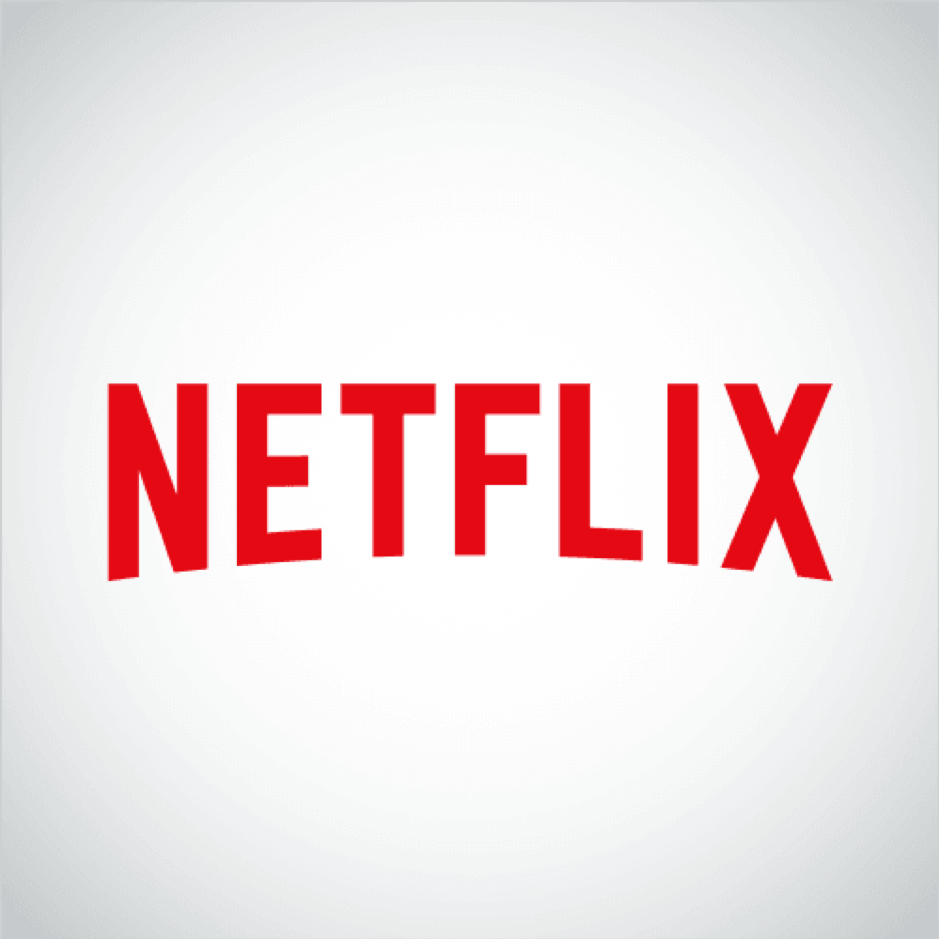
The third phase for Netflix’s device, saw the simplification of the projected letters and the background replaced, whilst the arch and deep red have been kept.
We have just said that Netflix’s previous logo was working well, so why the need to change?
The rise of Millennials.
The turn of the decade in 2010, brought with it a new era of consumers. The Millennials. They are a generation who grew up alongside the advances in technology and were raised on data and information being at their fingertips, as they turned into adults they brought with them a new wave of consumerism.
What fits perfectly with a generation that has extremely low patience due to having been drip-fed and nurtured on having access to information, high-speed internet, online shopping and instantaneous communications within seconds? An on-demand streaming service!
Netflix began to adapt their brand to fit their newly developed browsing system. They still adopt their Hollywoodesque arch and colour but have embraced simplicity by dropping the 3D effect. This simple change promotes ease of use in application across the board. The brand is recognisable and performs well at a variety of scales made for digital media and does so consistently at all times. The application of the brand itself takes inspiration from their forever expanding collection of film, tv and a sense of almost unlimited choice at your fingertips. Which you’ll understand from countless hours of scrolling through the ‘stacks’ trying to find something to watch!
“The new identity for Netflix revolves around the ‘stack,’ which is best imagined as a stack of cards all printed with some element of the entertainment company’s brand, like a character from one of its series or part of the red logo. A conceptual and visual thread to unify every touchpoint.”
The Netflix brand has grown and evolved with technology. The way we consume film and tv is very different now to how it was when Netflix began but this can also be said about the way we consume brands. We live in a time where content is king and we want it as fast as we can get it. Now it’s true to say within the app the brand becomes secondary to the image cards we now instantly recognise but this has been earned by building the brand over years. Constantly refining, fine tuning and keeping up with the times has ensured that the Netflix brand will be a mainstay in our lives for years to come.
Sometimes businesses need to rebrand for various reasons. Whether your brand needs to communicate it’s message and positioning clearer or if it is simply just a visual refresh, we can help work with you to bring your brand to life.