Our Enchanted Journey
16.05.2016
We’ve been working hard with The Enchanted Company to create a new brand image and marketing strategy to take them to a whole new level.
The Enchanted Company
The Enchanted Company started when founder, Bernie, was inspired by his young daughter’s love of ‘Miss Bun Bun’ – her pink rabbit! It wasn’t long before Bernie (with some help from his wife, Mariessa) developed a new business idea, creating children’s clothes starring ‘Miss Bun Bun’ and other forest friends. The idea grew from there, and today, The Enchanted Company has expanded to sell knick-knacks and homeware for grown-ups too.
The Brief
‘Clean and modern’
Bernie and Mariessa came to us with a desire to grow their business further with a redesign of their brand and website. The project was done in two stages, starting with an interim re-brand before the final brand was unveiled on the 17th May. This was the original brand: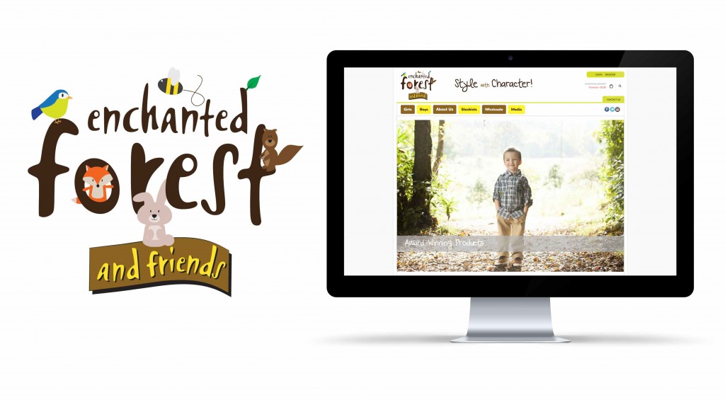
Stage 1: Interim Rebrand
‘Modernise and simplify’
The idea was to work with the original branding, making some small alterations and bringing the website up to a more modern style. Karen was given the task of creating this new brand and we all got very excited with ‘Pinning’ ideas to our collaborative Pinterest board. During this time, we focused on growing engagement and getting the brand message out to more people. 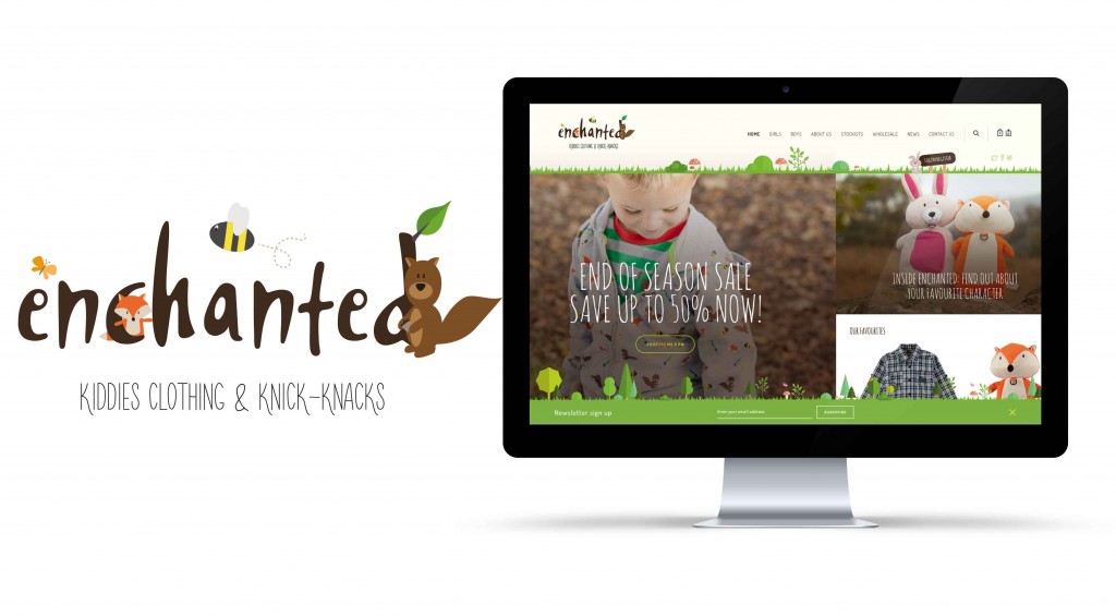
Stage 2: Development
‘Branding, branding, branding’
We started coming up with some ideas for the new brand and came back to Bernie and Mariessa with these 3 ideas: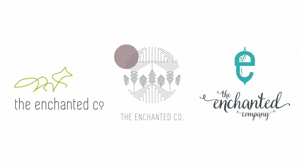 The favourite was the geometric idea in the middle, so we started to develop this further and Karen got the drawing tools out (see, it’s not all digital work!!)
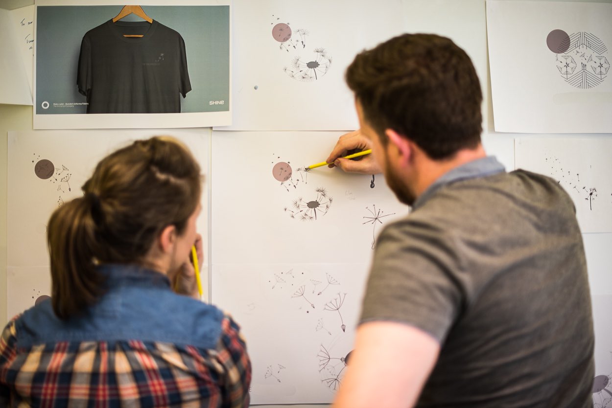
We had a slight detour when Bernie accidently spotted another idea that Karen had had in the initial brand development: dandelions.
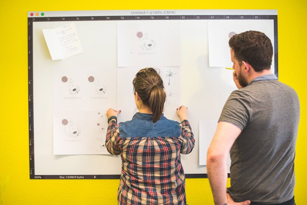
So back to the ‘drawing board’ and we set up our ‘Enchanted Wall’ and had lengthy discussions over how it would work and how to make it look really cool.

Stage 3: The Final Brand
‘A living brand’
After lots of hard work, meetings, Whatsapp messages and happy tears, we were ready to reveal the final brand and launch the website. Martyn was very excited to use his animation skills and created a mini launch video to showcase the new brand.
The final website design drew from our interim redesign, using the same concept and makeup, but changing the style and creating more aspects to the site.
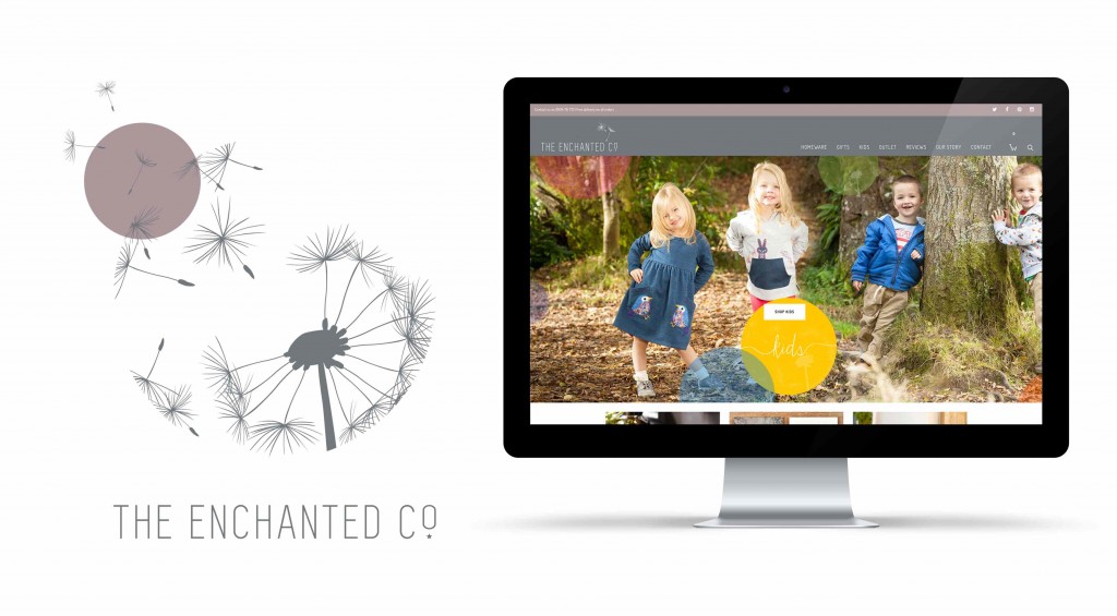 The ‘logo’ and brand image is living and dynamic, changing according to where it is positioned and how it is used. This gives us a number of different brand options that we can choose from to optimise the experience. The parent logo (on the left in the image below) shows the full aspect of the brand, incorporating the key colours, styling, and imagery (i.e. the big dandelion). The logo variations (on the right) are simplified versions, each of which derives from the parent brand.
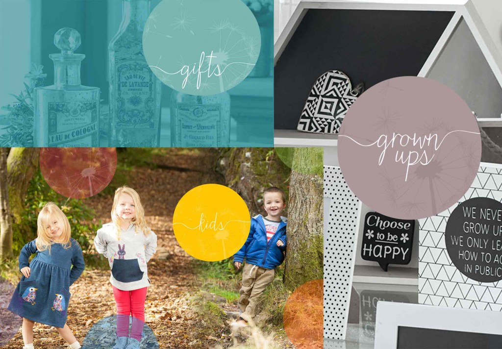
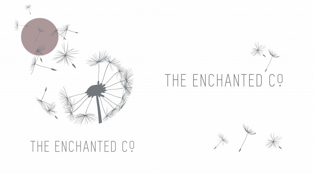 In addition, we also drew on ideas from previous concepts, such as the colouring and style from the ‘geometric’ design, but also decided to create individual identities for the sub-sections of the brand. Kids, gifts and homeware, each has its own identity and colour, helping people to distinguish between them.
So… let us know what you think…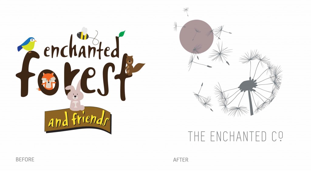
Posted by SHINE / 16.05.2016